Brand New Website, Same Old Wizardry
Gravity Wiz 3.0 is officially here! It’s pretty, and it’s fast. See how our brand new website reflects our sorcerous plans for the year to come.
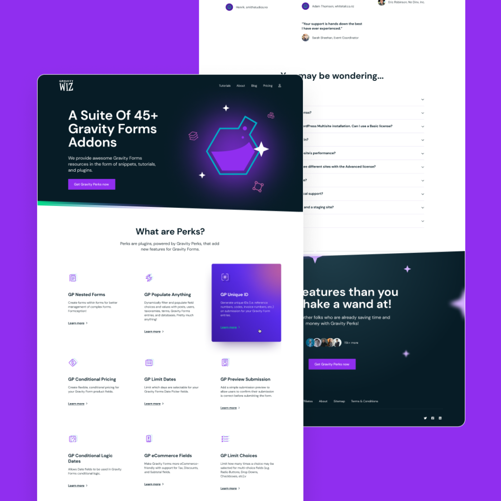
It’s been almost 10 years since our last redesign. That feels crazy to write out loud.
We’ve flirted with the idea of a refresh for quite some time, even had a false start or two, but it was so hard to prioritize our website over our products.
When you’re busy building the largest collection of 3rd-party Gravity Forms add-ons in the world, it’s easy to push that new website off just one more year, particularly when we were still getting good mileage with our daily driver.
As the years went by, our little beater started to show its age, both visually and under the hood. We’d accrued a decade of tech debt from the hundreds of greasemonkey modifications we’d made to keep the old girl running. Making changes was becoming increasingly more difficult and we weren’t able to capitalize on the budding Block Editor ecosystem.
Visually, the site failed to reflect the quality of our products. How could we expect our customers to appreciate the meticulous care we dedicate to our products if we weren’t dedicating that same care to the presentation of our products? Despite our best intentions, we all make some judgment about a book by its cover.
So, yeah, a redesign was long overdue. 😅
Objectives
Here’s what we set out to achieve with this redesign.
- Establish clearer branding.
- Refresh the website design to match that branding.
- Cleanse the website codebase with holy water.
- Empower our staff to do more with our website.
- Outsource as much of this as possible.
In all of this, it was of the utmost importance to maintain the playful, magical energy that makes Gravity Wiz such an awesome company to engage with and belong to.
Outsourcing a lion’s share of this work to a trusted partner was an absolute necessity. We couldn’t let such a major project disrupt our product roadmap. To this end, we partnered with Fixel, a top-notch full-service WordPress agency.
Brand
Over the years, we’d whimsically cobbled our branding together on an as-needed basis. It had some truly special elements but lacked the cohesion required to really shine.
We quickly realized before we could even start on a new website, we’d need to establish a cleaner, cohesive brand that conveyed how sorcerously serious we are about our work, without taking ourselves too seriously. 😄
Gravity Wiz
First stop, the Gravity Wiz logo.
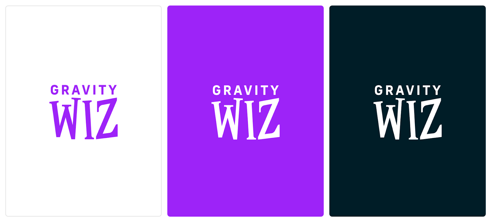
The new logo is…
- Familiar: Our original logo captured the fun but professional spirit of Gravity Wiz for over a decade. We were determined to preserve that quality while still forging a simpler and cleaner aesthetic that would better convey the polish of our brand and products.
- Simpler: We’ve ditched the fancy font we used for “Gravity”. We think it looks better and makes it possible to use that “Gravity” treatment to better align our product branding with our company brand (see Gravity Perks below).
- Cleaner: The “Wiz” is wearing its dress robes! It’s been cleaned up, ironed, and pressed — a presentation that is more becoming of a 12-year-old software company that remains dedicated to delighting and supporting its customers.
If you’re curious, here’s a quick before and after:
Gravity Perks
Following suit, our primary product line received its own little glow up.
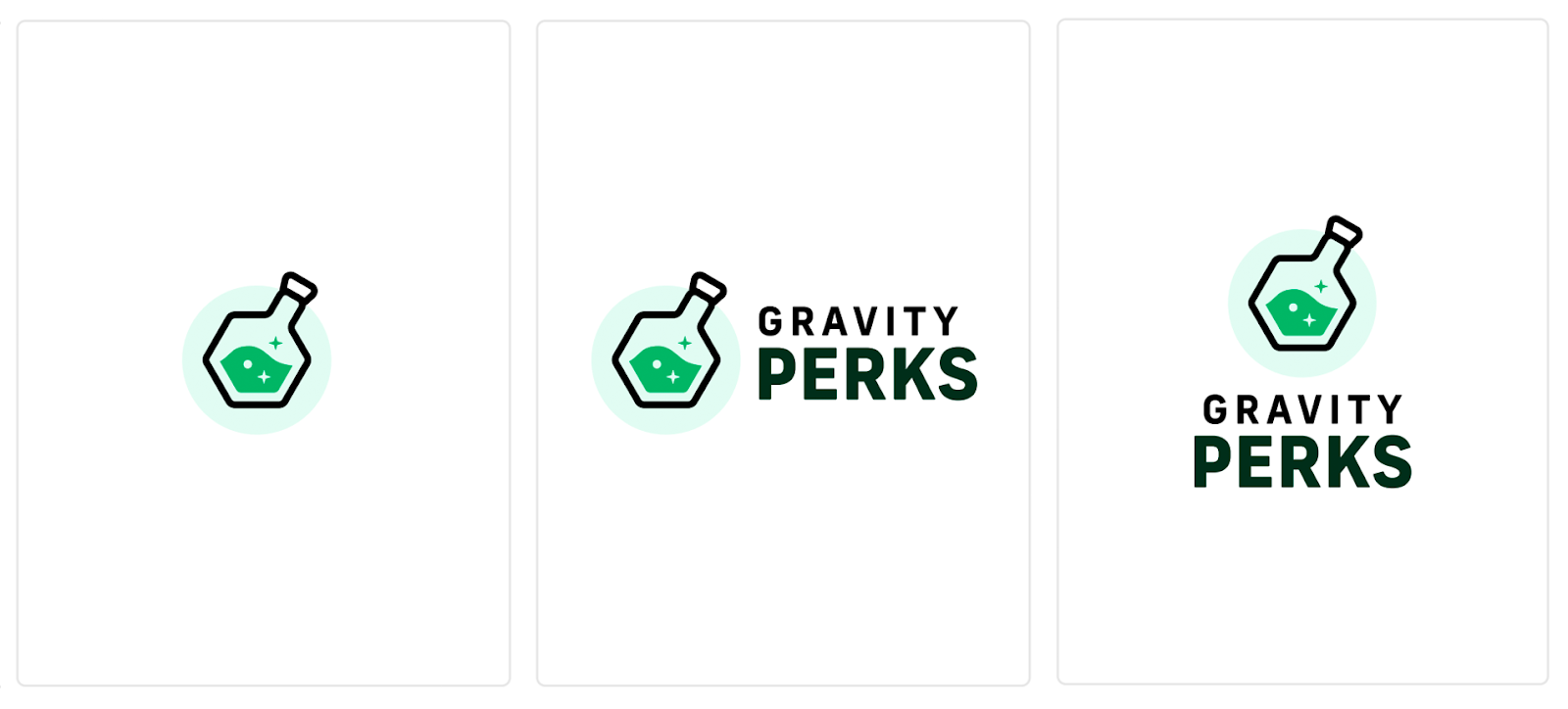
One of my favorite things about this new logo is the shared treatment of the “Gravity” text with the same text in the Gravity Wiz logo. A subtle but firm affirmation that these products come from the same trustworthy band of wizards.
Perk Icons
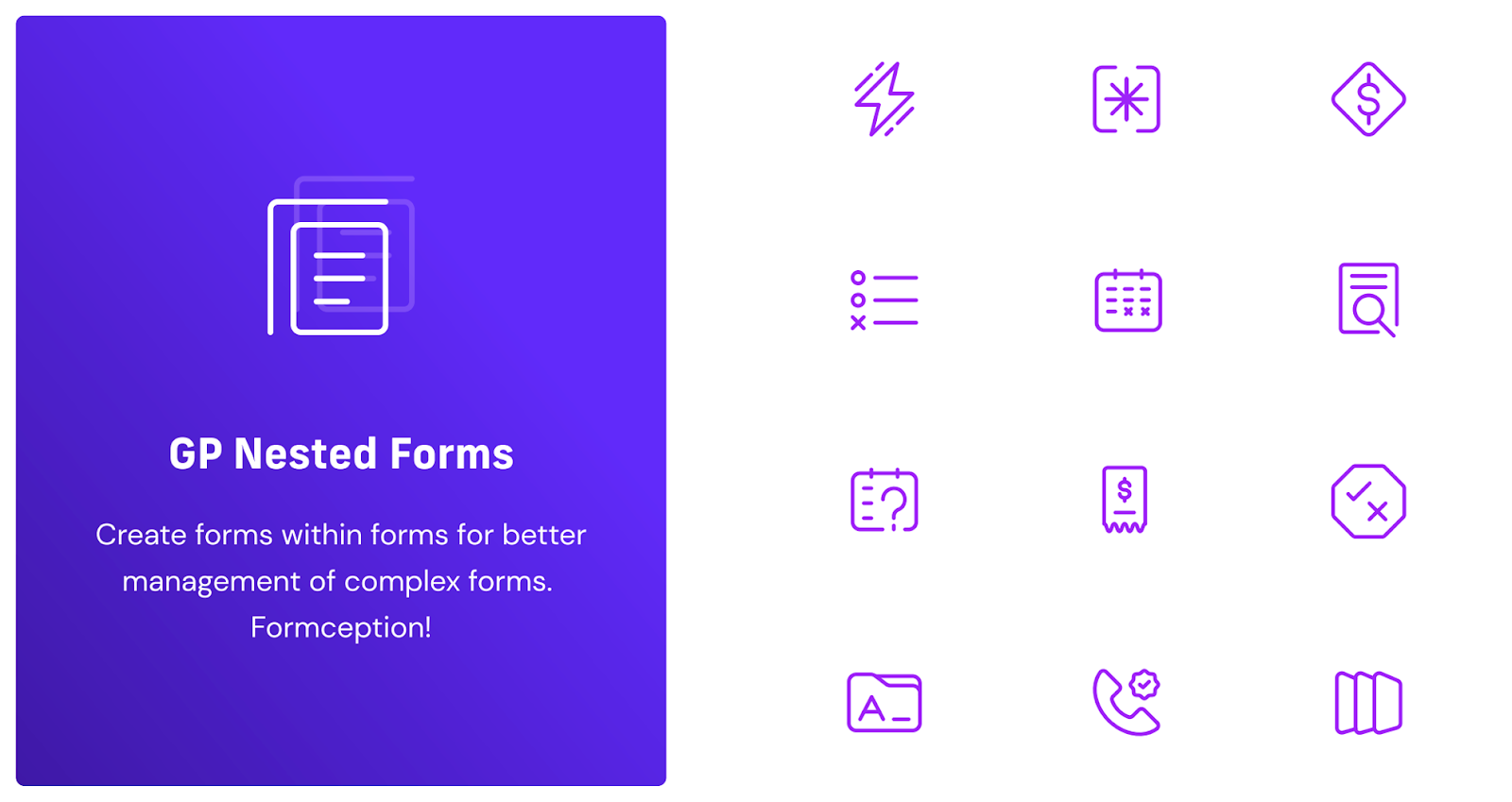
We’ve been dreaming of having icons for each perk since the dawn of time. I can’t tell you how excited I am that they’re finally here!
Website: What’s new?
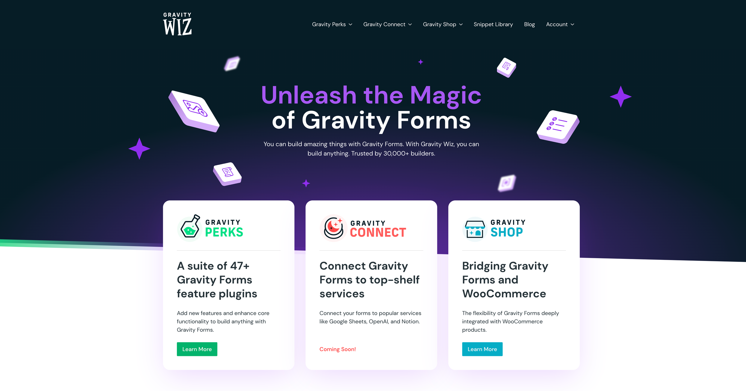
With our branding ironed out, it was time to dig into the website. We aimed to reskin rather than redesign as much as possible but we still redesigned where it was needed most. You’ll find the content and layout is mostly the same with helpful improvements sprinkled throughout.
Here are a few highlights.
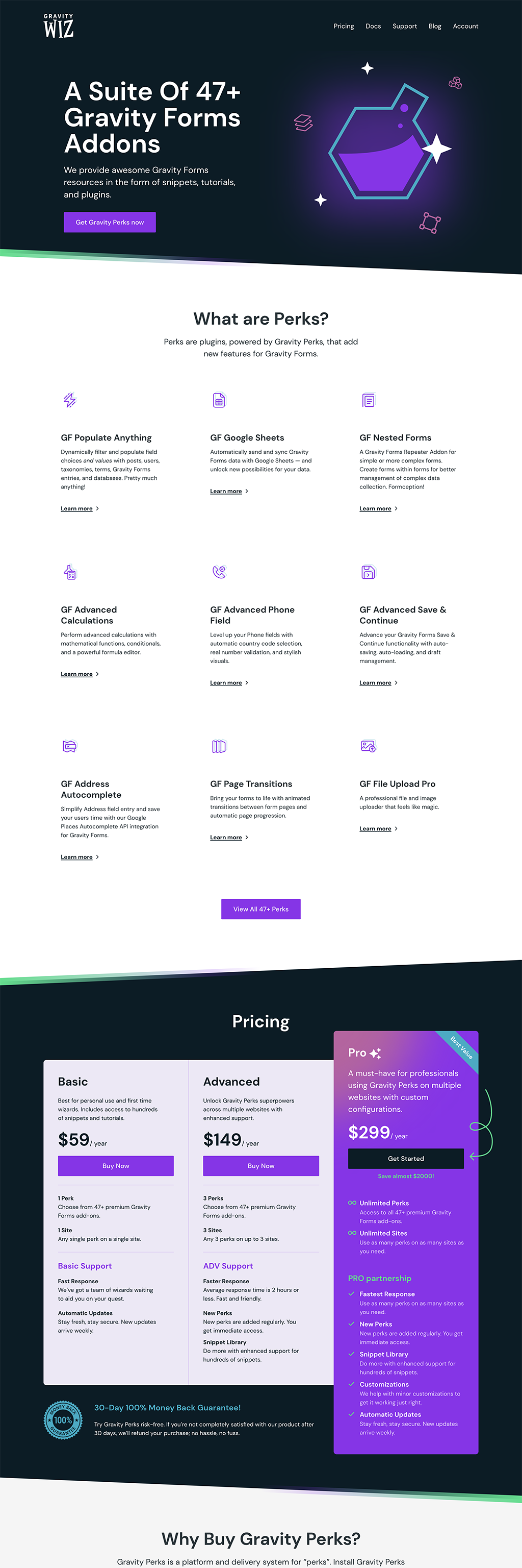
Home Page
First up, the home page. This is a great example where we reskinned rather than redesigned. There are some content updates but they were all minor improvements.
Keeping the layout consistent allowed us to get the new website shipped faster but also provides a unique opportunity to test how simply upgrading our aesthetic impacts sales. Exciting!
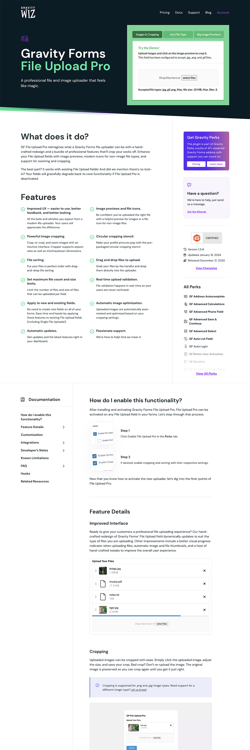
Product Pages
Product pages received the most significant overhaul. We’ve introduced a hero section and moved the demo into it, giving a much more enticing (and functional) first impression.
One unorthodox pattern we’ve used at Gravity Wiz since the beginning was including our sales copy and documentation on the same page. When Gravity Wiz was a one-wizard shop, this made implementation so much easier.
The unexpected byproduct of this was our thorough documentation became part of the sales pitch. By all conventional marketing wisdom, this shouldn’t work, but it’s been working very well for us.
With the new design, we’ve made a clearer distinction between the documentation and the sales copy. Plus, we’ve given the documentation section its own sticky sidebar to make navigation so much better.
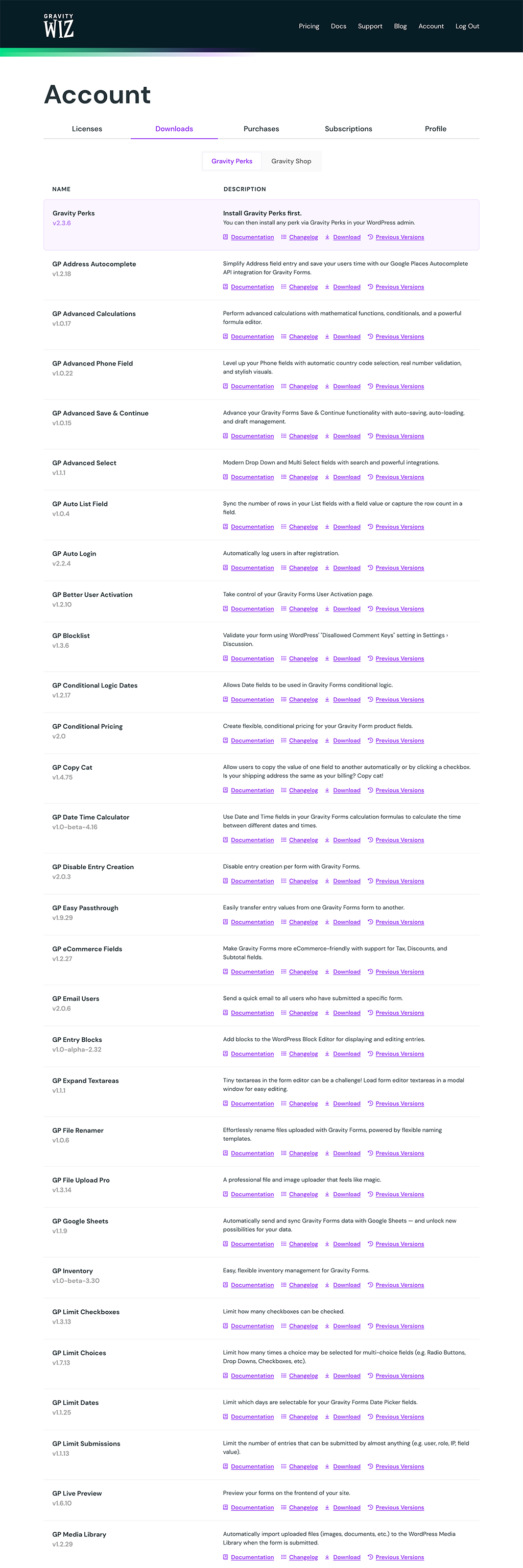
Account Pages
If you’re a Gravity Wiz customer, you’ll be pleased to see that your Account pages have received a delightful dose of visual TLC.
Your licenses, downloads, purchases, and subscriptions are all in the same place but we’ve used a surgeon’s wand (they use wands, right?) to tidy things up and make it easier to find what you need and perform common actions more easily.
We have lots of plans to make managing your Gravity Wiz account even better in future iterations.
This was a full website redesign so you’ll find dozens and dozens of other upgrades and enhancements throughout. Go explore and let us know what you think!
Acknowledgements
First and foremost, I must give immense credit and gratitude to our CTO, Clay Griffiths. He burned dozens of lamps worth of midnight oil implementing, testing, and polishing over the course of many months.
I’d also like to give a huge a shoutout to Vin and his team at Fixel. They’re an incredibly talented crew doing amazing work in the WordPress space. They were the perfect partner for a project 10 years in the making. The review I left them captures my experience precisely:
We needed a fresh look for our brand/website badly but when you’ve been rocking the same look for a decade, change can be hard. Fixel got me through the emotional turbulence so deftly, I didn’t even feel the band aid come off. It helped that the new design was absolutely magical. ✨
Future Plans
So what’s next?
Ongoing Improvements: We’ll be making hundreds of progressive enhancements to the new website. Oh, you thought we were done? Not even close. With the new infrastructure we’re able to make iterative changes much more quickly and sustainably. Keep an eye out for a new checkout experience and account management tools soon.
Multiple Product Lines: We’re also very excited to rework various aspects of the website to better showcase multiple product lines. You’re already familiar with our flagship product line, Gravity Perks, and we introduced Gravity Shop last year. This year, we’ll be introducing a third product line. We need to figure out how to give them equal focus on the website.
Tailored Landing Pages: Cole (our marketing wizard) is particularly excited about helping current and future customers better understand how Gravity Perks can meet their unique needs with tailored audience and use-case-specific landing pages. Have an idea you’d like to see us explore here? Get in touch.
Closing Comments
This has been an absolutely wild ride but I’m so happy to have arrived.
There’s an untold story here about my growth as a CEO and learning to take off a few of my many hats to let others, who wear them much better than me, help move our brand and website into the future.
To our customers, thank you for being a part of this epic adventure. We wouldn’t be here with you. 💜
The future is bright! And it’s more beautiful than ever. 😉

It was amazing to partner with you on this project, fellas! The brand already had an excellent reputation and a ton of personality. I’m proud to be a part of the G Wiz evolution!
Heck yeah, Vin! Thanks again for everything. 🙏
Overall, excellent work wizards! (imho, there’s still some work on the blog though, I’ve emailed David about it)
Your feedback is always welcomed and appreciated, Gui! Responded to your email as well. 🙏
A good step in the right way(s)! i am currently facing the same problem… everything for the customers, but the reflection of the quality of work has not yet begun. Have a good start with your enchanted new website!
greets
Stefan
Appreciated that, Stefan. Good look on your own journey. 😄
Looks great David! I appreciate your expertise and the wide variety of perks and snippets you have created and continue to maintain. Your commitment to continually improving is refreshing. I also appreciate the newsletter that helps keep me up to date on everything you are doing!
Thank you, Brad! You’ve been with us since the beginning. It gives your praise even more weight. 🙏
Thanks for all you do! I’m so pleased that you keep making your products better and more versatile. One thing I find myself wishing for on the website is a search box in the Perks documentation. Now where was that bit of prose about the all_fields merge tag again?? I wouldn’t ask if I didn’t know that you definitely listen to your customers. Enjoy!
Thanks for the feedback, Alice! We’ve just implemented an experimental site-wide search feature that can be activated by pressing
CMD + Kon MacOS orCTRL + Kon Windows. Here’s what it looks like.Assuming this performs well, we’ll make this accessible via search boxes throughout the site as well. 🤘
Congratulations, guys! The team at Gravity Wiz is truly awesome. Appreciate not only all the perks that come with being a customer and using the software, but the support is a shining quality that I constantly take home and walk away with as a Gravity Wiz Customer. Thanks again for being so committed to us and to Gravity Perks/Shop in general. You guys are doing a great job. Thank you again and congratulations again on this revamp of the website! The future, indeed, is bright. 😊
That means a lot, Caleb! I’ll make sure our support team sees your comment as well. Even more good things coming soon. 🙌