How to Create Searchable Gravity Forms Drop Downs and Multi Selects
Turn your Drop Down, Multi Select, and Address fields into searchable and keyboard-friendly selection fields with a single toggle.

Drop Down and Multi Select fields are how online forms handle choices at scale. Add 30 or 50 options and these fields work beautifully.
But push them to hundreds or thousands of choices—like scrolling through every building in Chicago on a property search form—and the experience falls apart. Before you know it, you’re caught in an endless “scroll-pocalypse.” For those navigating with a keyboard or screen reader? It becomes really challenging.
GP Advanced Select breaks this bad spell, turning your dropdowns, multiselects, and even address fields into searchable fields that are effortless to navigate, whether using a mouse, keyboard, or screen reader.
Best of all? One simple toggle makes it all happen.
This article requires the Gravity Forms Advanced Select perk.
Buy Gravity Perks to get this perk plus 48 other premium Gravity Forms plugins!
Setting Up Advanced Select
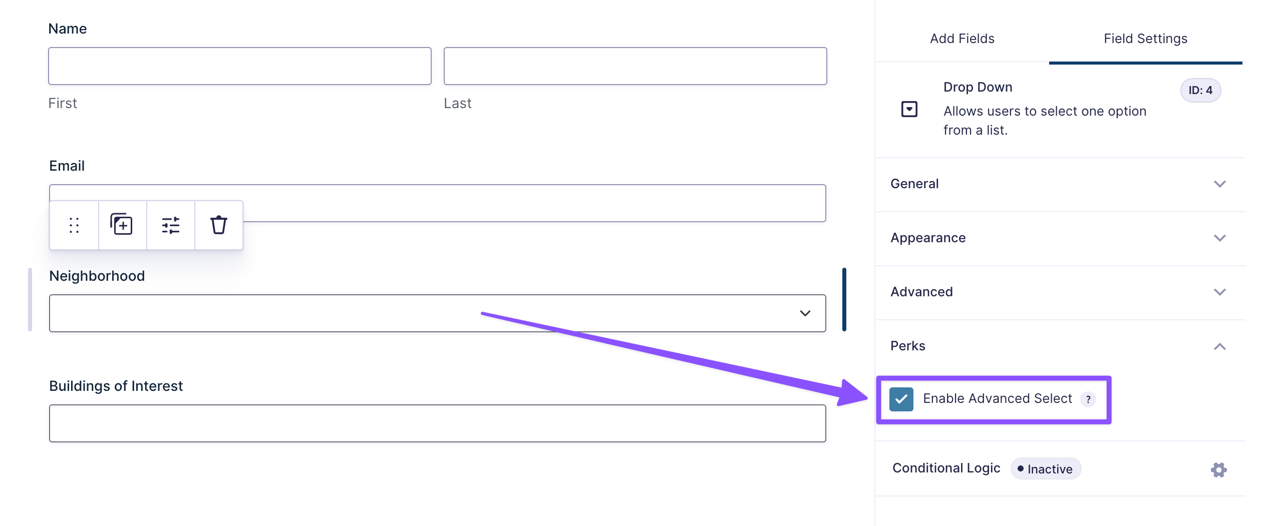
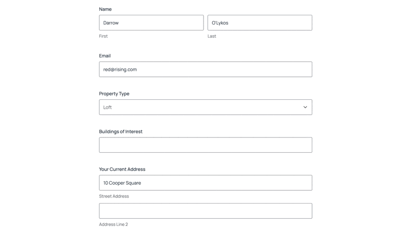
Advanced Select works on three field types: Drop Down, Multi Select, and Address fields.
First, open your Spellbook, and activate GP Advanced Select.
Then in your form:
- Select or add Drop Down, Multi Select, or Address field/s.
- Open the field settings and look for the Perks tab.
- Turn on Enable Advanced Select.
That’s it! Preview your form and give it a test drive.
How Advanced Select Works
That single toggle just unlocked a range of upgrades. Here’s what you get.
Built-in Search Bar
Instead of scrolling through hundreds of choices, users click the field and can now start typing. The choices filter in real-time as they type.
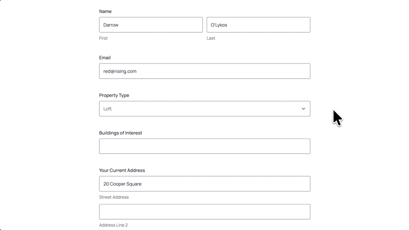
You can even populate dropdowns with hundreds (or even thousands) of options without hiccups.
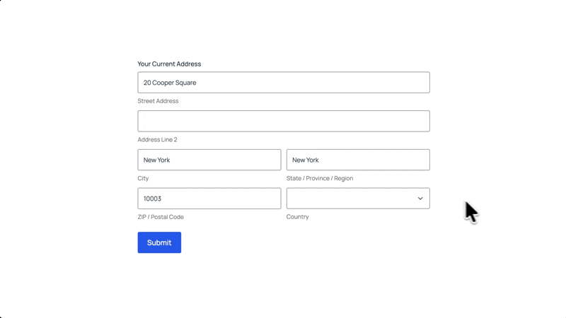
Address Field Support
The search bar works on Country dropdowns in Address fields. If you’re using US or Canadian address types, the State selector becomes searchable too.
Pro-tip
Looking to add this same searchable magic to Date and Time fields? We’ve got a helpful snippet ready for you!
Accessibility Wins
Beyond the improved UX, you’ve just made your selection fields accessible to people who rely on keyboards and screen readers. ♿️
Here’s how it works.
Improved Keyboard Navigation
Standard selection fields support keyboard navigation, but Advanced Select makes it more efficient by filtering choices by typing, then navigating only through relevant results.
Here’s how:
- Tab to focus the field and open the dropdown list.
- Up/Down arrow keys to navigate through the options.
- Enter to select an item.
For managing multiple items (Multi Select fields):
- CMD/CTRL + Click to select multiple items one by one.
- Hold Shift + left/right arrow keys to navigate between selected items.
- Backspace or Delete to remove selected items.
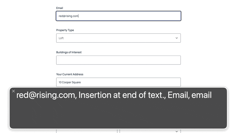
Screen Reader Support
Advanced Select is fully compatible with screen readers. Every action, searching, selecting, and removing choices, is announced. Users always know exactly where they are and what’s happening
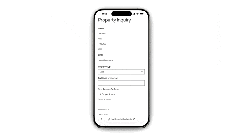
Mobile Ready
Advanced Select fields adapt perfectly for touchscreens. Tap the field and the keyboard appears with the search bar ready. Type a few letters and filtered options appear instantly.
One Click, Big Magic
Next time you’re adding a field with hundreds or thousands of choices, you’ll know exactly what to do. 😉