How to Build Horizontal Forms with Gravity Forms
Want to display your form’s fields horizontally, instead of vertically? Learn how in this quick step by step guide.

May 19, 2022: Updated to support GF 2.5's layout editor, GF 2.6's inline submit button and using multi-input fields (like the Name field).
May 19, 2022: Updated to support GF 2.5's layout editor, GF 2.6's inline submit button and using multi-input fields (like the Name field).
By default, Gravity Forms outputs it’s forms in a vertical (or column) format. This just means that the form fields are stacked on top of one another all the way down the form. This is ideal for most forms but there are some cases where you may want to display your form with a horizontal layout instead. This means the form fields are displayed side by side, in a row, also allowing for an inline submit button.
Gravity Forms can actually get you a decent way towards this goal using the powerful Gravity Forms CSS Class and the drag and drop editor. This method of creating horizontal forms does have some limitations. Here’s an example using the helper styles we provide later in this tutorial.
How to create Gravity Forms with a Horizontal Layout
Step 1 – Align Fields Using Drag and Drop Editor
Go to whichever form you’d like to layout horizontally. Using the the Drag and Drop editor, align the fields in your form horizontally by dragging the fields into the Column Drop Zones.
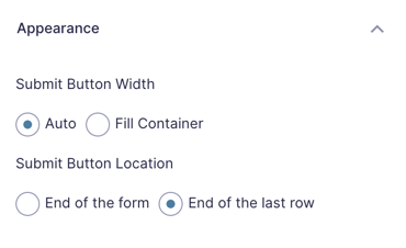
To place the Submit button at the end of the form, first select it, then navigate to the Appearance tab. Set the Submit Button Location to End of the last row.
At this point your Gravity Form is now a horizontal form!
There are two additional steps we can take to make this even more streamlined.
Step 2 – Hide the Field Label and Sub Labels
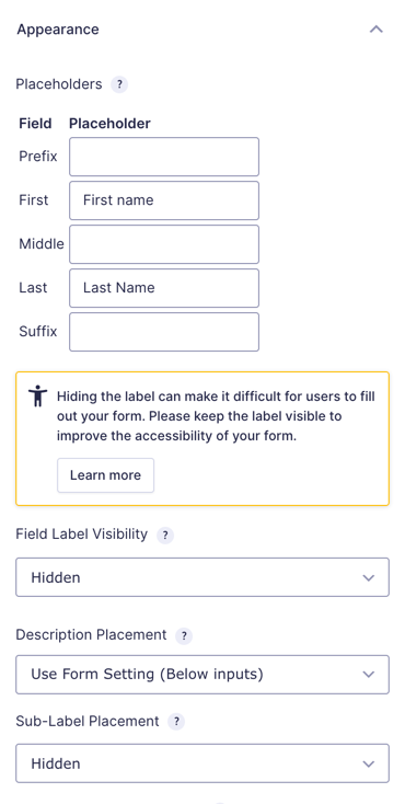
In many cases when implementing a horizontal form, you are putting it in location without a ton of room. We can hide the labels and use placeholders to save a little space. Visit the Appearance tab on each field and set visibility to Hidden in the Field Label Visibility and Sub-Label Placement drop down fields.
After applying this configuration, your form should now look something like this:
Step 3 – Add Helper Styles
We’re inching closer to something good here… but you might notice that some of the fields aren’t properly aligned and the submit button is larger than the inputs. Here are some simple helper styles that can act as a starting point to get your horizontal form styled more consistently.
This code can be copied and pasted into your theme’s style.css stylesheet file. Keep in mind, theme styles are not loaded in preview so you might want to check out Gravity Forms Live Preview for an easy way to preview your forms directly in your WordPress theme.
.gw-horizontal-form_wrapper .ginput_container input,
.gw-horizontal-form_wrapper .ginput_container select,
.gw-horizontal-form_wrapper #field_submit input.button {
	height: 2.4rem;
}

.gw-horizontal-form_wrapper #field_submit input.button {
	padding: 0 1.4rem;
}

.gw-horizontal-form_wrapper .gform_fields {
	grid-column-gap: 1vw !important;
}

.gw-horizontal-form_wrapper .ginput_complex span:not(:first-child) {
	padding-left: 1vw !important;
}
Step 4 – Add gw-horizontal-form to the Form’s CSS Class Name Setting
Now we need to apply those helper styles to our form. We’ll do this by setting the helper class on our form settings.
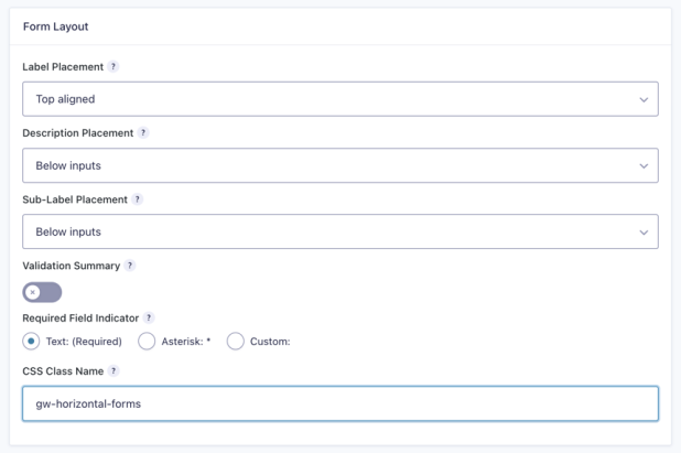
Visit the Form Settings for the form you want to convert and add the gw-horizontal-form class to the CSS Class Name setting.
After applying the helper class to your form, the final result will look something like this:
Limitations
- This method works best for simple forms with only a few fields.
- This method isn’t a “final” solution but it should get you exactly 93% of the way there.
- This method requires some additional customization to handle responsive styling e.g. for column layouts.
The pros are that it’s available with the Gravity Forms WordPress plugin out of the box and doesn’t require too much effort to get everything looking just right without using add-ons.
What questions do you still have?
Do you still have any questions about how to build horizontal forms with the Gravity Forms plugin in WordPress? We’d love to know what they are.
Comments
Comments are closed.


I’m looking at the current Gravity Forms documentation on gf_simple_horizontal and see this: “This class is deprecated by the submit button being built directly into the Form Editor in Gravity Forms 2.6.” I was only able to get good results by setting a fixed width on the email field, otherwise it was short.
Do you have any updated thoughts? Thanks!
Hi Jeffrey,
It seems the Submit button on GF 2.6 it’s available in the Form Editor and lets you set the width of the button in the Appearance tab. I would suggest reaching out to Gravity Forms support about this question.
Cheers.
Looks like this page: https://docs.gravityforms.com/adding-an-inline-submit-button-in-gravity-forms-2-5/ replaces the instructions on this page.
Even better: GF 2.6 does all of this in the form editor.
Thanks for the heads up Jeff, this looks slick!
Hi –
Any thoughts on how to make validation errors (like required field needs to be entered) not mess up the formatting of horizontal forms?
Thanks!
Hi Chris,
This is possible with custom CSS but will differ per theme and form. With Gravity Form 2.5 you will be able to setup the fields as blocks which will make it even easier.
Please some one to help me ? Sub-Label Placement not appear…How could I inlude it ?
Hi Aimé,
If you have a Gravity Perks license, drop us a line in Support and we’ll be happy to dig into this for you.
Applied one of the codes mentioned above and now at least the field and button are aligned and centered.
(Green newsletter signup form at) https://www.alettahelena.com
Now, I would like to have fields and button using the entire available space.
Any suggestion would be honestly appreciated.
Thanks in advance!
Hello Rudd, Thank you for writing in. I do see that your page has gf_simple_horizontal set for the form but I do not see gf_inline set for each inline item. Also, it looks like you may want to edit your CSS files to center the form as a whole. Here is a tutorial from Gravity Forms on how to do that.
Hi, I’m getting some strange behaviour with this one. I apply the css classes as described. It then “hides” my email field label and reduces the size of the email field box.
any thoughts on why that would be and how to rectify?
Thanks, Stuart
It’s not working for me either, maybe GF have changed something on the CSS side that is causing issues with this?
Label placement must be Top aligned in form settings/form layout (step 1).
Hey Jason, Excellent question. This seems to be a default interaction with gf_simple_horizontal. This only works with the “top label” form layout option. When added to “CSS Class Name” in your form settings will create a very simple horizontal form layout (think simple email address field and inline form button). The field label is hidden so using the placeholder option for the field is recommended. Please note that this works best on very simple, single-input field types. Also, it works best if you set the input size to “large” in the field settings. Let us know if you have any other questions.😀
Is it possible to do this for mobile? Obviously wouldn’t make sense with a lot of fields, but we have 1 field and a “send” button.
I would expect this to work in mobile now. Do you have an example of what you’ve implemented with this so far?
http://ampauto.kinsta.cloud/inventory/delray-buick-gmc-delray-beach-fl/used-2014-chevrolet-traverse-1gnkrgkd3ej187931/
In the section, “Send Seller a Message”
It doesn’t seem to work on firefox for me – everything is left justified and smaller: https://www.dropbox.com/s/uwgqem17s7hznje/Screenshot%202019-11-15%2023.10.28.png?dl=0 Looks like this on Safari and Chrome: https://www.dropbox.com/s/ctxdf2kcetls8yz/Screenshot%202019-11-15%2023.11.14.png?dl=0
Any advice for mozilla? thank you!
Do you have a URL where I could view this form?
Hi Annette, thanks for reaching out to us via Gravity Perks support. I wanted to follow up here for the benefit of other folks having this issue.
The difference in styling between Chrome and Firefox was due to some existing CSS in the site’s theme. If you run into this, you can simply add this to your theme’s style sheet to force the form to 100% width in both browsers:
http://snippi.com/s/13yiw81
Is there a way to just make the submit button inline with the very last field?
Like I want my whole form to be three lines. The first two lines would each have two questions, the last line would have one question then the Submit button.
This is possible with custom CSS but will differ per theme and form.
Thanks for this tutorial.
I’m trying to add the form to a newsletter template that came with my theme. When I added the “gf_simple_horizontal” and “gf_inline” appropriately, the email field became smaller.
Is there a way to increase the length of the email field (it’s in large already)?
Hi Chris, the form-level classes override some of the styles on the form elements. You would need to use CSS to set a desired width on your Email field.
How can I accomplish the same look for a multi-page form so that the next button would be in place of the submit button with same inline style?
We don’t have a solution for this one.
Thank you. Works perfectly.
What would be the CSS to centralize this?
Come again?
Naturally the form appears to be aligned to the left. Is there a container or ready class to centralise this?
I’m looking to do this too.
I think I’m still misunderstanding? The “gf_simple_horizontal_wrapper” is the class to use to centralize this behavior.
I’m having the same issue, I have have the gf_simple_horizontal set with gf_inline on all 3 input fields and the form is left justified left rather than center.
https://termitetiger.com/test/
I’m using Divi theme.
Any clue why it is left rather than center justified?
Hi Brian, this is the default behavior of the gf_simple_horizontal ready class. You would need additional custom CSS to center it.
I centered it by adding the following code:
http://snippi.com/s/zm5l5o5
Thanks for sharing, JaxRachel!
Fantastic Tip. Works perfectly. TY!
how do you change the size of the fields for horizontal forms? I want only an email field with a button. The field size never changes. I tried selecting “small”, “medium” and “large”
Looks like Gravity Forms doesn’t support this in this context. You would need to use CSS to set the sizes manually.
Do you have anything in your kit to add a modal box helper at the end of a field title for the person completing the form, much in the same way that the admin panel has them with the ‘?’ and when you hover additional explanation comes up. As some fields only display conditionally it needs to be in with the form title. I don’t want to swamp the form with extensive text in the description field that is offered. Thanks
Hi Ed, sounds like you’re looking for tooltips? This is a great plugin for that: https://github.com/norcross/gravity-tooltips
[…] Source: How to Build Horizontal Forms with Gravity Forms – Gravity Wiz […]
[…] Jungs und Mädels von Gravitywiz empfehlen zusätzlich auch noch dem gesamten Formular die […]
Do you know if there’s a way to make only part of form horizontal?
Two or three fields can be placed on the same line with the “thirds” or “halves” style options — but not the submit button. So I have, for instance, some HTML fields I want above, and then a name, address, and submit button below that I’d like to be in a line. I can get the name and address on the same line, but I can’t seem to control the placement of the submit button.
(Also, your readers should be aware that under normal circumstances, hiding the field labels and relying on placeholder text alone is bad practice. Screen readers, etc. used for accessibility purposes won’t read the placeholder; they need the label.)
Thanks, Rachel, I thought we had a mention in here about accessibility but it was actually on this other article.
In regards to your question, I do not know of a ready solution for making only part of the form horizontal outside of the ready classes you already mentioned. You’d have to write some custom CSS to wrangle the submit button into it’s desired location.
Well, drat. I was hoping there might be an easy way. This CSS newbie is struggling with all the CSS wrangling to get a decent-looking form. .lol
Thank you!
Line 17 is missing a :
Fixed. Thanks, David!
Hi, I tried gf_simple_horizontal with just an email field. But the field does not resize–it stays at small whether I select large or medium.
Any suggestions? Thx!
Hi Makil, the gf_simple_horizontal class overrides some of GF’s other styles, including the size setting. You can manually override the width for any input by adding a custom style to your theme’s stylesheet:
input#input_1418_1 { width: 500px; }
Where “1418” is your own form ID and the “1” is your field ID. Template: input#input_FORMID_FIELDID
I would like to Create 4 column table in Gravity form can you provide me the code
Local Guardian (If Any): S.No Name Relationship Address (w/ tel. no.)
Form & output should be like Table
Sorry, Faith. We’re not able to provide bespoke code pro bono.