How to Migrate From Gravity Forms CSS Ready Classes

Learn how to replace CSS Ready Classes for common Gravity Forms styling jobs like columns, callouts, and hidden fields.
- What Are Gravity Forms CSS Ready Classes?
- What Replaces Gravity Forms CSS Ready Classes?
- When a Ready Class Needs Custom CSS
- How to Migrate Common CSS Ready Classes
- Keep Stylin’
If you’ve spent any time styling Gravity Forms, you’ve probably come across CSS Ready Classes — and you may already be using a few.
Gravity Forms started moving away from Ready Classes with version 2.5, and has deprecated more of them over time as those jobs moved to built-in settings and modern CSS.
That doesn’t mean you’re losing those layout and styling options. You can still make the same kinds of changes, just with built-in settings or a little custom CSS instead.
In this guide, I’ll show you what to use instead and how to migrate the most common Ready Class setups. Let’s dive in!
What Are Gravity Forms CSS Ready Classes?
CSS Ready Classes are predefined class names you add to a field or form to apply a layout or style without writing the CSS yourself. They’ve been handy for everything from columns and callouts to hidden fields and other styling tweaks. As Gravity Forms phases them out, those are the same jobs you’ll want to move to the current settings or CSS.
What Replaces Gravity Forms CSS Ready Classes?
There isn’t one single replacement for every Ready Class. Some jobs now have a built-in Gravity Forms setting, while others still need a little custom CSS.
The easiest rule is simple: use the built-in option when there is one, then reach for CSS when there isn’t.
Before we get into the step-by-step migrations, here’s a quick map of what replaces what.
| Ready Class | Status | Use Instead |
|---|---|---|
gf_left_half, gf_right_half, thirds, quarters | Deprecated | Drag-and-drop columns in the form editor |
gf_list_2col– gf_list_5col• _vertical variants | Planned for deprecation in Gravity Forms 4.0 | Choice Layout → Columns |
gf_alert_* | Deprecated | Custom CSS |
gf_scroll_text | Deprecated | Terms/Consent when appropriate, or custom CSS |
gf_invisible | Deprecated | Visibility setting where appropriate, or custom CSS |
gf_hide_ampm | Deprecated | 24-hour format when appropriate, or custom CSS to keep 12-hour input |
gf_hide_charleft | Deprecated | Custom CSS |
Using a Ready Class that isn’t covered here?
Gravity Forms’ Ready Classes migration guide has the full list and recommended replacement for each one.
When a Ready Class Needs Custom CSS
Ready Classes worked by applying predefined CSS when you added a specific class name to a field or form. When there isn’t a built-in replacement, we can recreate the same effect with a new class name and a little custom CSS.
You won’t need to write that CSS from scratch here — I’ll give you the class name and the matching snippet for each example.
We’ll add that CSS with Code Chest, a free Gravity Wiz plugin that lets you add CSS directly to a form. You can install it for free through Spellbook.
- Select the field: Open the field you want to customize › go to the Appearance tab.
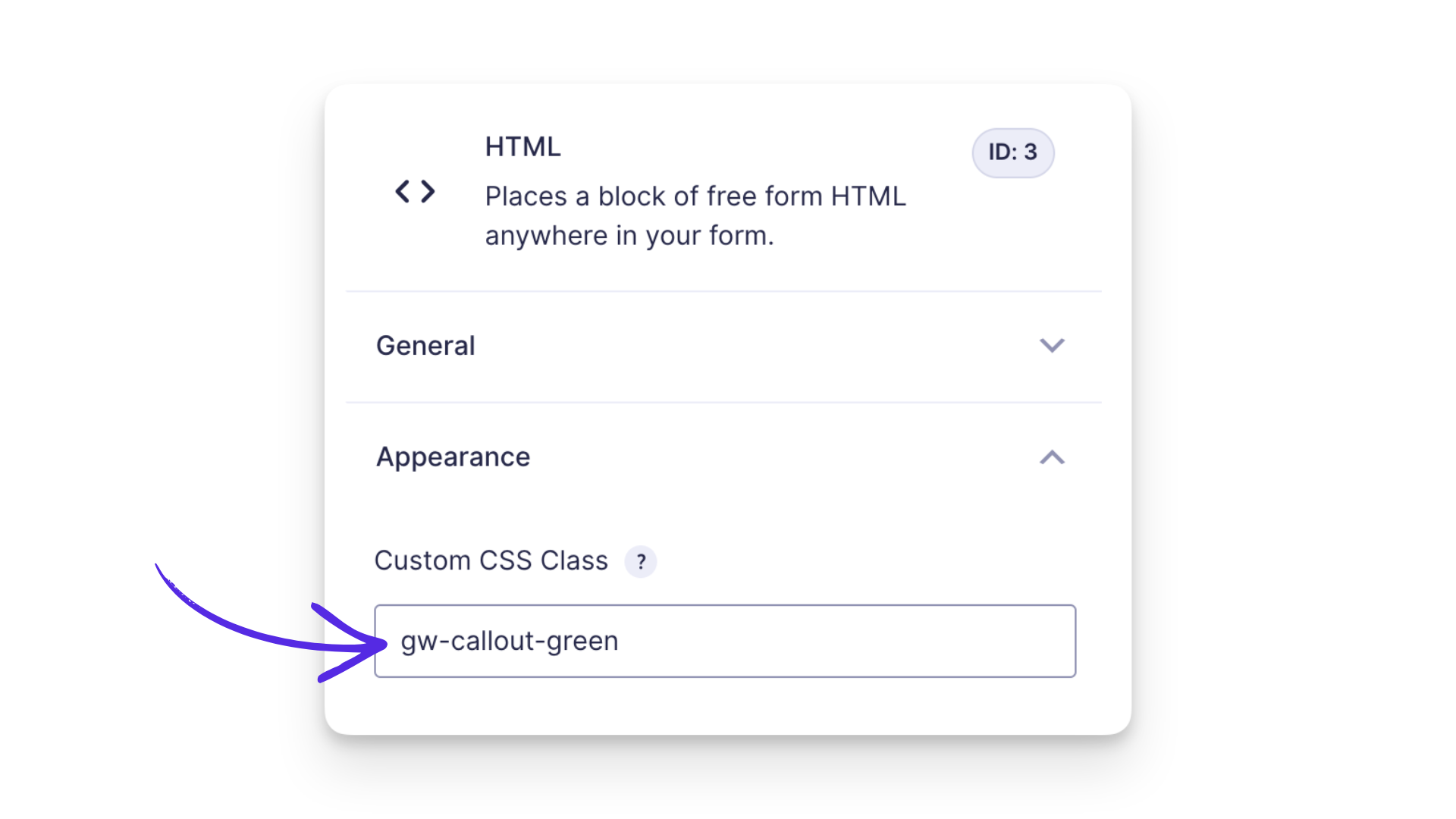
- Add the class: Find Custom CSS Class and enter the class name shown in the example.
- Add the CSS: Open Settings › Code Chest and paste the matching CSS into the CSS field.
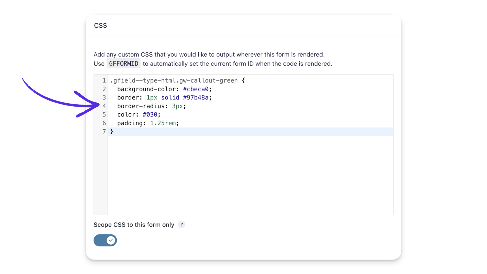
If you need to apply multiple classes to one field, just separate them with a space.
After adding the CSS, save your form and click Preview to check the result on the front end. Custom CSS changes won’t appear in the form editor itself.
Want a better way to preview your form?
Gravity Forms Dev Tools includes Preview Tools, so you can preview your form on the frontend with your theme styles applied — plus a few handy testing controls.
How to Migrate Common CSS Ready Classes
For each migration below, we’ll start with the built-in option when Gravity Forms has one, then use custom CSS where it’s still needed.
Create Multi-Column Layouts in the Form Editor
If you’re using Ready Classes to place fields side by side, you can now create those layouts directly in the form editor.
Drag a field to the left or right of another field to create columns, then use the column handles to resize them. Gravity Forms supports up to four columns this way.
This replaces older column Ready Classes like gf_left_half, gf_right_half, gf_left_third, and the quarter-width classes.
Don’t see the column controls?
Your form may still be using Legacy Markup. You’ll need to disable it under Form Settings before you can use drag-and-drop columns. If it’s an older form, test the change first to make sure the rest of your layout still looks right.
Split Checkbox and Radio Choices Into Columns
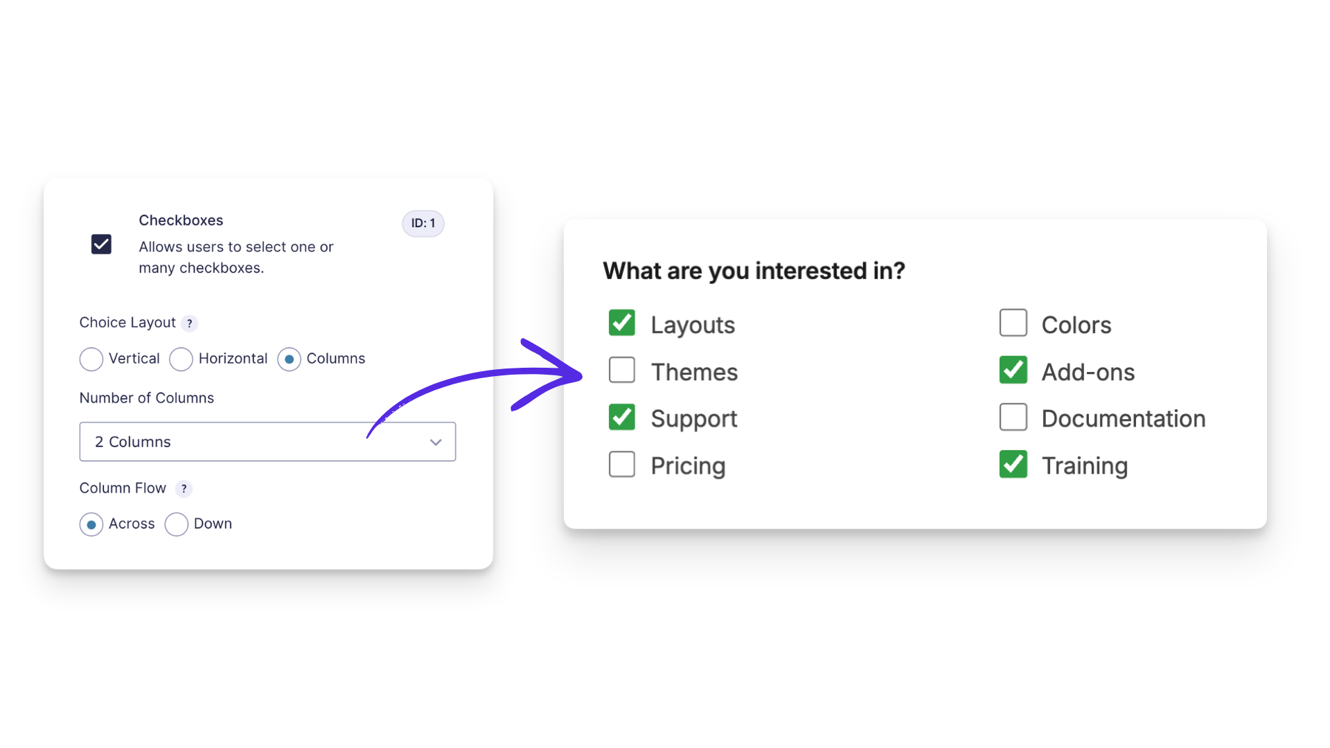
You can split Checkbox or Radio Button choices into columns directly from the field settings.
Open the field › General tab › choose Columns under Choice Layout. From there, you can choose how many columns to use and how the choices flow.
This replaces gf_list_2col through gf_list_5col, including their _vertical variants.
Style an HTML Field as a Colored Callout
There isn’t a built-in replacement for the old alert Ready Classes, so custom CSS is the cleanest option here.
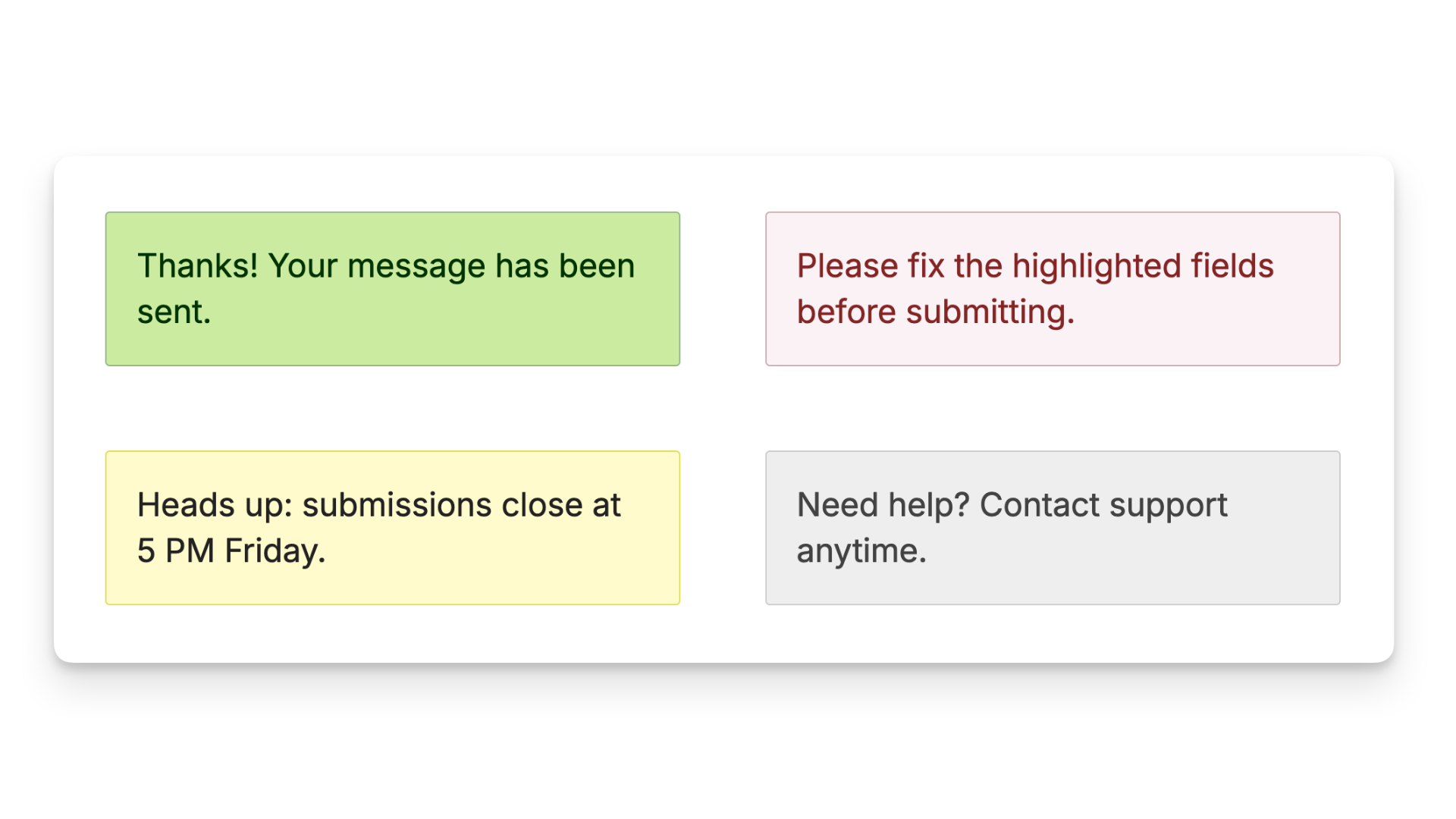
These examples recreate the old gf_alert_green, gf_alert_red, gf_alert_yellow, and gf_alert_gray styles with new custom class names.
Show CSS for colored HTML callouts
You only need the CSS for the color you want.
- Copy that CSS into Code Chest › CSS.
- Open your HTML field › Appearance › Custom CSS Class › add the matching class name shown below.
Green — Class name: gw-callout-green
.gfield.gw-callout-green {
  border-radius: 3px;
  margin-block: 1.25rem !important;
  margin-inline: 0 !important;
  padding: 1.25rem !important;
  background-color: #cbeca0;
  border: 1px solid #97b48a;
  color: #030;
  text-shadow: #dfb 1px 1px;
}
Red — Class name: gw-callout-red
.gfield.gw-callout-red {
  border-radius: 3px;
  margin-block: 1.25rem !important;
  margin-inline: 0 !important;
  padding: 1.25rem !important;
  background-color: #faf2f5;
  border: 1px solid #cfadb3;
  color: #832525;
  text-shadow: #fff 1px 1px;
}
Yellow — Class name: gw-callout-yellow
.gfield.gw-callout-yellow {
  border-radius: 3px;
  margin-block: 1.25rem !important;
  margin-inline: 0 !important;
  padding: 1.25rem !important;
  background-color: #fffbcc;
  border: 1px solid #e6db55;
  color: #222;
  text-shadow: #fcfaea 1px 1px;
}
Gray — Class name: gw-callout-gray
.gfield.gw-callout-gray {
  border-radius: 3px;
  margin-block: 1.25rem !important;
  margin-inline: 0 !important;
  padding: 1.25rem !important;
  background-color: #eee;
  border: 1px solid #ccc;
  color: #424242;
  text-shadow: #fff 1px 1px;
}
Still using gf_alert_blue?
That Ready Class is deprecated too. If you want a blue version, use one of these examples as a starting point and swap in your own colors.
Save the form and preview it to make sure the callout looks the way you want.
Want a different color, spacing, or border? Paste the CSS into your favorite AI assistant and describe what you’d like to change.
Make Long Content Scrollable
If you’re replacing gf_scroll_text, first think about what the scrolling box is actually for. 🤔
Using it for terms or an agreement?
You may not need custom CSS at all. GP Terms of Service gives you a dedicated Terms of Service field and can require users to scroll before agreeing. For a simpler agreement, Gravity Forms’ built-in Consent field is another good option.
If you just need a long block of content inside a scrolling box, you can recreate that layout with custom CSS.
Show CSS for scrollable content
Add this CSS in Code Chest › CSS:
.gsection.gw-scroll-text {
  background-color: #fff;
  block-size: 15rem;
  border: 1px solid #ccc;
  overflow-x: hidden;
  overflow-y: scroll;
  padding: 2rem;
}

.gsection.gw-scroll-text .gsection_title {
  margin-block-start: 0;
}
Then open the Section Break field › Appearance › Custom CSS Class › add: gw-scroll-text
Save the form and preview it to make sure the content scrolls the way you want.
Hide a Field
If the field has a Visibility setting, start there. Open the field › Advanced › Visibility › choose Hidden. The field stays hidden from visitors but can still work behind the scenes.
Product fields are a little different. If a Hidden Product field works for your setup, that’s the simplest option. Drop Down and Radio Button Product fields also have a Visibility setting.
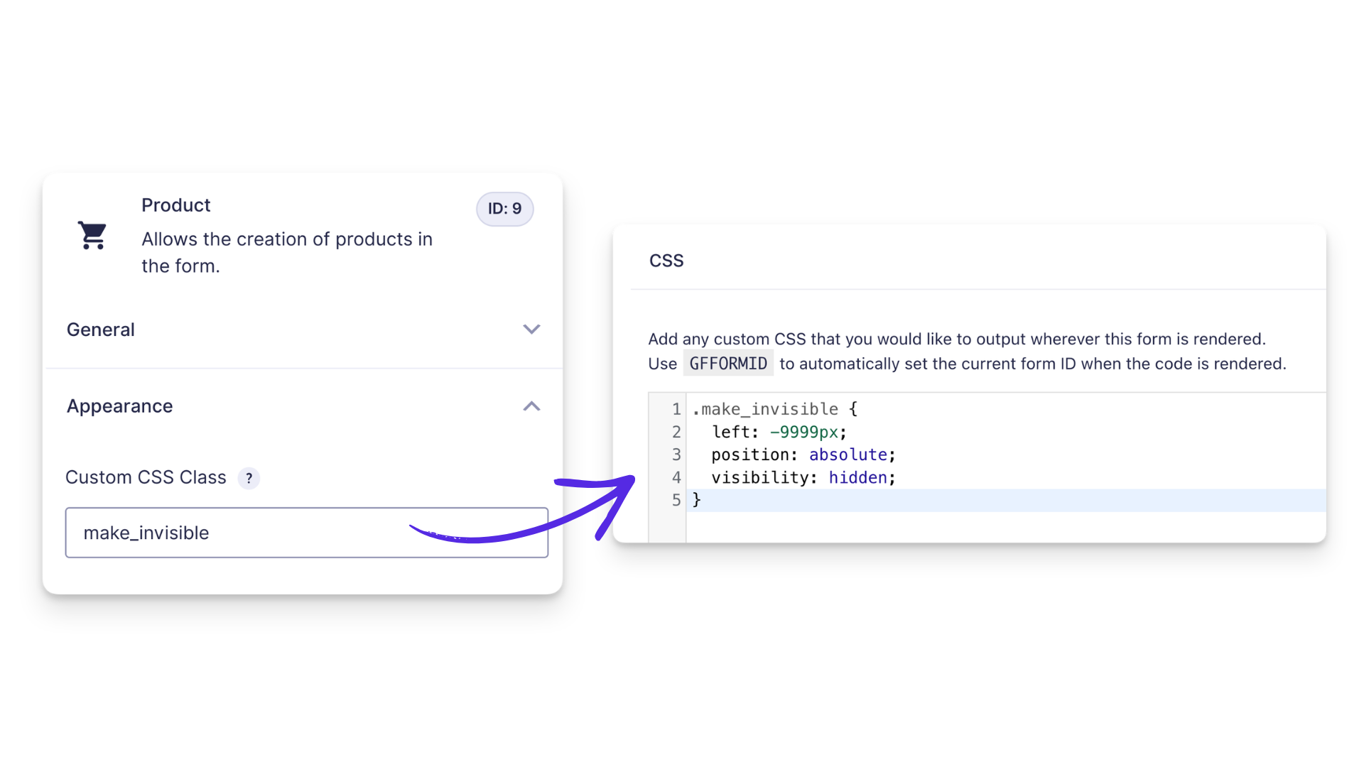
If you need another Product field type to stay active while hidden, custom CSS is still useful. We use the same make_invisible class from our guide to hiding Gravity Forms Product fields:
Show CSS for hiding a field
Add this CSS in Code Chest › CSS:
.make_invisible {
  left: -9999px;
  position: absolute;
  visibility: hidden;
}
Then open the field › Appearance › Custom CSS Class › add: make_invisible
Save the form and preview it to make sure the field is hidden.
Still using gf_invisible?
That Ready Class is deprecated. make_invisible is a custom Gravity Wiz class — not a new Gravity Forms Ready Class — and the CSS recreates the same hiding behavior without adding the deprecated class back to the field.
And don’t swap in gf_hidden for Product fields. gf_hidden isn’t deprecated, but it uses display: none, which can stop Product fields from being included in the form total.
Remove the AM/PM Selector
If you don’t need AM/PM at all, the cleanest option is to change the Time field to 24 hour under General › Time Format.
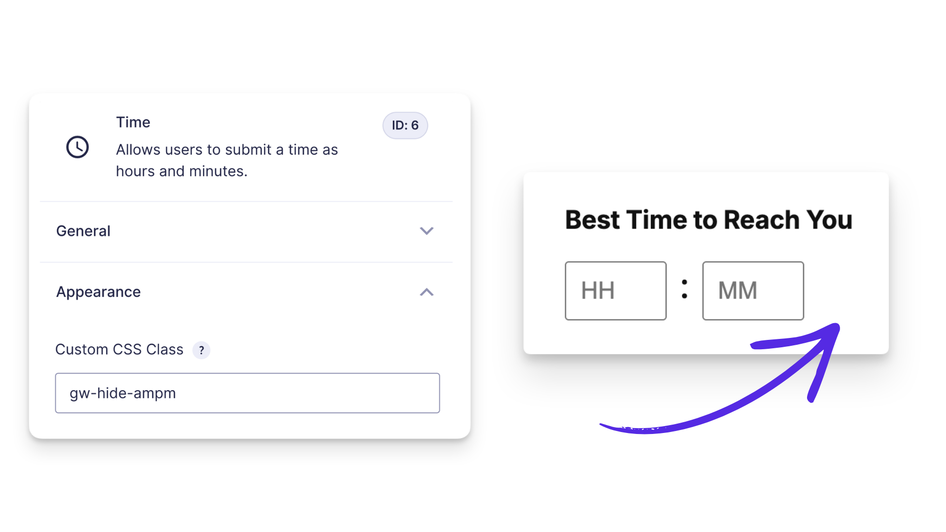
If you specifically need to recreate the old gf_hide_ampm behavior and keep the field in 12-hour format, use custom CSS instead:
Show CSS for hiding the AM/PM selector
Add this CSS in Code Chest › CSS:
.gw-hide-ampm .gfield_time_ampm {
  display: none !important;
}
Then open the Time field › Appearance › Custom CSS Class › add: gw-hide-ampm
Save the form and preview it to make sure the AM/PM selector is hidden.
Hide the Character Counter
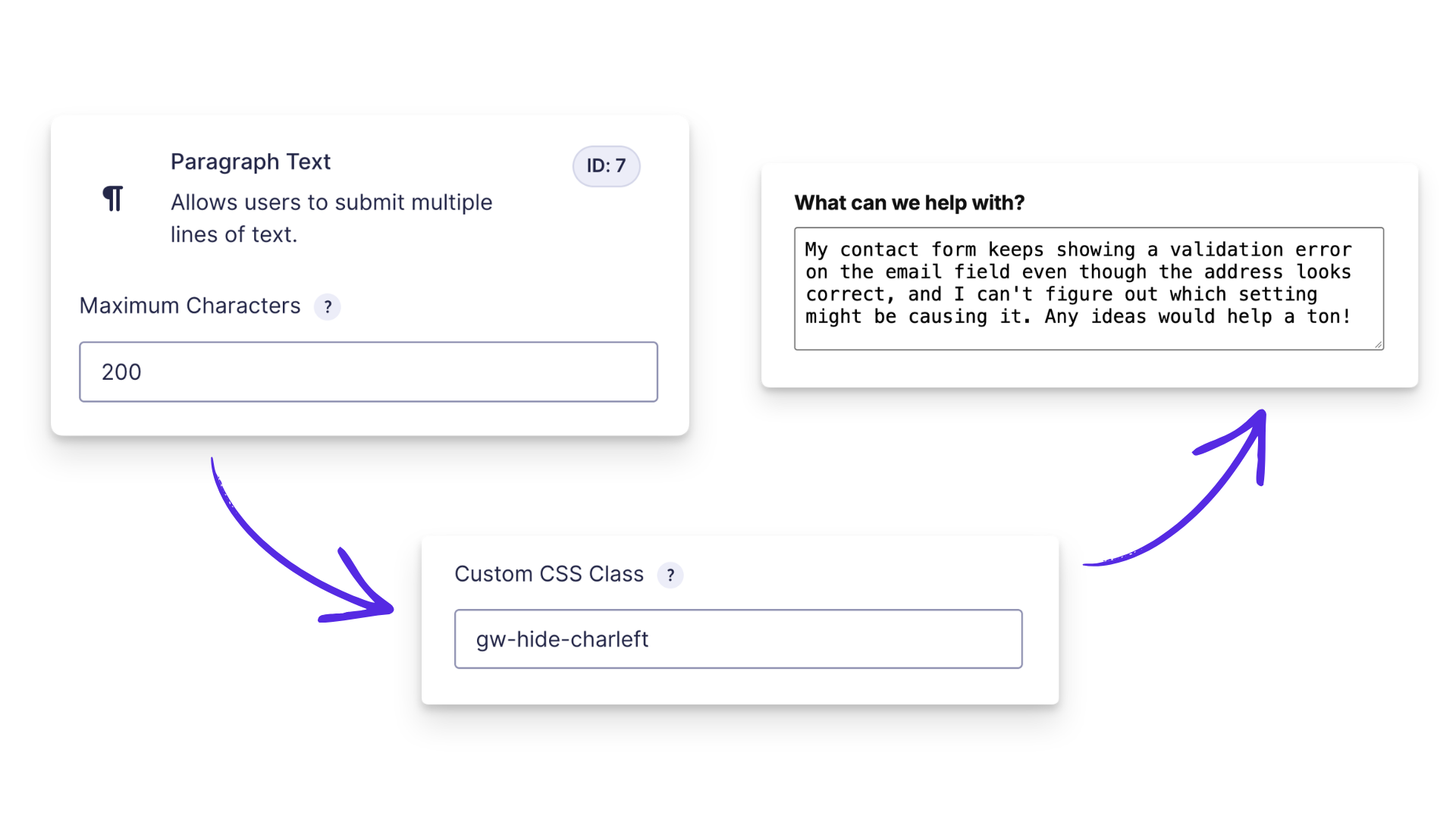
If you want to keep a character limit but hide the counter, you can replace gf_hide_charleft with a small custom class.
Show CSS for hiding the character counter
Add this CSS in Code Chest › CSS:
.gw-hide-charleft .charleft,
.gw-hide-charleft .ginput_counter {
  display: none !important;
}
Then open the field › Appearance › Custom CSS Class › add: gw-hide-charleft
Save the form and preview it to make sure the counter is hidden.
Want to keep customizing?
Once you’ve replaced your Ready Classes, our complete guide to styling Gravity Forms covers Form Themes, custom CSS, and more ways to customize your form.
Keep Stylin’
Ready Classes are being phased out, but the things you use them for aren’t. The rule of thumb is simple: use the built-in setting first, then reach for custom CSS when Gravity Forms doesn’t have one.
If you’re working through an older form, you don’t have to rebuild everything at once. Start with any deprecated Ready Classes you find, then work through the rest as you update the form.
Which Ready Class are you ready to retire first? 🪄