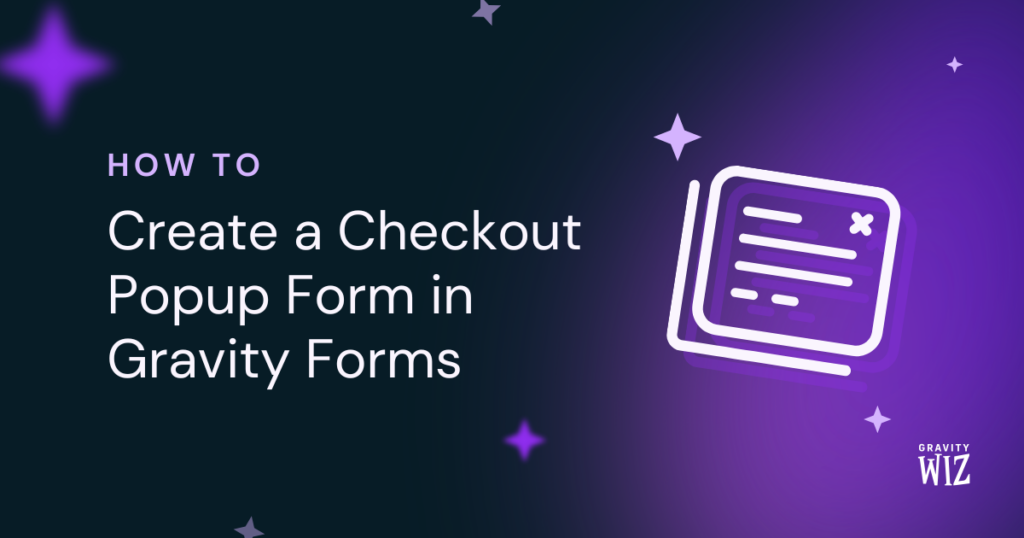
How to Create a Checkout Popup Form in Gravity Forms
Learn how GP Popups lets you open a Gravity Forms checkout form in a popup with the click of a button.
- How do you create a checkout popup form in Gravity Forms?
- What You’ll Build
- What You’ll Need
- How to Set Up a Checkout Popup in Gravity Forms
- Edge Cases & Limitations
- Taking It Further
- Frequently Asked Questions
Want to open a checkout form, an event signup, or a newsletter form in a popup when a visitor clicks a button, without redirecting them to another page?
Gravity Forms Popups (aka GP Popups) can do just that. It lets you display any Gravity Form in a popup, triggered by a button click, a scroll, a timer, and more.
In this guide, we’ll build a simple checkout form as an example, set it up as a popup using GP Popups, and go through how to connect it to a button in Block Editor, Classic Editor, and Elementor.
This article requires the Gravity Forms Popups perk.
Buy Gravity Perks to get this perk plus 48 other premium Gravity Forms plugins!
How do you create a checkout popup form in Gravity Forms?
Use GP Popups, part of the Gravity Perks suite, to display any Gravity Form in a popup. It lets you control the display mode, animation, sizing, and behavior. One trigger option is Button/Click, which uses a CSS selector to identify which element on the page opens the popup.
Set the trigger to Button/Click, add a CSS selector in the popup feed, then add that same class to the button you want people to click. Once clicked, the popup opens right on the page. Just make sure the class names match exactly. If they don’t, the popup won’t fire.
What You’ll Build
By the end of this guide, you’ll have:
- A Gravity Forms checkout form displayed in a popup.
- A button anywhere on your page that opens the popup on click.
- A custom CSS class connecting the two. Set it once and it works everywhere the button appears.
What You’ll Need
- Gravity Forms (any license)
- Gravity Perks (via Spellbook)
- Includes: GP Popups
- A page editor (Block Editor, Classic Editor, or Elementor)
How GP Popups Connects a Button to a Form
GP Popups uses a CSS selector to define which element on the page opens the popup.
Any clickable element can be the trigger, like a button, a link, an image, or a product card. You get to choose what makes the most sense for the page.
The setup has two parts:
- The selector you enter in the popup feed.
- The matching class you add to your button in the page editor.
When those two match, the popup opens.
What Is a CSS Selector?
Think of it as a label that tells GP Popups which element on the page should open the popup.
For this setup, you’ll come up with a custom class name like open-checkout, which should be specific enough to target the right button, and flexible enough to reuse anywhere.
Try to avoid generic names like btn or button since your theme might already be using them.
Want to skip the CSS class?
GP Popups also supports a Hash trigger. You can open a popup by linking to a URL fragment like #checkout instead of a class name. Check out the GP Popups docs to learn more.
How to Set Up a Checkout Popup in Gravity Forms
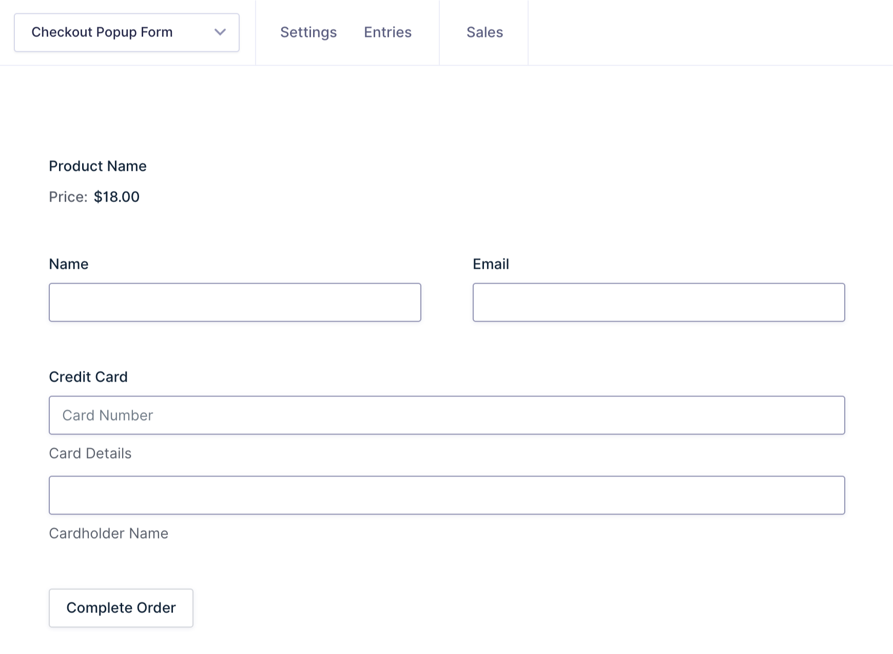
Step 1 — Build Your Checkout Form
Start by creating the form you want to show in the popup.
Since you’re building a checkout form, make sure to include the essentials: product fields, contact info, and a payment field.
Want to add tax, discounts, or a subtotal to your checkout form? See how to calculate tax or VAT with Gravity Forms.
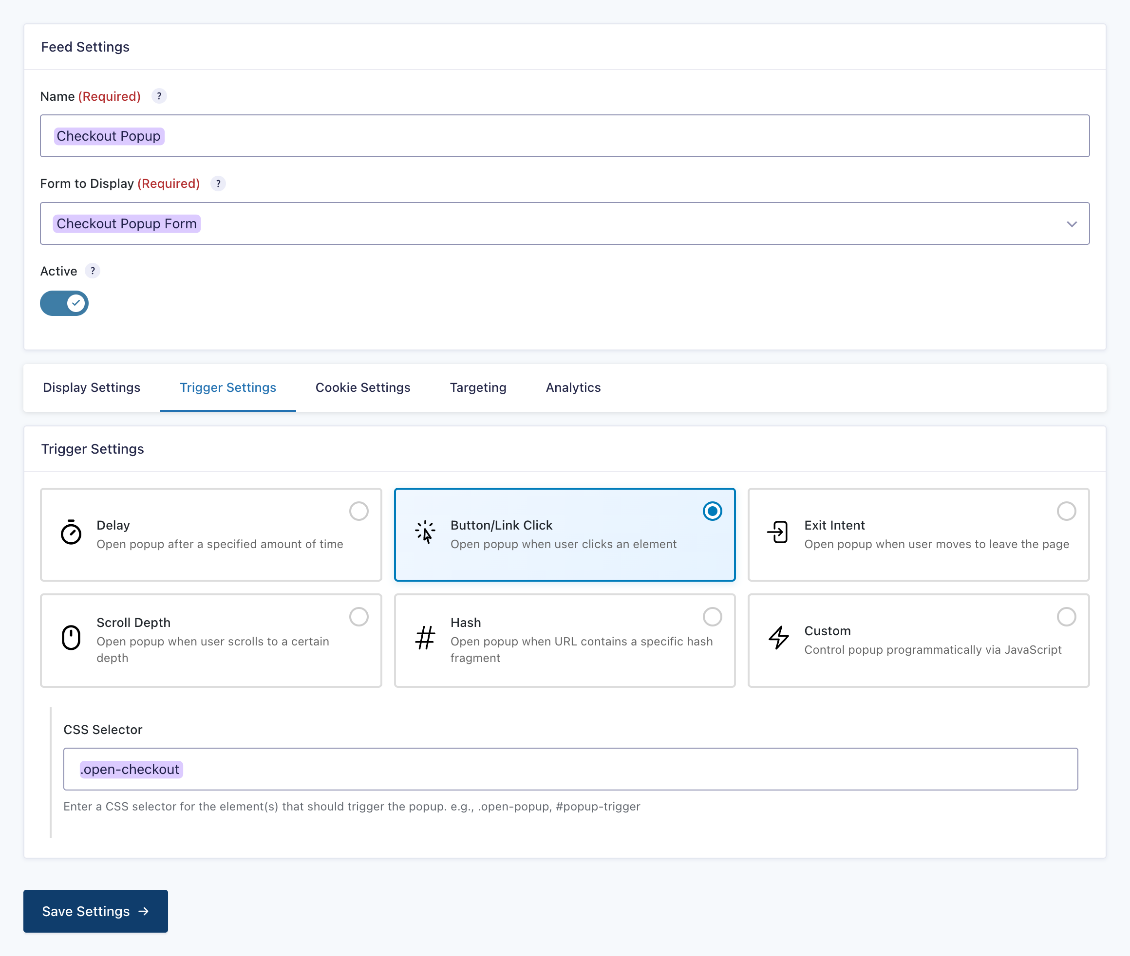
Step 2 — Create the GP Popups Feed
The popup feed controls when the popup shows up and what it looks like.
- Open your Spellbook › activate GP Popups.
- In your WordPress admin, go to Forms › Popups.
- Click Add New.
- Choose your checkout form from the dropdown.
- Set the Trigger to Button/Click.
- In CSS Selector, enter your class name
.open-checkout. - Adjust the display mode, size, and animation.
- Save the feed.
Step 3 — Add the Trigger Class to Your Button
We’ll go through how to add the trigger class to your button in three editors: Block Editor, Classic Editor, and Elementor.
Can I style my popups?
Yes! GP Popups lets you style your popup directly in the feed settings. Adjust colors, sizing, borders, animations, and more.
The popups in the examples below have custom styles applied so you can see what’s possible. If you want to style your own, the GP Popups styling guide has everything you need.
Adding the Trigger to Your Button with the Block Editor
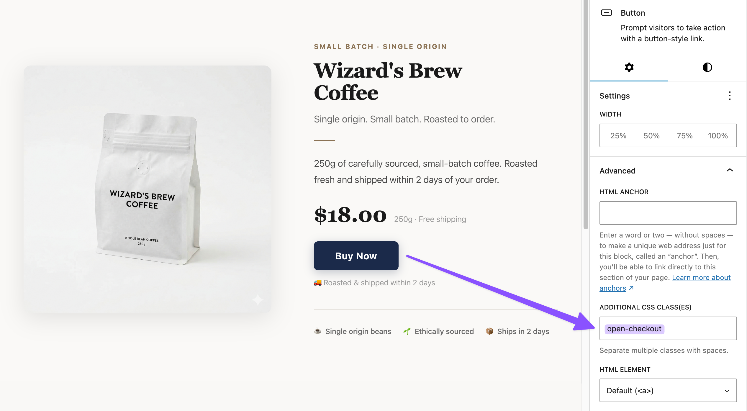
- Add a Button block to your page.
- In the block settings panel on the right sidebar, open the Advanced tab.
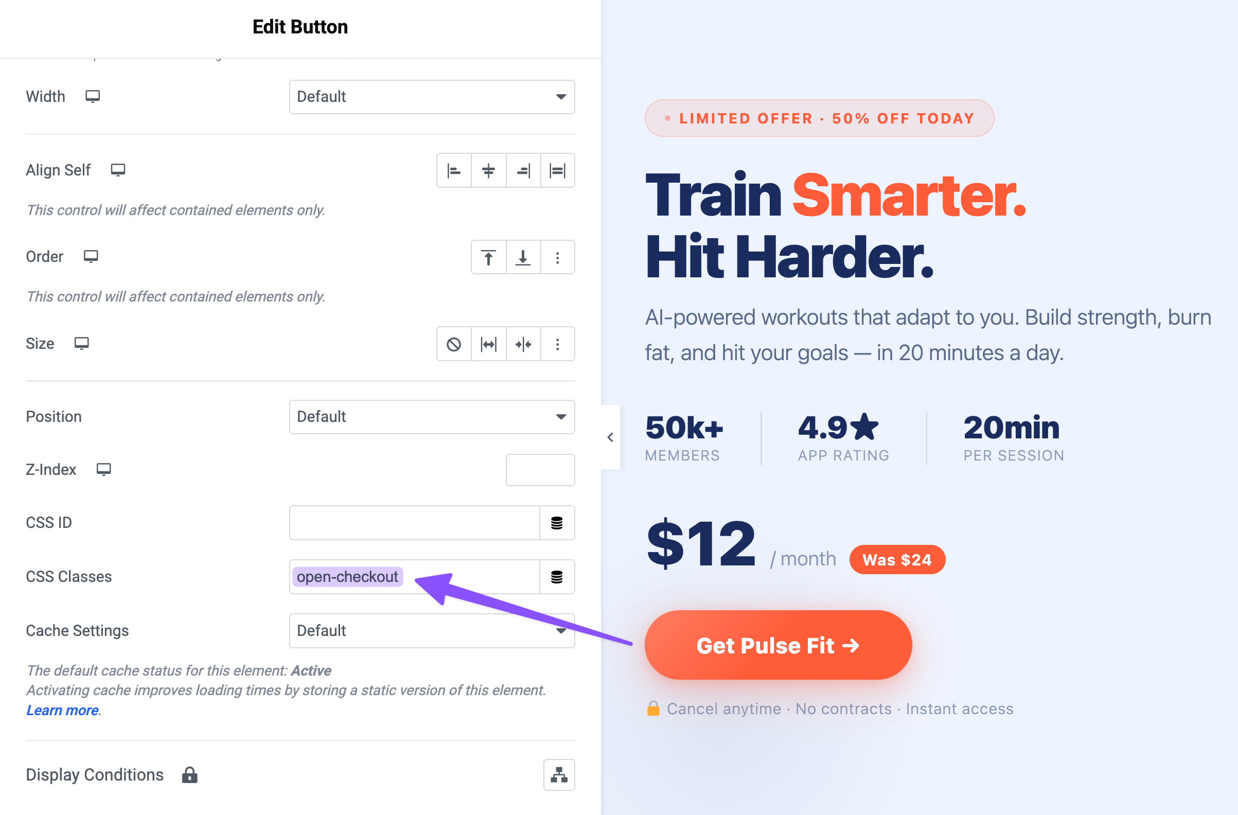
- In the Additional CSS class field, enter
open-checkout(don’t add dot prefix —.open-checkout). - Click Update to save the page.
Adding the Trigger to Your Button with the Classic Editor
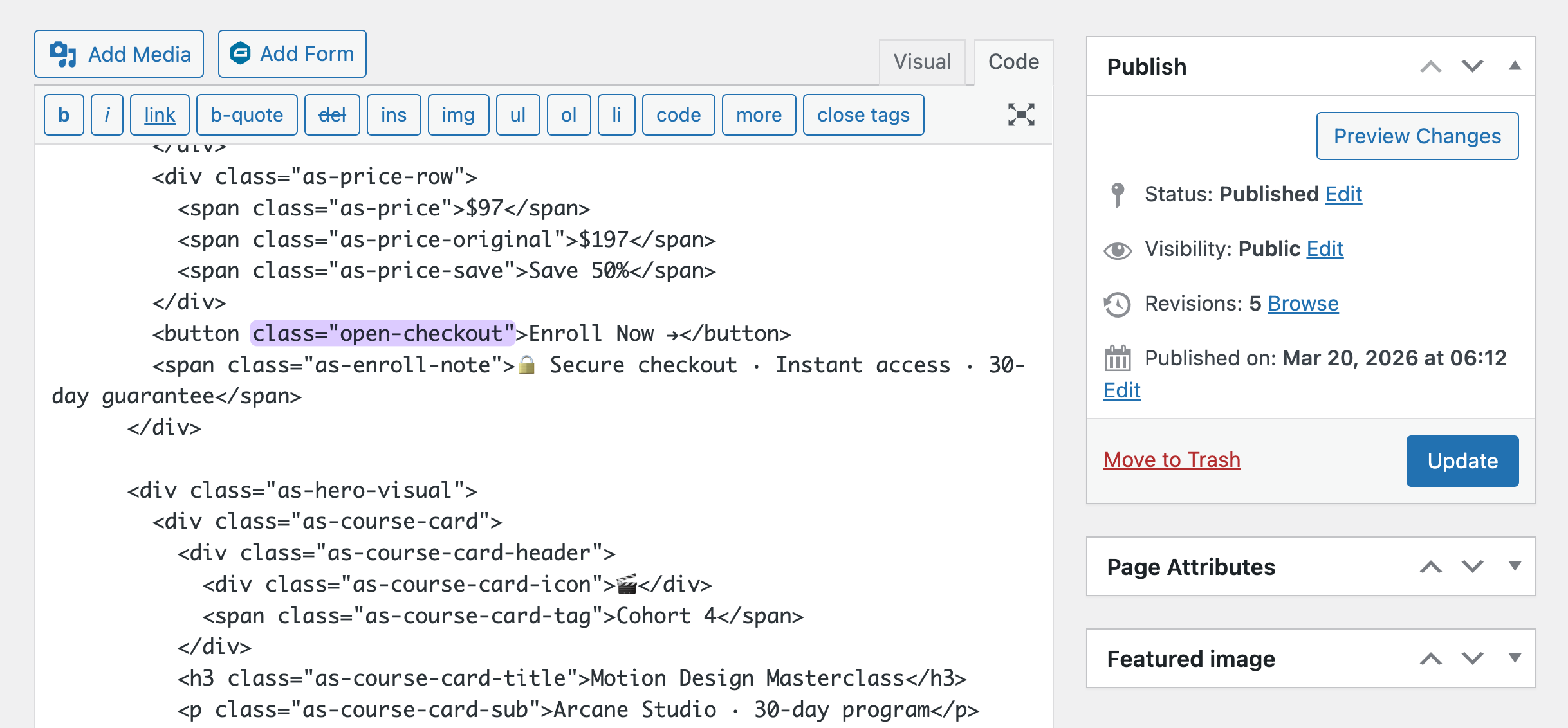
- Open your page or post, then switch to the Code tab.
- Locate your button element, typically an
<a>or<button>tag. If you don’t have one yet, add it directly in the HTML. - Add
class="open-checkout"to your button element.- Already have a class on it? Just add
open-checkoutafter it with a space. For example:class="existing-class open-checkout".
- Already have a class on it? Just add
- Save the page.
Adding the Trigger to Your Button with Elementor
- In the Elementor editor, select your Button widget.
- Open the Advanced tab in the left settings panel.
- In CSS Classes, enter
open-checkout. - Click Update.
Edge Cases & Limitations
Here are a few quick things to keep in mind as you build.
- Multiple buttons, one popup. You can reuse the same class on as many buttons as you want. Any element that matches that class will open the same popup, like a checkout button in a header, a banner, and a product card.
- Multiple popups on one page. Each popup feed uses its own CSS selector. If you have more than one popup on the same page, give each one a different class so the triggers do not overlap.
- Class naming collisions. Skip generic class names like
btnorbuttonsince your theme may already use them. A unique name likegpp-checkout-triggerhelps keep them clean.
Taking It Further
The button trigger is just the starting point. Here are a few ways to extend the setup.
- Trigger from any element, not just buttons. The CSS class approach works on more than buttons. You can add the same class to a text link, a product image, or anything clickable to open the popup.
- Combine with GP Populate Anything. GP Populate Anything can pass values from the parent page into the popup form. For a checkout flow, that can include product details, pricing, or user information so the checkout form can pre-fill for the visitor.
- Restrict where the popup appears. GP Popups includes page targeting rules so you can control where a popup can fire. This is handy when the trigger button lives in a global header or footer since you can limit the popup to specific pages, URLs, or user conditions.
- The Button/Click trigger is just one of five ways to fire a GP Popups form. Compare all trigger types in our guide to GP Popups triggers.
Key Takeaways
- GP Popups turns any Gravity Form into a popup triggered by any element on the page.
- The Button/Click trigger uses a CSS selector, a class name you define, to connect the popup feed to the button.
- Adding the class to a button works the same way across editors: Block Editor (Advanced tab), Classic Editor (HTML tab), Elementor (Advanced tab, CSS Classes field).
- The same class can be applied to as many buttons as you want. All of them will trigger the same popup.
Related Use Cases
This same approach works for more than checkout forms. Here are a few ways to reuse it.
- Newsletter signup popup. Use the same Button/Click trigger with a simpler signup form. Or swap to a Delay or Exit Intent trigger to catch visitors at the right moment.
- Event registration popup. Add a “Register Now” button to an events listing page. When someone clicks it, the registration form opens in a popup so they can stay on the page through the entire signup flow.
- Lead capture popup. Use Button/Click with GP Popups’ Corner or Banner display mode for a less interruptive option. This works well for lead magnets or content upgrades.
If you want the full list of options, check the GP Popups documentation and the GP Popups intro post.
Frequently Asked Questions
Do I need to know CSS to do this?
No. You do not need to write any CSS. Just pick a class name and enter it in two places: the CSS Selector field in GP Popups and the class field on your button. Make sure they match exactly.
Can I have multiple popups on one page, each with its own button?
Yes. Give each popup feed its own unique CSS selector, then add the matching class to the button you want to use. Each popup will work on its own.
Can I trigger the same popup from multiple buttons?
Yes. You can add the same class to as many elements as you want. Any element with that class will open the popup when someone clicks it.
Can I use this for forms other than checkout?
Yes. GP Popups works with any Gravity Form. The checkout example is just one use case. You can use the same setup for contact forms, registration forms, lead capture forms, and more.