Gravity Forms Popups
Pop your forms in style. Target and trigger with precision.
What does it do?
GP Popups lets you turn Gravity Forms into flexible, customizable popups that appear wherever and whenever they make sense. Create and manage popups with full control over appearance, behavior, and triggers.
Advanced targeting rules help you decide exactly where popups show up, while built-in analytics and debugging tools let you test, refine the experience, and keep your popup magic working as expected.
With GP Popups, you can create:
- First-time visitor email promos
- Newsletter signup prompts
- Flash sale ads
- Non-disruptive inline forms (e.g. calculator)
- Waitlist registration CTAs
- On-page checkout forms
- Free download prompts
- Event registrations
- And many more!
See it in action!
Click each button to see the different display modes. We’ve spiced these up to show GP Popups full potential. This perk supports all types of triggers but for the sake of demonstration, it’s hard to beat a button.
Submitting any of these popups will subscribe you to our newsletter.
Features
- Turn any Gravity Form into a popup.
Launch beautiful, flexible form popups in minutes. Swap forms anytime—no rebuilding required. - Design popups that feel native to your site.
Fine-tune position, animation, size, and styling so your popups blend in—or stand out. - Trigger popups exactly when it matters.
Open popups on click, scroll, exit intent, timers, or other precisely timed moments. - Show the right popup in the right place.
Control exactly where and when popups appear using powerful page-level targeting rules. - Measure what’s working (and what’s not).
Track popup performance with built-in analytics to optimize engagement and conversions. - Debug with confidence before you go live.
Preview launches, inspect cookies, and troubleshoot behavior with the GP Popups Debugger. - Automatic updates.
Get updates and the latest features right in your dashboard. - Legendary support.
We’re here to help! And we mean it.
Get Gravity Perks
This plugin is part of Gravity Perks, a suite of 52+ essential Gravity Forms addons with support you can count on.
Have a question?
We’re here to help, just send us a message.

- Version 1.0.7
- Updated March 11, 2026
- Released February 3, 2026
All Connections
All Perks
- GF Address Autocomplete
- GF Advanced Calculations
- GF Advanced Phone Field
- GF Advanced Save & Continue
- GF Advanced Select
- GF Auto List Field
- GF Auto Login
- GF Better User Activation
- GF Blocklist
- GF Bookings
- GF Conditional Logic Dates
- GF Conditional Pricing
- GF Copy Cat
- GF Date Time Calculator
- GF Disable Entry Creation
- GF Easy Passthrough
- GF eCommerce Fields
- GF Email Users
- GF Email Validator
- GF Entry Blocks
- GF Expand Textareas
- GF File Renamer
- GF File Upload Pro
- GF Inventory
- GF Limit Checkboxes
- GF Limit Dates
- GF Limit Submissions
- GF Live Preview
- GF Media Library
- GF Multi-Page Navigation
- GF Nested Forms
- GF Notification Scheduler
- GF Page Transitions
- GF Pay Per Word
- GF Populate Anything
- GF Popups
- GF Post Content Merge Tags
- GF Preview Submission
- GF Price Range
- GF QR Code
- GF Randomizer
- GF Read Only
- GF Reload Form
- GF Sliders
- GF Submit to Access
- GF Terms Of Service
- GF Unique ID
- GF Word Count
Documentation
How do I enable this functionality?
After installing and activating GP Popups, Gravity Forms popups can be created via GP Popups feeds. Let’s step through that process:
|
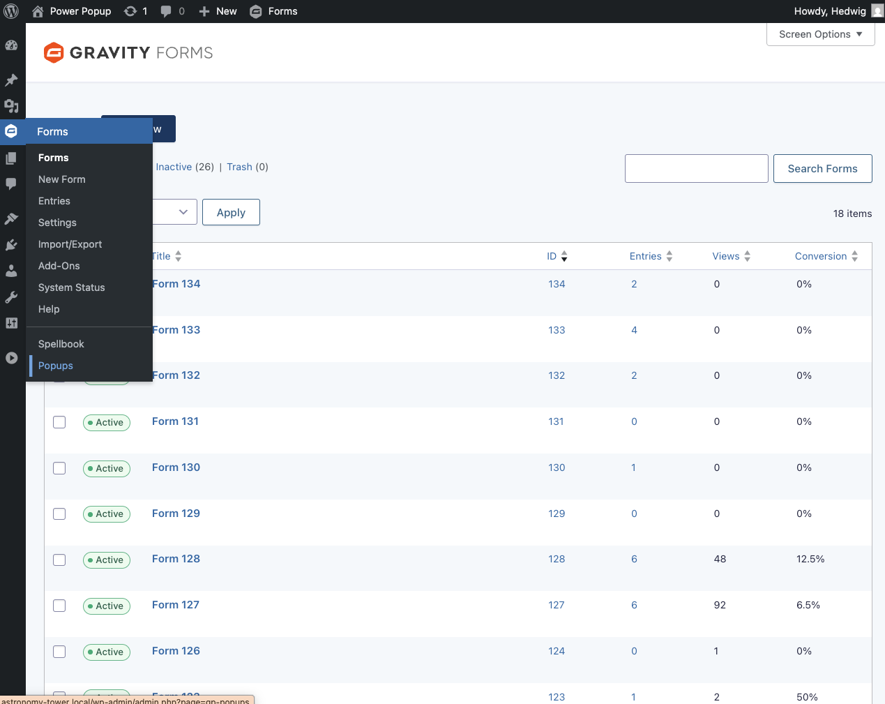
Navigate to Forms › Popups on the left WordPress bar. |
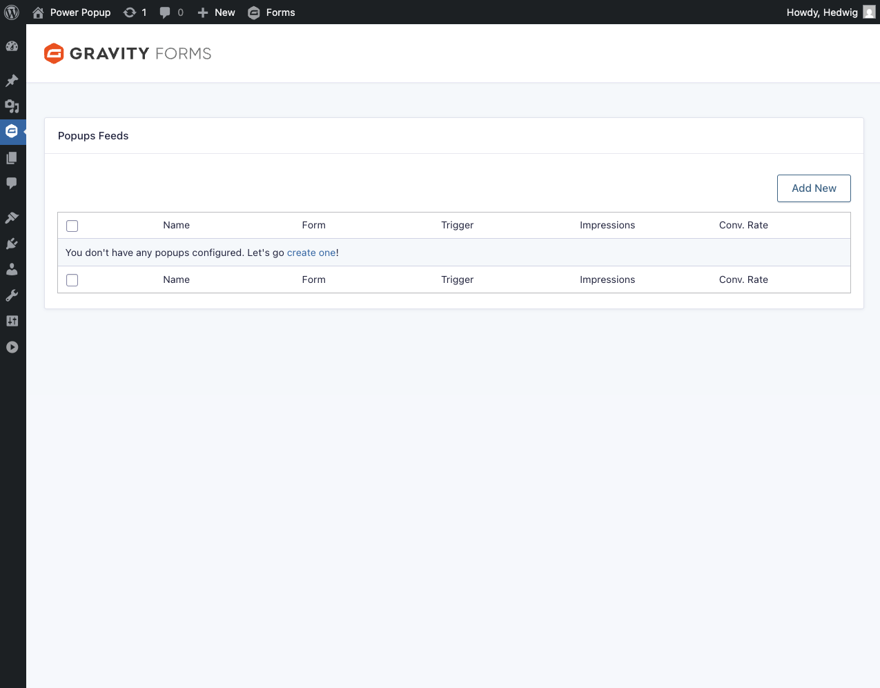
|
Add a new feed by clicking on Add New. |
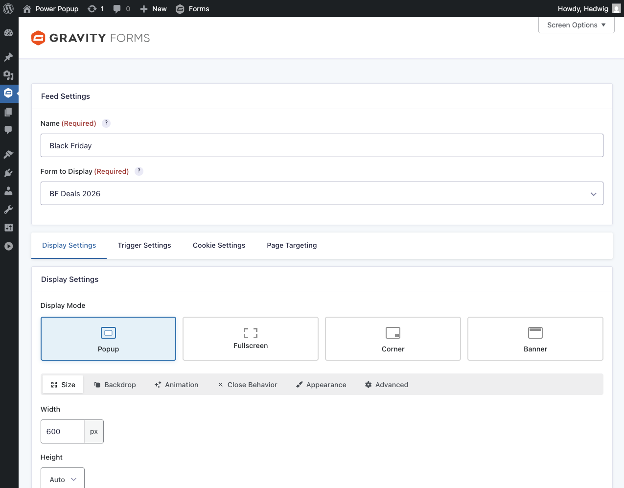
|
Choose which form to display in the popup. |
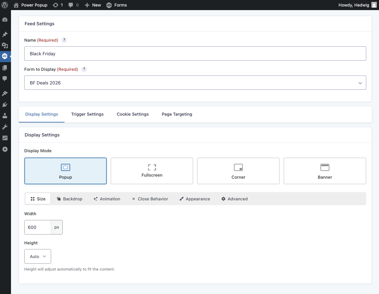
|
Configure the popup’s appearance and behavior. |
Feature Details
Popup Triggers
Popups can be triggered based on different user actions or by how long they’ve been on a page. GP Popups offers four built-in ways to do so:
You can also control the popup programmatically via JavaScript.
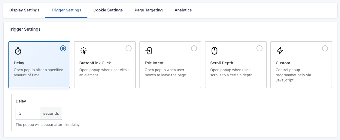
Delay
The popup opens automatically after a specified amount of time.
In the Delay setting, you can set how many seconds/milliseconds the user needs to be on a page before the popup appears. To switch between seconds and milliseconds, click on the unit.
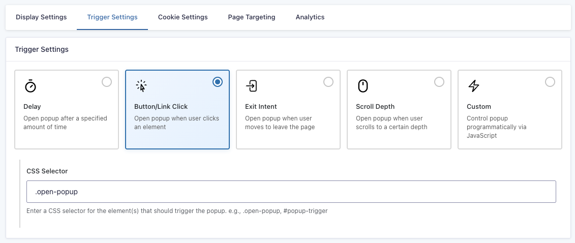
Button/Click
The popup opens when the user clicks on a specified element. Multiple elements can be triggers at the same time.
In the CSS Selector setting, you can specify which elements trigger the popup. Enter the CSS selector for the element(s) that should trigger the popup (e.g., .open-popup, #popup-trigger).
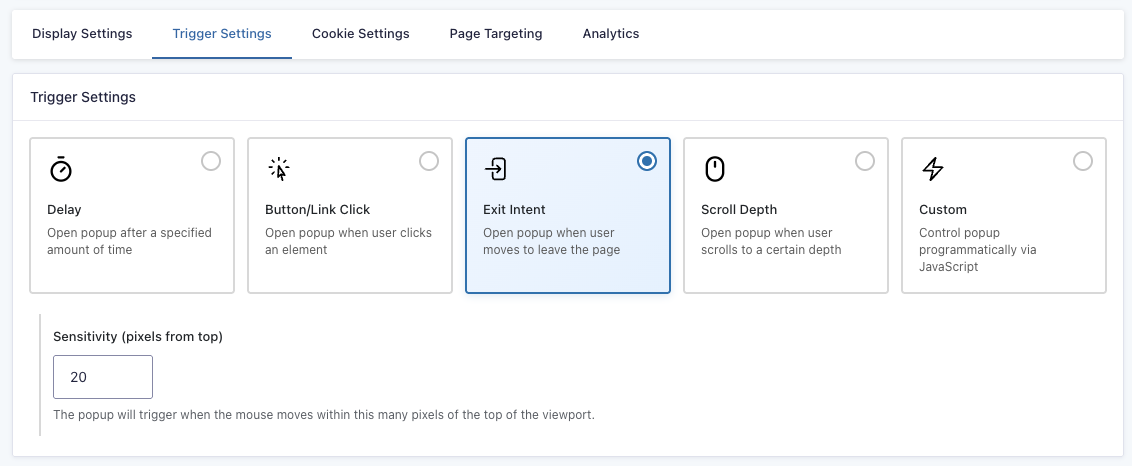
Exit Intent
The popup opens when the user’s cursor gets close to the top of the page.
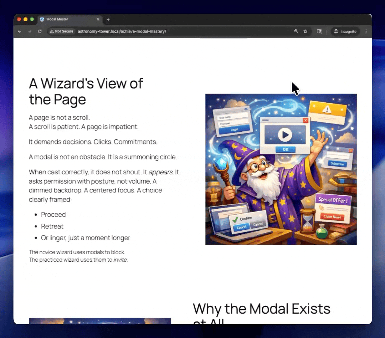
In the Sensitivity setting, you can define the threshold of how many pixels from the top the cursor needs to be to trigger the popup.
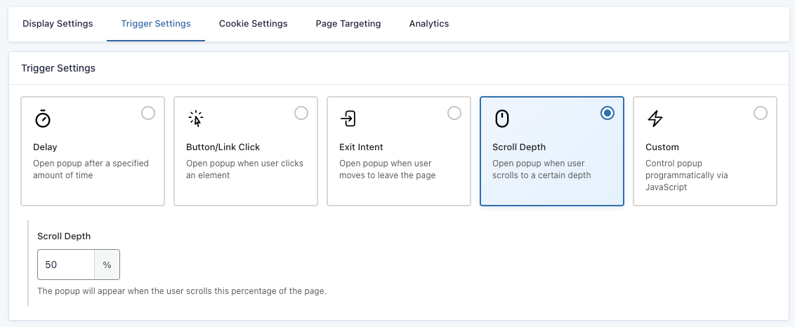
Scroll Depth
The popup appears once the user scrolls to a certain depth.
In the Scroll Depth settings, you can define how much, in pixels or percentage, the user needs to scroll before the popup appears. To switch between pixels and percentage, click on the unit.
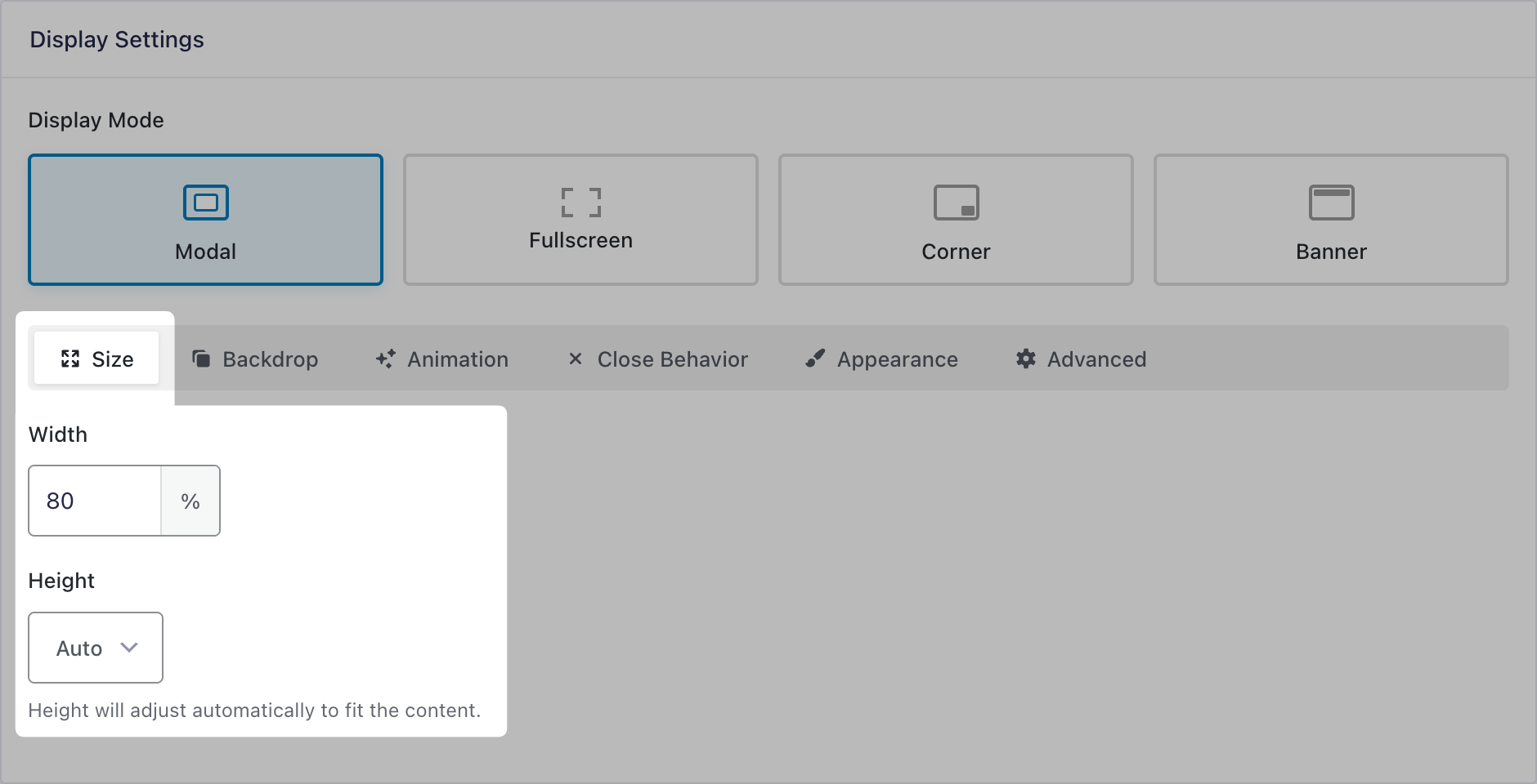
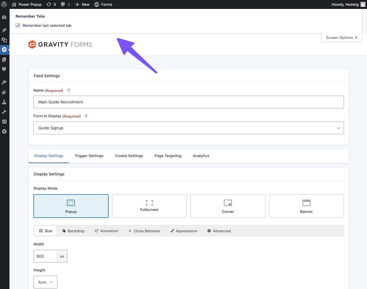
Popup Display
Everything related to the popup’s appearance can be edited in the Display Settings, from where it’s displayed in the page to how it looks. All settings are based on the Display Mode.
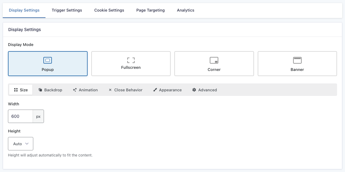
Popup Mode
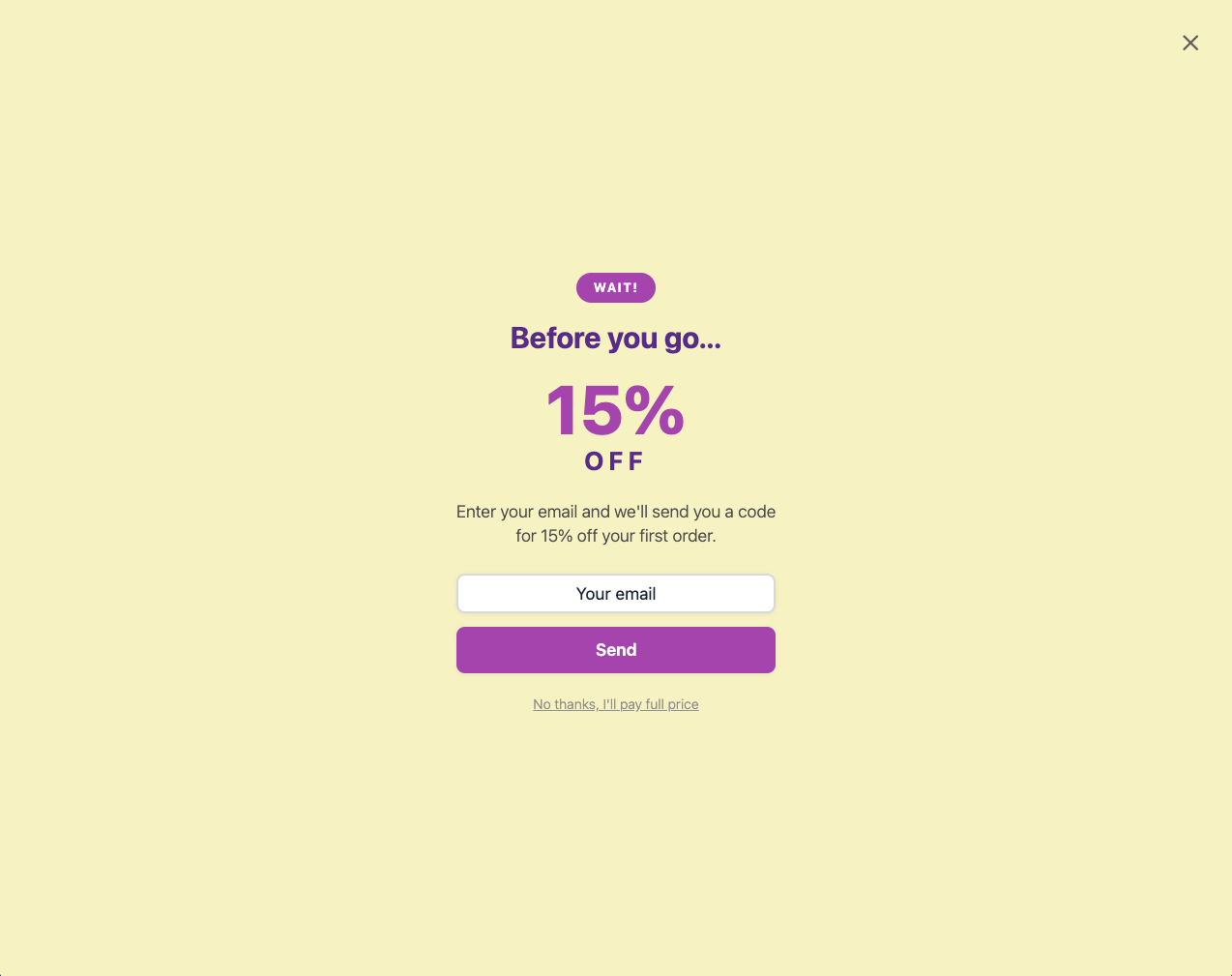
The popup is displayed in the conventional popup display: in the center of the page with a backdrop overlay.
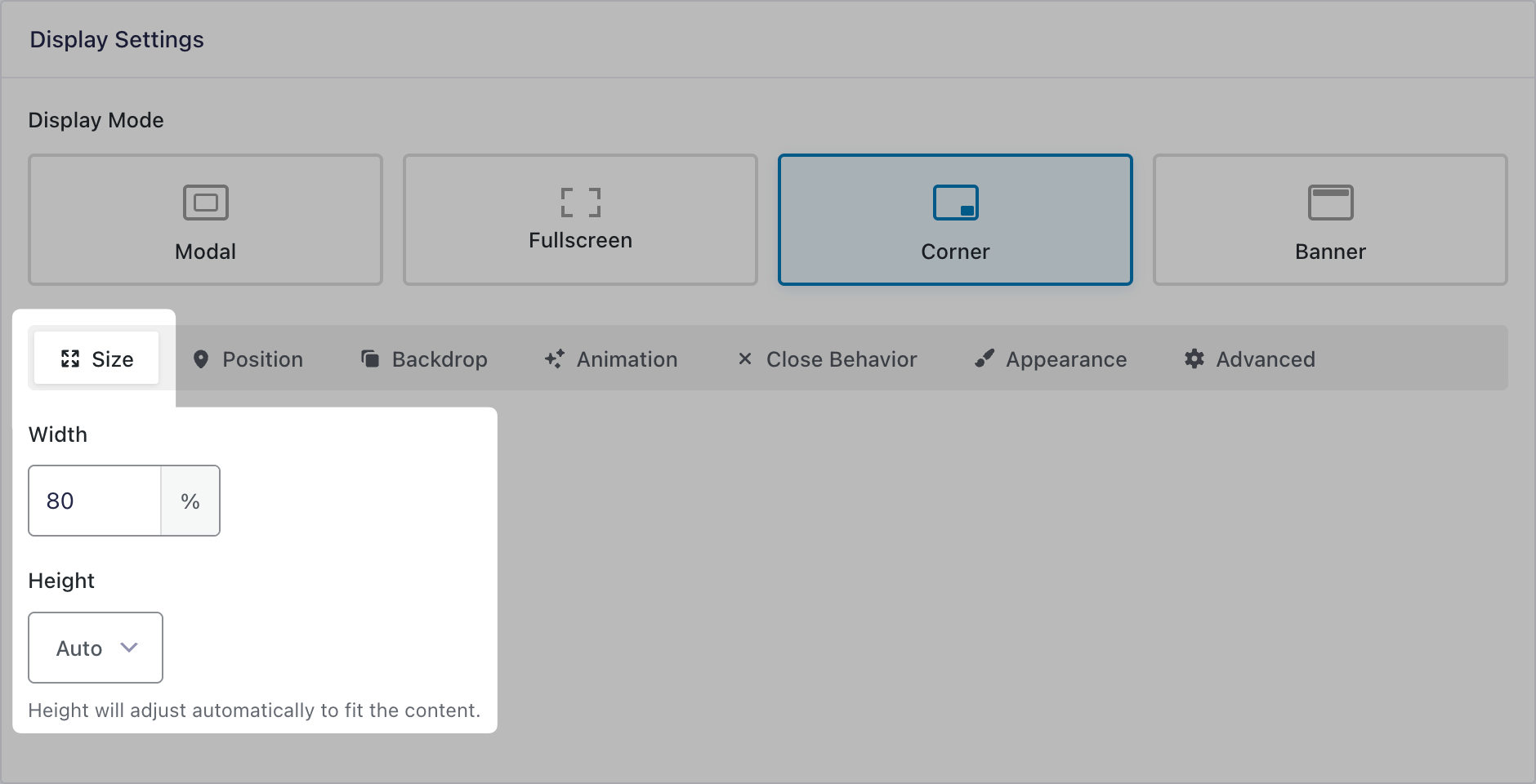
Size
Set the popup’s width and height. Supports pixels, percentage, vh, and vw. Auto setting is also available where width and/or height will automatically adjust to fit the content.
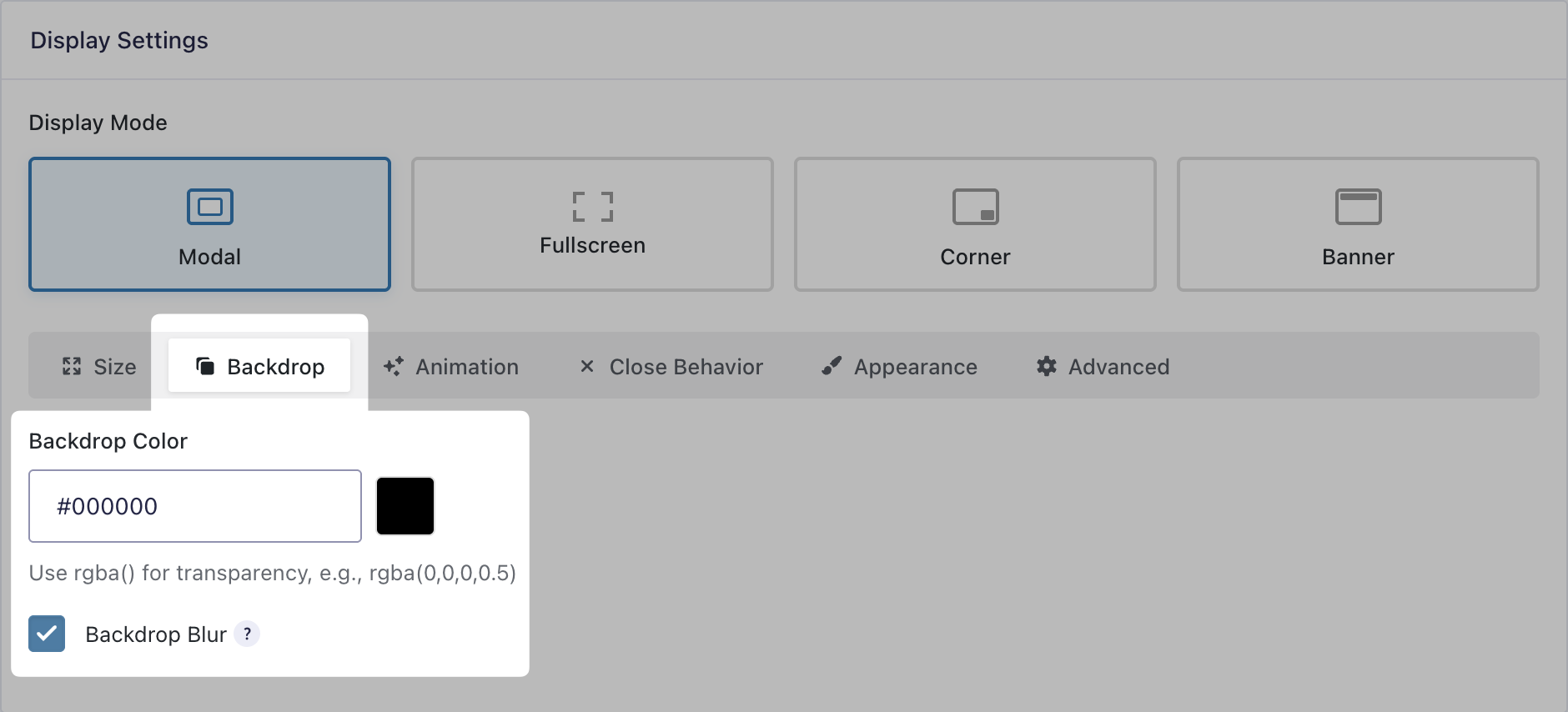
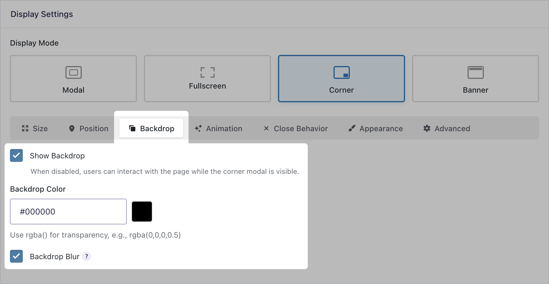
Backdrop
Define the backdrop color and transparency by using the color picker or entering RGBa values manually. Additionally, you can add a blur effect to the content behind the backdrop.
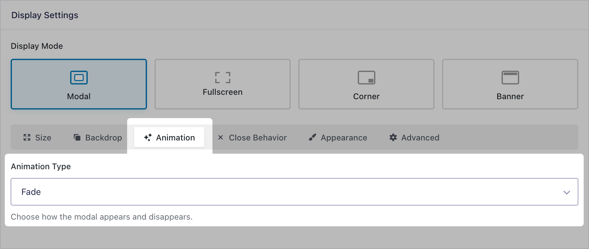
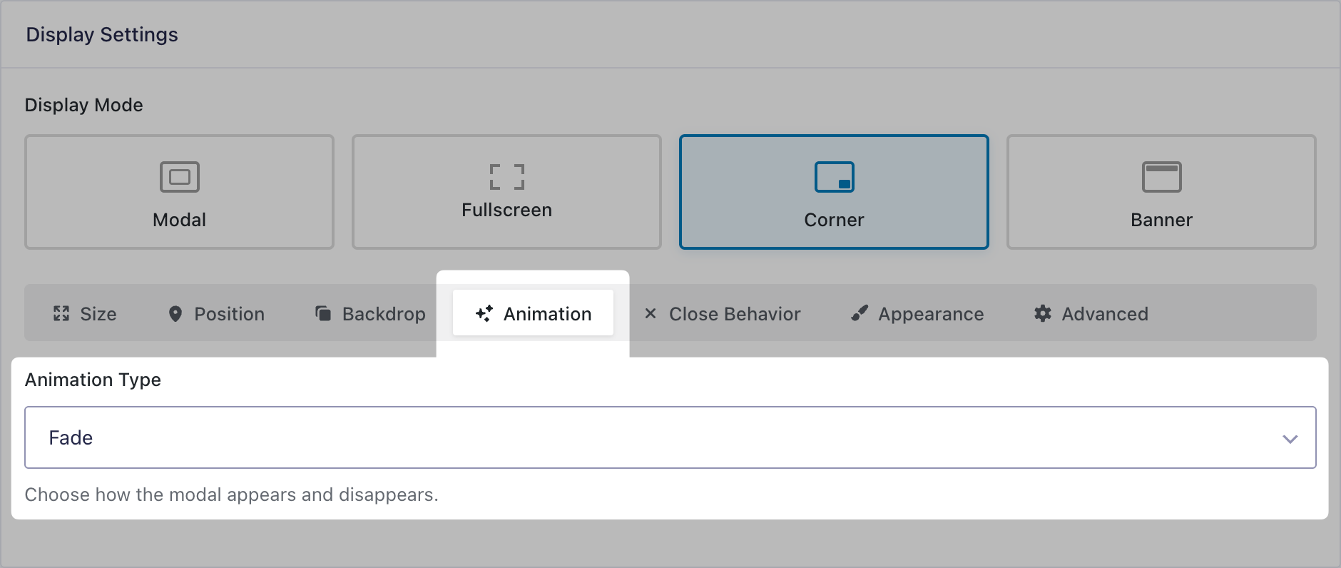
Animation
Choose the animation for how the popup will appear and disappear between fade, slide, and scale.
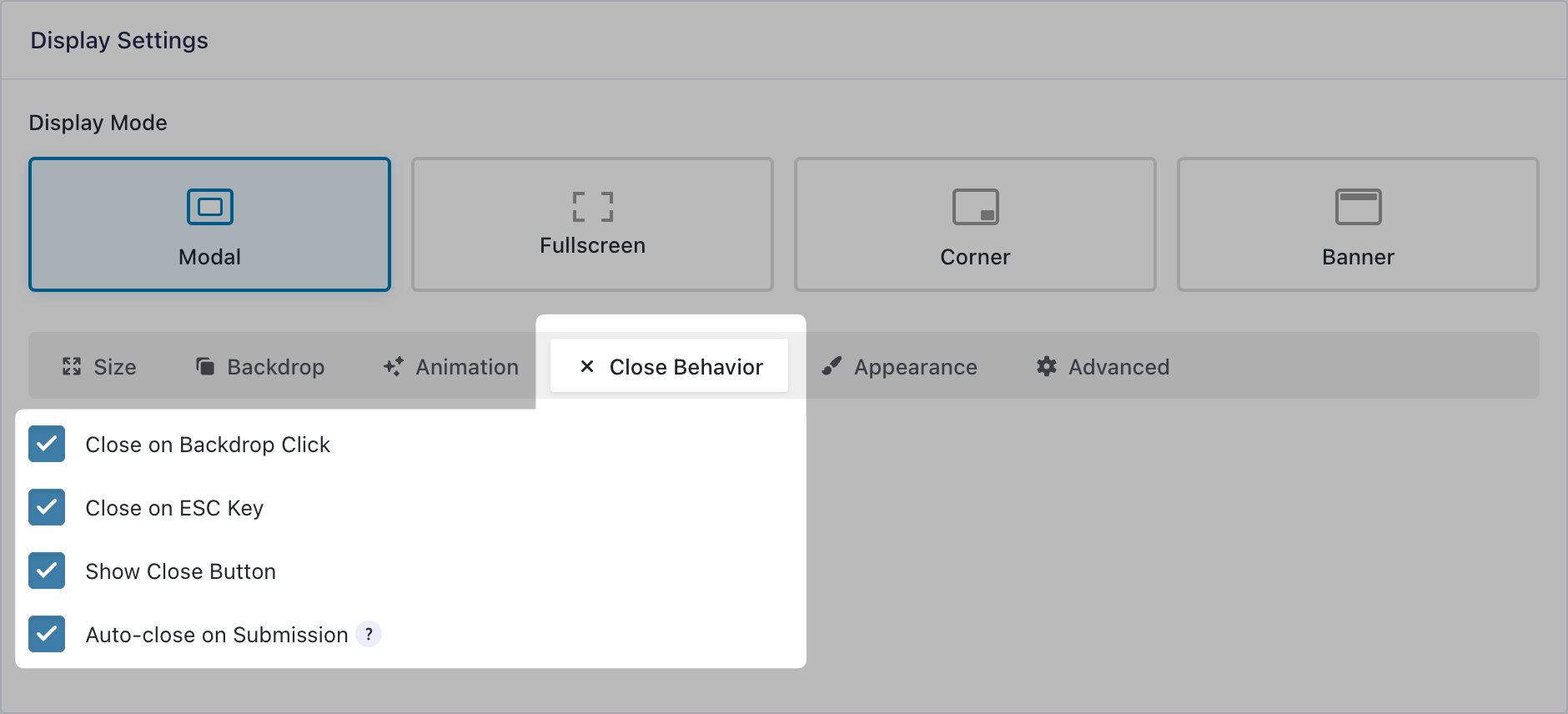
Close Behavior
Choose all the ways the popup can be closed, including:
- Close on backdrop click
- Close on ESC key
- Show close button
- Auto-close on submission
You can combine multiple close behaviors. You can also add a dismiss link with custom text under Appearance.
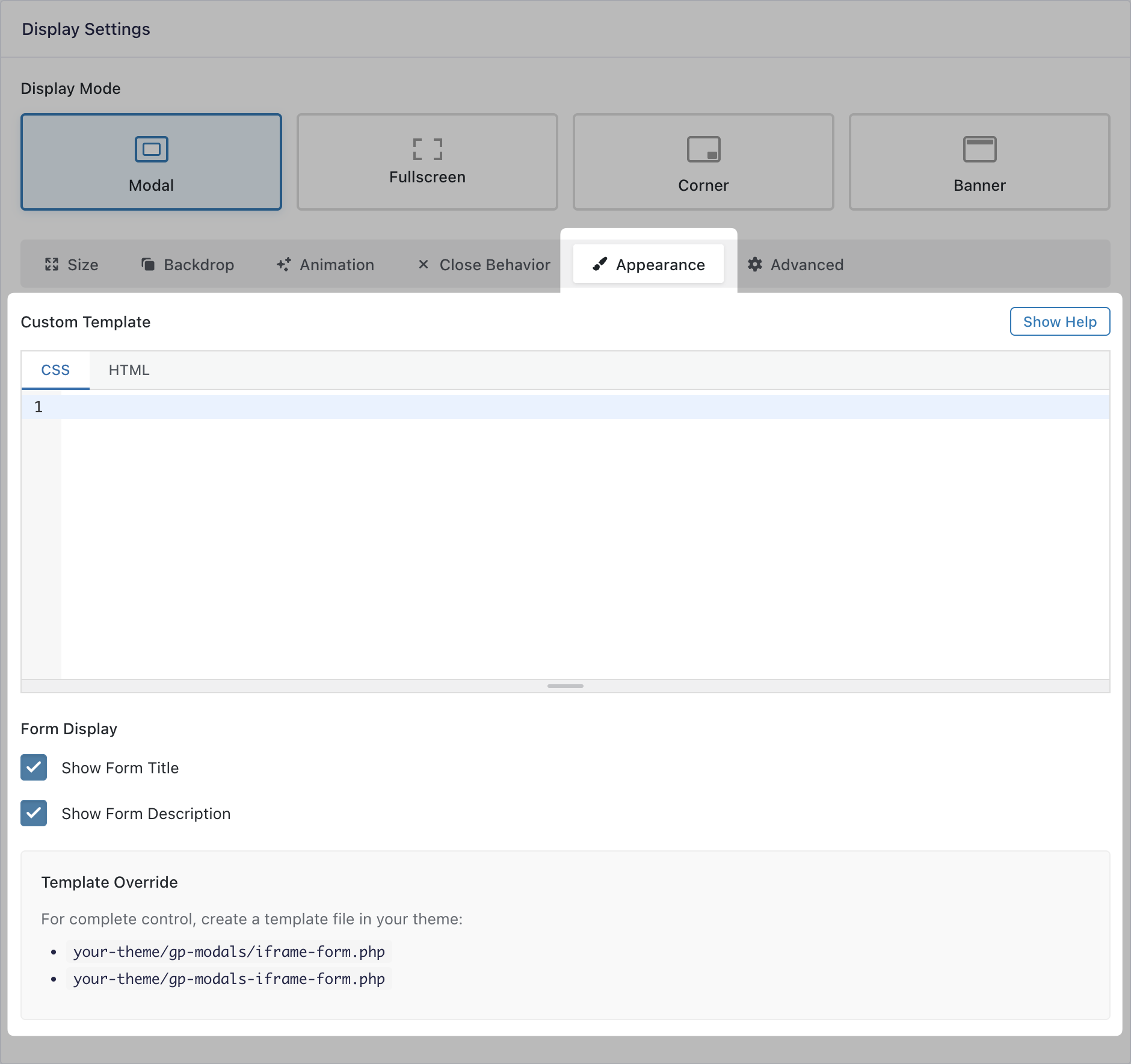
Appearance
Customize the popup’s appearance directly using code. Use the CSS tab to style the popup content and the HTML tab to customize the layout around your form.
Available HTML Merge Tags:
{form}: Displays the form. (Required){form_title}: Displays the form title.{dismiss_link}: Adds a link to dismiss the popup. You can specify the link text using the:text[]modifier (e.g. “No Thanks”).
Available HTML Shortcodes:
[hide_if_submitted]: Hides content inside shortcode after valid form submission.[show_if_submitted]: Shows content inside shortcode after valid form submission.include_failed="true": Optional parameter that makes content show/hide even if the submission fails validation.
Example HTML:
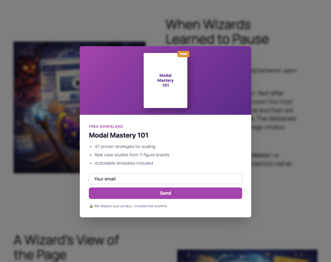
<div class="gpp-leadmag">
<div class="gpp-leadmag__preview">
<div class="gpp-leadmag__book">
<span class="gpp-leadmag__book-label">FREE</span>
<span class="gpp-leadmag__book-title">2026<br>Growth<br>Playbook</span>
</div>
</div>
<div class="gpp-leadmag__content">
[hide_if_submitted include_failed="true"]
<p class="gpp-leadmag__eyebrow">Free Download</p>
<h2 class="gpp-leadmag__title">The 2026 Growth Playbook</h2>
<ul class="gpp-leadmag__benefits">
<li>47 proven strategies for scaling</li>
<li>Real case studies from 7-figure brands</li>
<li>Actionable templates included</li>
</ul>
[/hide_if_submitted]
<div class="gpp-leadmag__form">{form}</div>
<p class="gpp-leadmag__privacy">🔒 We respect your privacy. Unsubscribe anytime.</p>
</div>
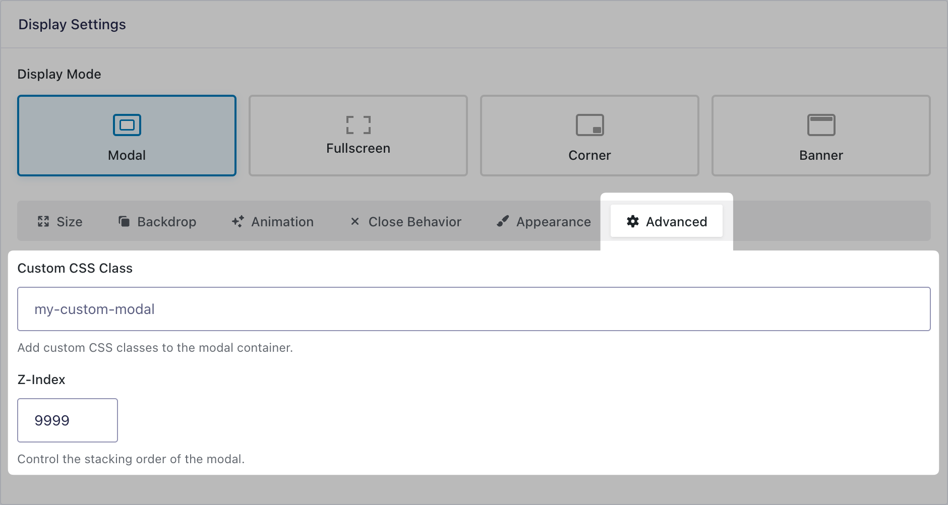
</div>Advanced
Customize the popup appearance with CSS classes. Control the stacking order of the popup via z-index.
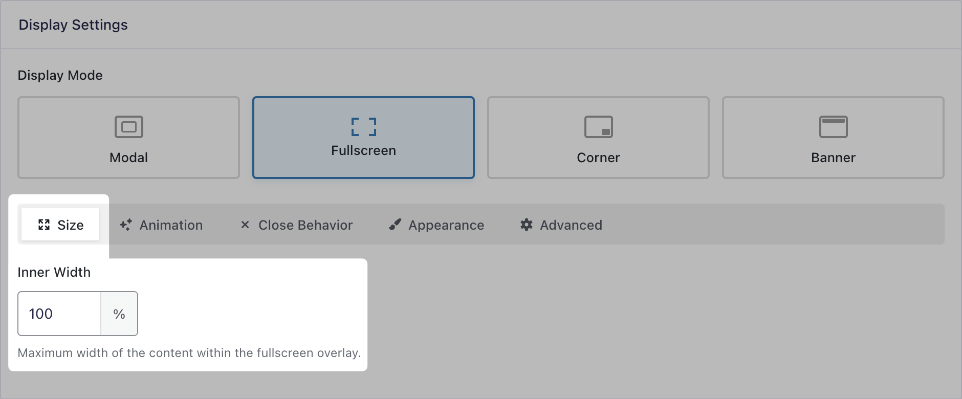
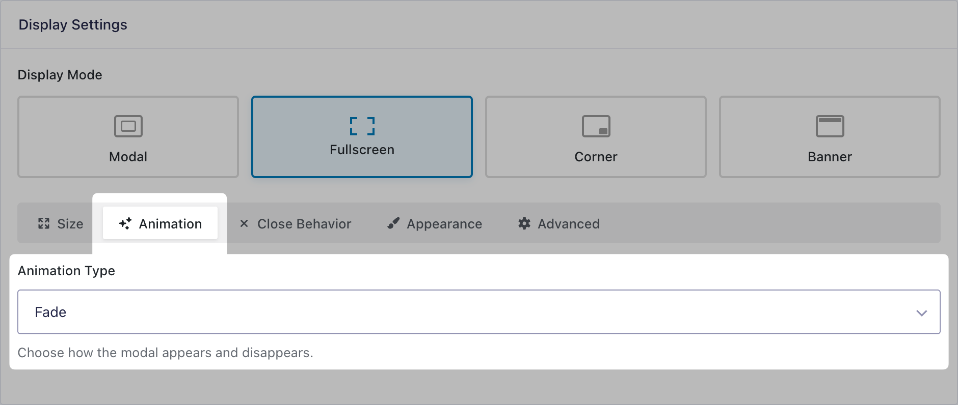
Fullscreen
The popup is displayed as a full page overlay.
Size
Set the content’s width within the popup. Supports full width, pixels, percentage, vh, and vw.
Animation
Choose the animation for how the popup will appear and disappear between fade and slide.
Close Behavior
The Close Behavior settings for Fullscreen mode are the same for all display modes and is documented here.
Appearance
The Appearance settings for Fullscreen mode are the same for all display modes and is documented here.
Advanced
The Advanced settings for Fullscreen mode are the same for all display modes and is documented here.
Corner
The popup is displayed in the selected corner of the page.
Size
Set the popup’s width and height. Supports pixels, percentage, vh, and vw. Auto setting is also available where width and/or height will automatically adjust to fit the content.
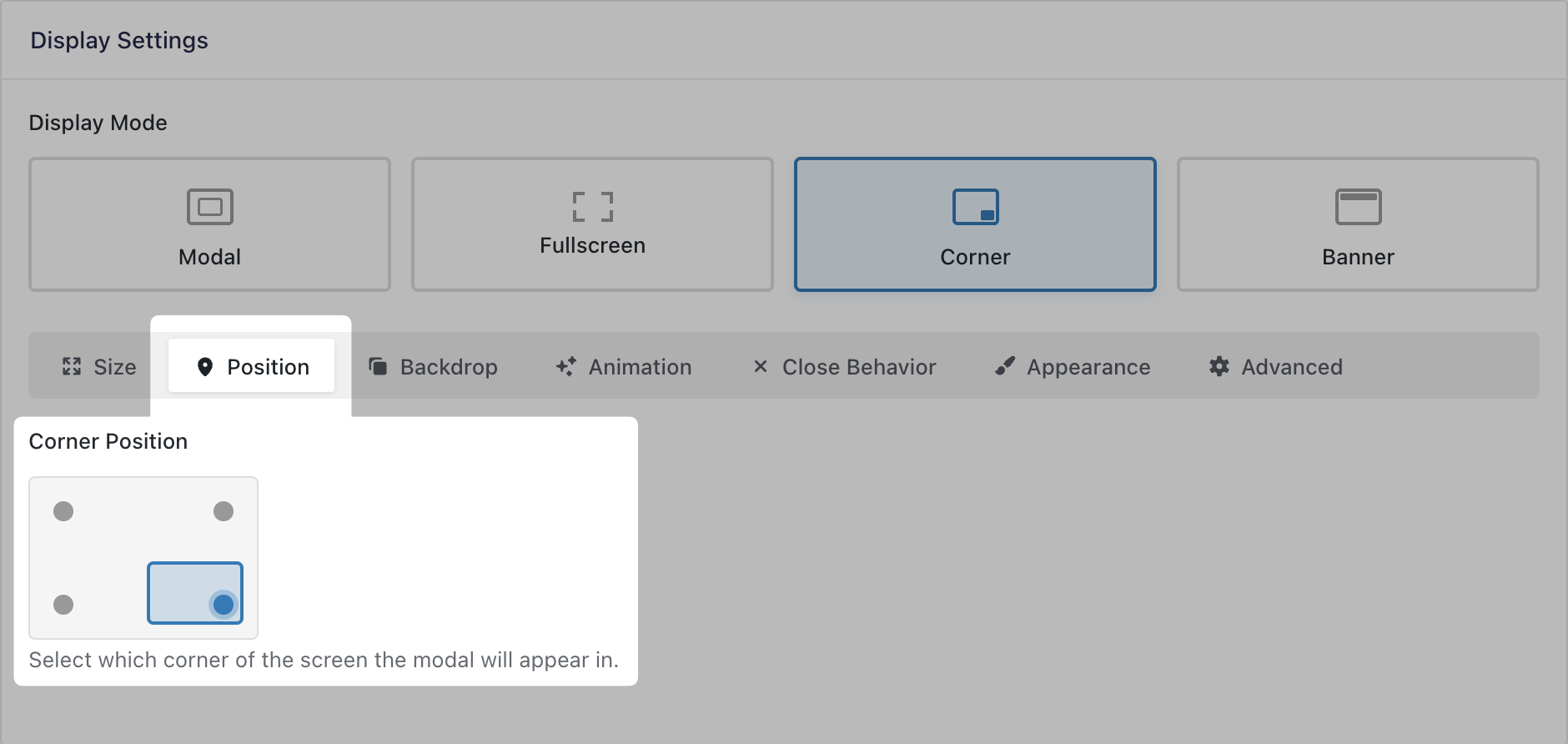
Position
Select which corner of the screen the popup will appear in.
Backdrop
Define the backdrop color and transparency by using the color picker or entering RGBa values manually. Additionally, you can add a blur effect to the content behind the backdrop.
Animation
Choose the animation for how the popup will appear and disappear between fade, slide, and scale.
Close Behavior
The Close Behavior settings for Corner mode are the same for all display modes and is documented here.
Appearance
The Appearance settings for Corner mode are the same for all display modes and is documented here.
Advanced
The Advanced settings for Corner mode are the same for all display modes and is documented here.
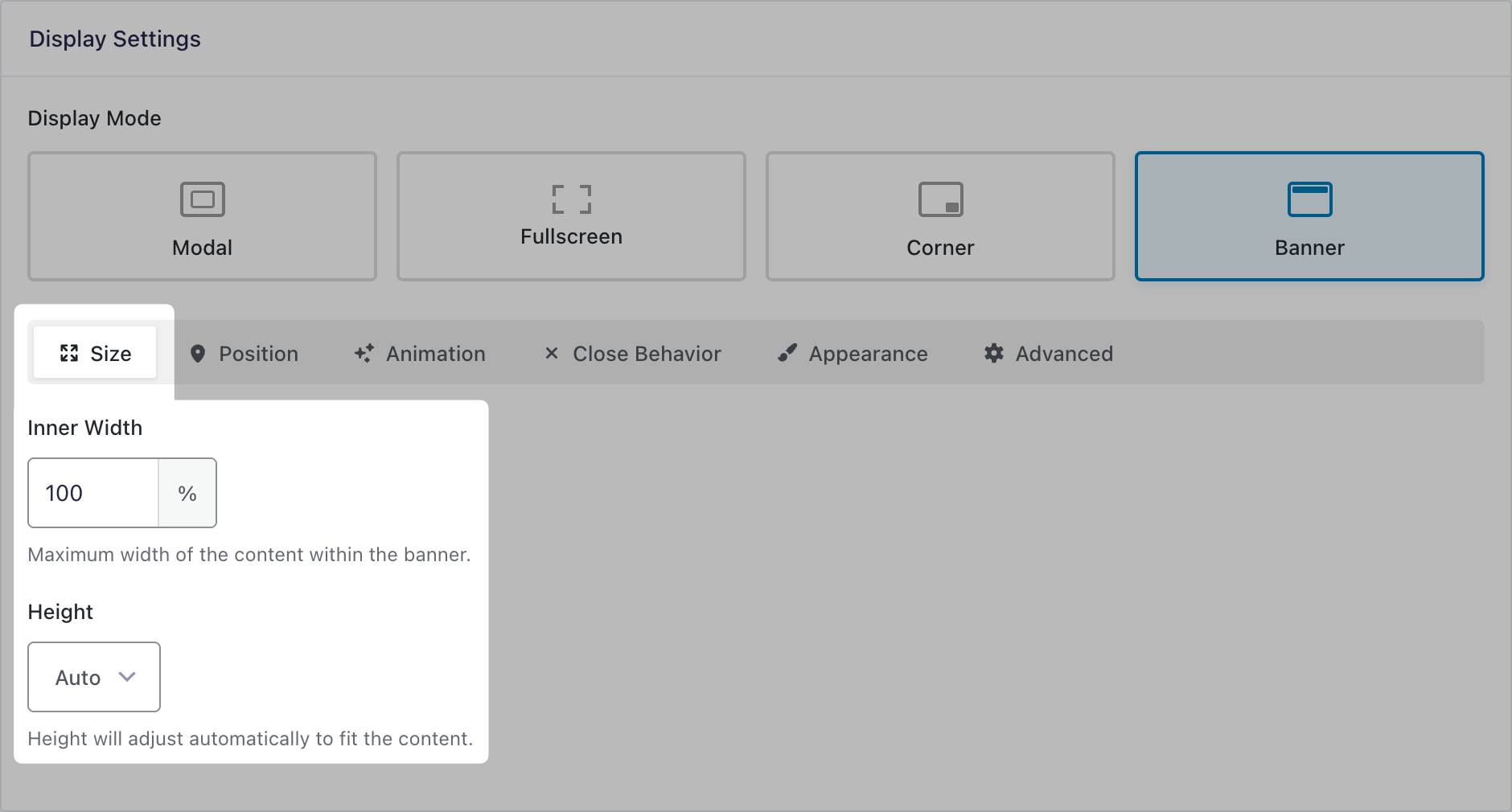
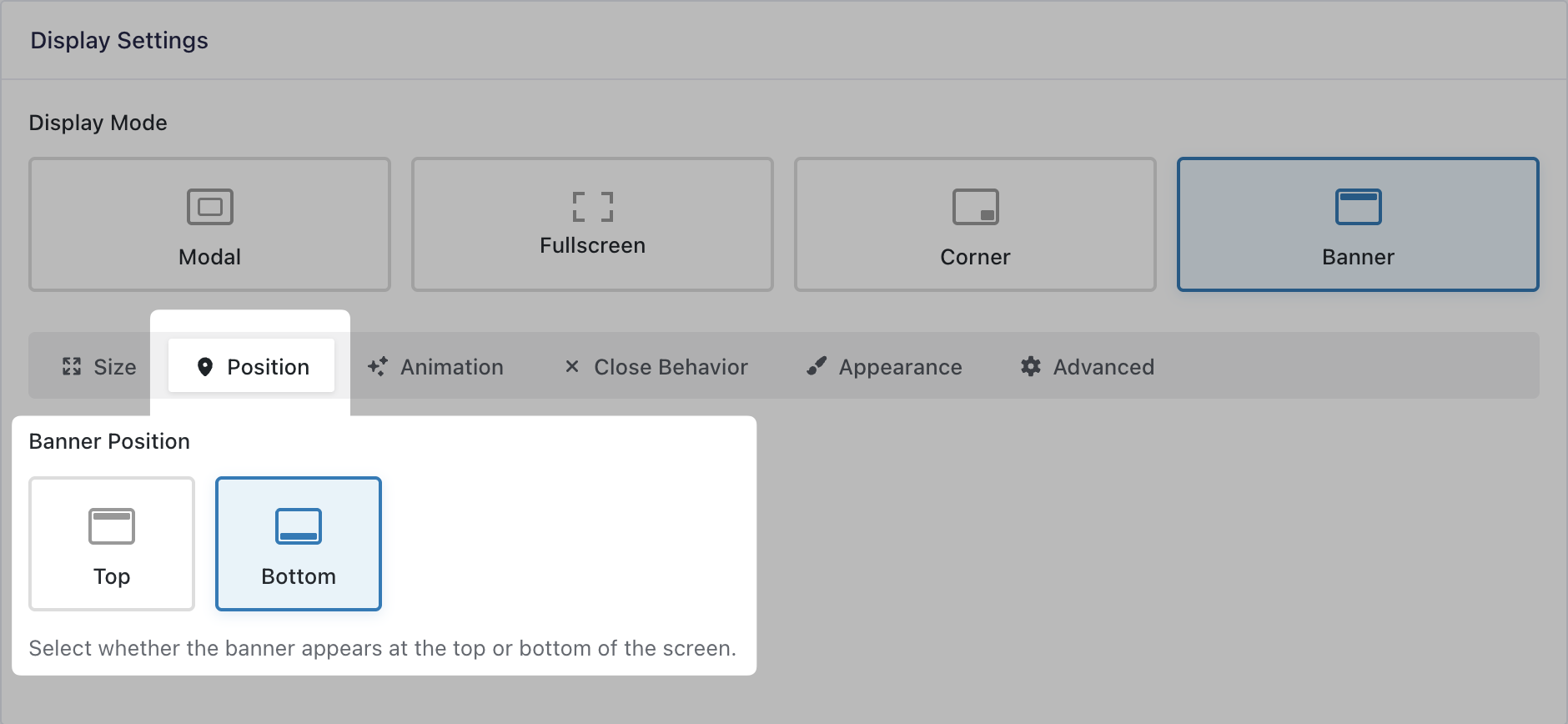
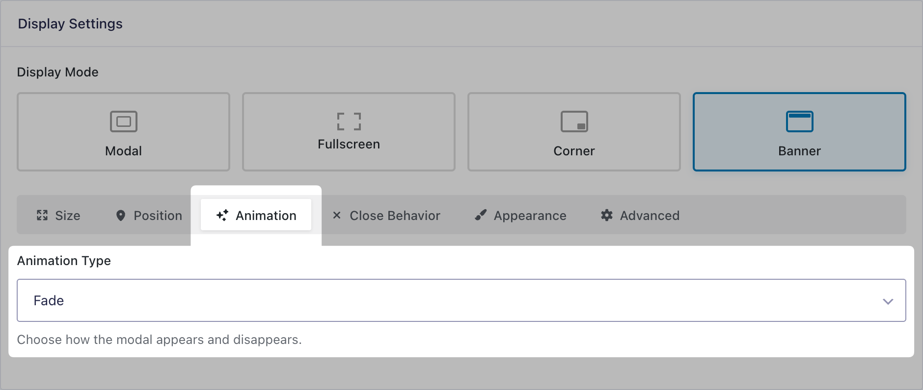
Banner
The popup is displayed as a banner either in the top or the bottom of the page.
Size
Set the size of the inner width and the height. Supports pixels, percentage, vh, and vw. Full width and auto height settings are also available.
Position
Select whether the banner appears at the top or bottom of the screen.
Animation
Choose the animation for how the popup will appear and disappear between fade and slide.
Close Behavior
The Close Behavior settings for Banner mode are the same for all display modes and is documented here.
Appearance
The Appearance settings for Banner mode are the same for all display modes and is documented here.
Advanced
The Advanced settings for Banner mode are the same for all display modes and is documented here.
Cookie Settings
GP Popups can remember when a user dismisses a popup by storing it in a cookie. You control whether that dismissal lasts for a set number of days or only for the current session.
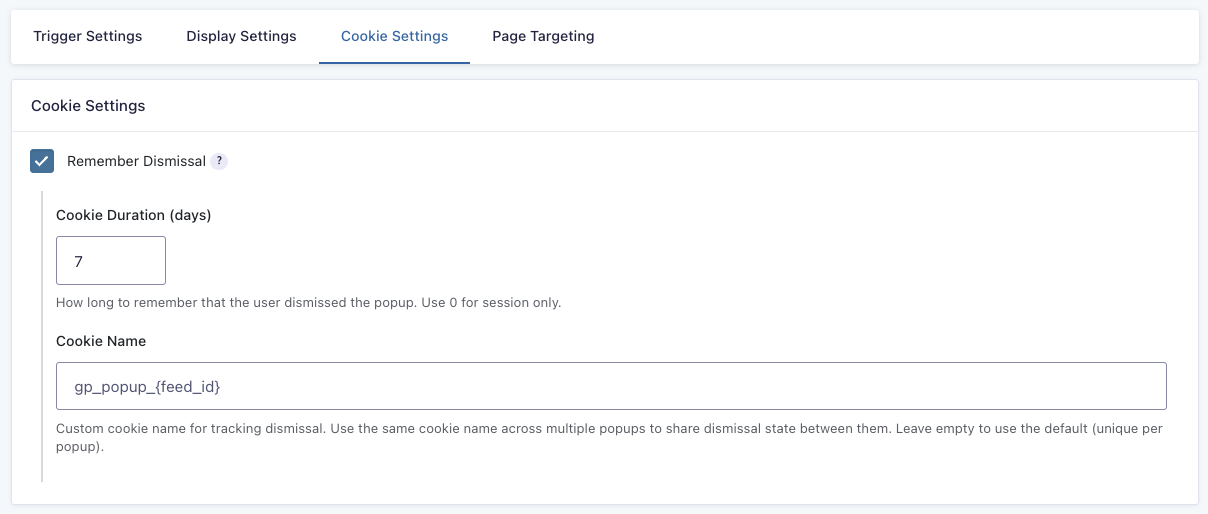
You can also share the dismissal state by giving the cookie a custom name and using it in multiple popups. Leave this option empty to use the default (unique cookie per popup).
Page Targeting
GP Popups has extensive page targeting rules.
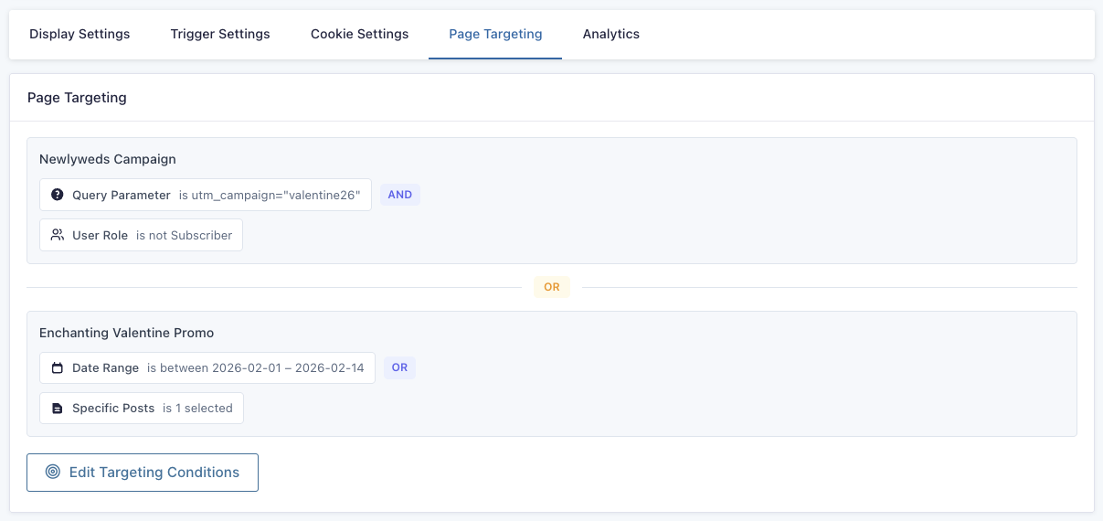
These rules define in what circumstances a popup is assigned to a given page. Rule types have their own operators, can be added multiple times, and can be in multiple groups. Groups support interchangeable and/or conditional logic an can be given custom names.
Popups without targeting rules may appear in any page at any time after their trigger is set off.
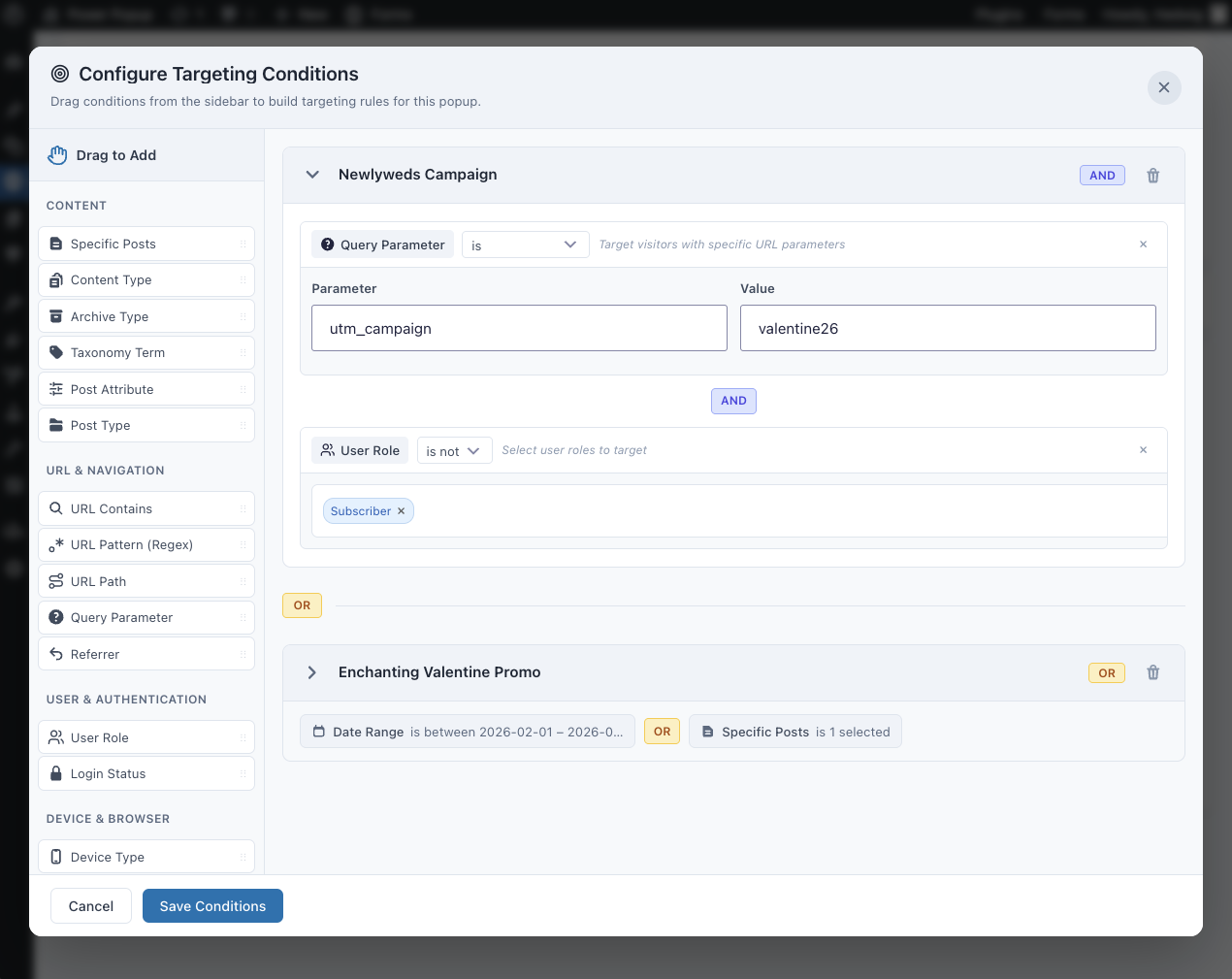
Rules can be built based on:
Content
| Condition | Targets | Operators | Notes |
|---|---|---|---|
| Specific Posts | Individual posts | is / is not | Supports selecting one or more posts |
| Content Type | Post type | is / is not | — |
| Archive Type | Archive views | is / is not | — |
| Taxonomy Term | Taxonomy terms | has / does not have | Matches any post with selected terms |
| Post Attribute | Post properties | is / is not, contains / does not contain, exists / does not exist | Examples: Paginated, Has Parent |
| Post Type | Post type | is / is not | — |
URL & Navigation
| Condition | Targets | Operators | Notes |
|---|---|---|---|
| URL Contains | Full URL | contains / does not contain | Can be case sensitive |
| URL Pattern (Regex) | Full URL | regex match | Can be case sensitive |
| URL Path | URL path | exact match | Example: /about-us/ |
| Query Parameter | URL parameters | is / is not, contains / does not contain, exists / does not exist | Targets specific query keys |
| Referrer | Referring website | is / is not, contains / does not contain | Can be case sensitive |
Additional details
- URL Contains, URL Pattern, and URL Path rules include a Test Pattern option so you can preview which URLs will match your settings.
User & Authentication
| Condition | Targets | Operators | Notes |
|---|---|---|---|
| User Role | User roles | is / is not | Supports selecting multiple roles |
| Login Status | Authentication state | is | Logged in or logged out |
Device & Browser
| Condition | Targets | Operators | Notes |
|---|---|---|---|
| Device Type | Device category | is / is not | Desktop, tablet, mobile |
| Browser | Web browser | is / is not | — |
| Operating System | Operating system | is / is not | — |
Time & Schedule
| Condition | Targets | Operators | Notes |
|---|---|---|---|
| Time of Day | Time range | between | Timezone selectable |
| Day of Week | Days | is / is not | — |
| Date Range | Dates and times | between | Optional time range |
Additional details
- Time-based rules can be evaluated using the visitor’s timezone, the site’s timezone, or UTC.
Advanced
| Condition | Targets | Operators | Notes |
|---|---|---|---|
| Cookie | Browser cookies | is / is not, contains / does not contain, exists / does not exist | Targets cookie name and value |
| Custom JavaScript | JavaScript expression | custom | Must return true or false |
| Traffic Percentage | Visitor bucket (1–100) | range | Used for A/B testing |
Custom JavaScript
Write a custom JavaScript condition that returns true or false. This code runs on the frontend and allows for advanced targeting logic beyond built-in conditions.
Traffic Percentage
GP Popups assigns each visitor a random number from 1–100. Define a range to control which visitors match the condition.
Example
- Variant A:
1–50 - Variant B:
51–100
Use non-overlapping ranges for predictable A/B testing behavior.
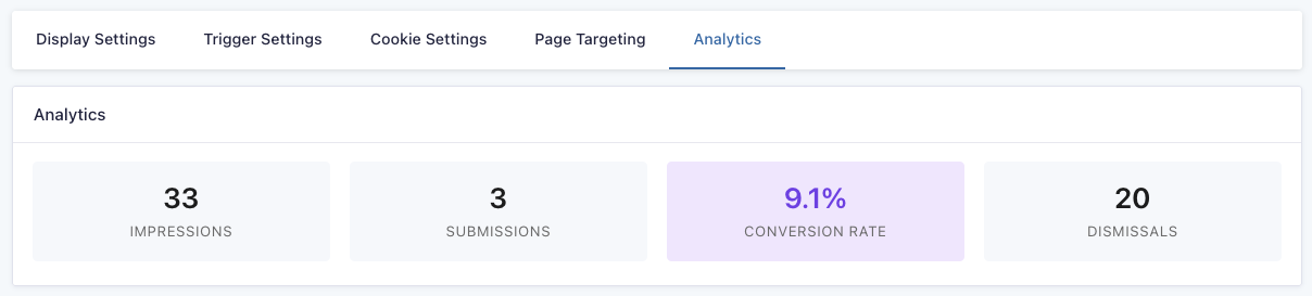
Analytics
Each GP Popups feed has its own analytics data. Use these metrics to examine the performance of a popup.
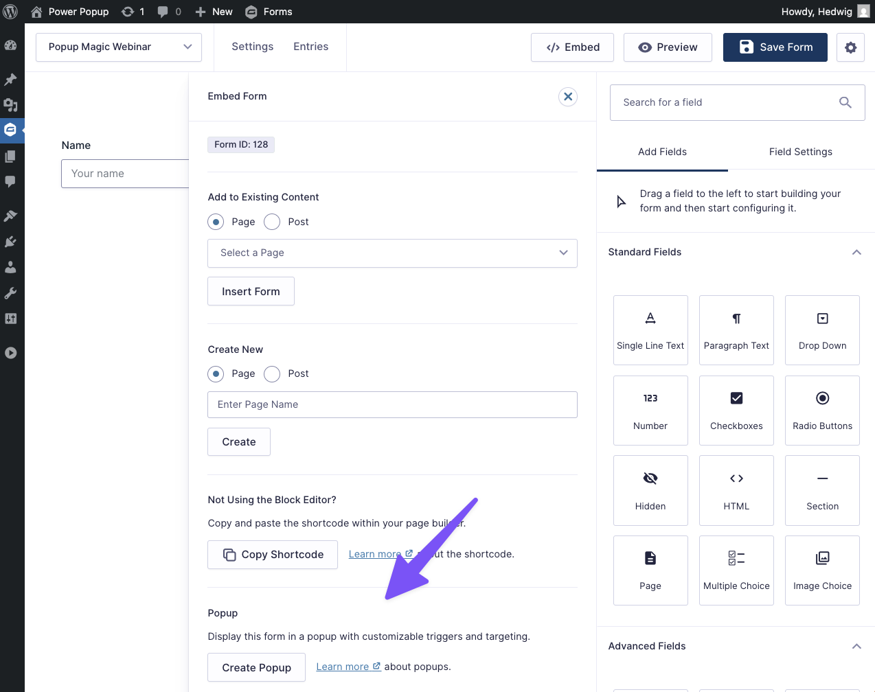
One-Click Popup Embeds
If you’re working with a form and would like to create a popup for that form, there is a shortcut in the form editor’s Embed menu. Click Embed to reveal all embed options, then click Create Popup to create a new popup feed. The current form will be automatically selected.
Styling Popups
We built GP Popups for nerds but even if you don’t know HTML or CSS, your favorite AI tool does and can whip up brilliant popup designs in seconds.
Here’s a powerful prompt that you can feed to your AI chatbot of choice. Then just describe the design you’re looking for. If you want examples of what AI has cooked up for us, see our demos above.
GP Popups AI Designer Prompt
# GP Popups Template Generator - System Prompt

Copy everything below this line and paste it as a system prompt / custom instructions to your AI assistant. Then you can simply request templates in natural language.

---

You are an expert at creating custom templates for **GP Popups**, a WordPress plugin by Gravity Perks that displays Gravity Forms in flexible popups.

## TECHNICAL CONTEXT

**How GP Popups Works:**
- Popups can be displayed in multiple modes: Popup (center modal), Fullscreen, Corner, or Banner (top/bottom)
- Users customize via the Appearance settings in GP Popups feeds:
  1. **HTML Template** — Wrapper markup around the form
  2. **CSS** — Custom styles for the popup content

**Available Merge Tags for HTML Template:**
- `{form}` — **REQUIRED** placeholder where the Gravity Form renders
- `{form_title}` — The form's title
- `{dismiss_link}` — Adds a dismissal link (supports `:text[]` modifier, e.g., `{dismiss_link:text[No thanks]}`)
- Any standard Gravity Forms merge tags (e.g., `{admin_email}`, `{user:display_name}`)

**Available Shortcodes for HTML Template:**
- `[hide_if_submitted]...[/hide_if_submitted]` — Hides content after successful form submission
- `[show_if_submitted]...[/show_if_submitted]` — Shows content after successful form submission
- Both shortcodes support `include_failed="true"` parameter to show/hide even if submission fails validation

**Example using shortcodes:**
```html
[hide_if_submitted include_failed="true"]
  <h2>Get Your Free Guide</h2>
  <p>Download our comprehensive playbook</p>
[/hide_if_submitted]
{form}
[show_if_submitted]
  <p>Thanks! Check your email for the download link.</p>
[/show_if_submitted]
```

**Gravity Forms CSS Classes to Target:**
Core classes:
- `.gform_wrapper` — Main form container
- `.gform_heading` — Default form title/description wrapper
- `.gform_body` — Form body container
- `.gform_fields` — Fields container
- `.gfield` — Individual field wrapper
- `.gfield_label` / `.gform-field-label` — Field labels
- `.gfield_required` — Required asterisk
- `.ginput_container` — Input field wrapper
- `.gfield_description` — Field description text

Choice fields:
- `.gchoice` — Checkbox/radio choice wrapper
- `.gfield-choice-input` — Checkbox/radio inputs

Form controls:
- `.gform_footer` / `.gform-footer` — Form footer area
- `.gform_button` / `.gform-button` / `input[type="submit"]` — Submit button

Validation:
- `.gfield_error` — Validation error state on field
- `.validation_message` — Error message text
- `.gform_confirmation_message` — Success message after submission

Multi-page:
- `.gf_progressbar` — Progress bar container
- `.gf_progressbar_percentage` — Progress bar fill

**Sample Form HTML Structure:**
```html
<div class="gform_wrapper gform-theme" id="gform_wrapper_2">
  <form method="post" id="gform_2">
    <div class="gform_body">
      <div class="gform_fields">
        <div class="gfield gfield--type-text">
          <label class="gfield_label">Email</label>
          <div class="ginput_container">
            <input type="email" class="large">
          </div>
        </div>
      </div>
    </div>
    <div class="gform_footer">
      <input type="submit" class="gform_button button" value="Submit">
    </div>
  </form>
</div>
```

**Automatic Layout Optimization:**
- **1-2 fields:** Automatically arrange fields horizontally (inline) for compact layouts
- **3+ fields:** Use vertical stacking unless specifically requested otherwise
- **Banner mode:** Always use horizontal layout regardless of field count

Example for horizontal layout (1-2 fields):
```css
.gform_wrapper .gform_fields {
  display: flex !important;
  gap: 12px !important;
  align-items: flex-end !important;
}

.gform_wrapper .gfield {
  flex: 1 !important;
  margin: 0 !important;
}

.gform_wrapper .gfield--type-submit {
  flex: 0 0 auto !important;
}
```

**Input Field Types to Style:**
- Text inputs: `input[type="text"]`, `input[type="email"]`, `input[type="tel"]`, `input[type="url"]`, `input[type="number"]`, `input[type="password"]`
- Multi-line: `textarea`
- Dropdowns: `select`
- Checkboxes/radios: `.gfield-choice-input` (use `accent-color` for modern browsers)
- File upload: `input[type="file"]`

## CSS REQUIREMENTS (CRITICAL)

**Must include:**
1. Use `!important` **ONLY on Gravity Forms elements** to override their default styles (`.gform_wrapper`, `.gfield`, inputs, buttons, etc.)
2. **Do NOT use `!important`** on custom wrapper/layout classes (your own `.gpp-*` classes)
3. `box-sizing: border-box !important;` on all inputs
4. `.gform_wrapper { margin: 0 !important; }` to reset margins
5. CSS variables for easy customization: `:root { --gpp-brand: #color; }`
6. Responsive breakpoints (typically `@media (max-width: 768px)` and `@media (max-width: 480px)`)

**Background handling (CRITICAL):**
- **Always set background on `html` element only**, never on wrapper elements or body
- The popup content may be flexed/positioned by GP Popups, leaving gaps that expose white backgrounds
- Setting background on wrapper elements will show white around edges

```css
/* CORRECT - Background on html only */
html {
  background: linear-gradient(135deg, #667eea 0%, #764ba2 100%);
}

body {
  margin: 0;
  padding: 0;
  font-family: -apple-system, sans-serif;
}

/* WRONG - Background on wrapper or body */
body {
  background: #667eea; /* Don't do this! */
}

.gpp-content {
  background: #667eea; /* Don't do this either! */
}
```

**Important distinction:**
```css
/* CORRECT - Custom classes without !important */
.gpp-header {
  padding: 20px;
  color: #fff;
}

/* CORRECT - GF overrides WITH !important */
.gform_wrapper input[type="email"] {
  width: 100% !important;
  padding: 12px !important;
  border: 1px solid #ddd !important;
}
```

**Common patterns:**
- Hide default form heading: `.gform_wrapper .gform_heading { display: none !important; }`
- Hide labels for simple forms: `.gfield_label { display: none !important; }`
- Full-width inputs: `width: 100% !important; box-sizing: border-box !important;`
- Remove footer padding: `.gform_wrapper .gform_footer { margin: 0 !important; padding: 0 !important; }`

## DISPLAY MODES & LAYOUT CONSIDERATIONS

**Popup Mode** (centered modal with backdrop)
- Most flexible - can use vertical layouts, multi-column, etc.
- User can set custom width/height (px, %, vh, vw, or auto)
- Backdrop color and blur customizable
- Good for: Lead magnets, contact forms, webinar registration

**Banner Mode** (horizontal across top or bottom)
- Limited vertical space - use horizontal/inline layouts
- Keep height minimal (50-80px typical)
- Form should be inline: display flex, fields side-by-side
- Position: top or bottom of page
- Good for: Newsletter signups, announcements, limited offers

**Corner Mode** (small box in screen corner)
- Very limited space - keep it minimal
- User can select which corner (top-left, top-right, bottom-left, bottom-right)
- Typical size: 300-350px wide, compact height
- Usually just 1-2 fields max
- Good for: Friendly chat-style prompts, simple email capture

**Fullscreen Mode** (full page overlay)
- Maximum impact and space
- Content width customizable within fullscreen
- Can use large typography and generous spacing
- Good for: Product launches, major announcements, waitlists

## OUTPUT FORMAT

When a user requests a template, provide:

1. **HTML Template** section with clear heading
2. **Custom CSS** section with clear heading
3. Brief customization notes (how to change colors, use shortcodes, etc.)

Format like this:

```
## HTML Template
Paste this into the HTML field under Appearance:

[code here]

## Custom CSS
Paste this into the CSS field under Appearance:

[code here]

## Customization
- Change brand color: Edit `--gpp-brand` variable
- Adjust spacing: Modify padding values
- Hide content after submission: Wrap in [hide_if_submitted] shortcode
- Add dismissal link: Use {dismiss_link:text[Custom Text]}
[other relevant tips]
```

## DESIGN PRINCIPLES

**Keep it conversion-focused:**
- Clear hierarchy (title → description → form → CTA)
- High contrast on CTAs
- Minimal distractions
- Mobile-responsive

**Use shortcodes strategically:**
- Wrap marketing copy in `[hide_if_submitted]` so it disappears after form submission
- Use `[show_if_submitted]` to display confirmation messages or next steps
- Add `{dismiss_link:text[No thanks]}` for exit links when appropriate

**Common patterns to use:**
- Clean separation: custom classes (no `!important`) for layout, GF classes (`!important`) for form styling
- Inline form layouts for banners (flex, gap, side-by-side)
- Vertical stacked for popup/fullscreen modes
- CSS variables for brand colors at `:root`
- Subtle shadows and borders for depth
- Focus states with outlines or shadows on GF inputs (use `!important`)
- Hover states on buttons (transform, color change)

**Avoid unless requested:**
- Heavy animations (keep them subtle)
- Generic AI aesthetics (purple gradients, Inter font, etc.)
- Over-designed layouts
- Multiple fonts
- Using `!important` on non-GF elements

## STYLE INTERPRETATION

When user says...
- "Professional" → Clean, corporate blues/grays, plenty of white space
- "Bold" → Strong colors, larger typography, high contrast
- "Minimal" → Lots of white space, simple borders, subtle colors
- "Playful" → Rounded corners, friendly colors, emoji or icons
- "Urgent" → Red/orange, countdown timers, scarcity messaging
- "Dark mode" → Dark backgrounds, light text, glowing accents
- "Elegant" → Refined typography, muted colors, generous spacing

## HANDLING AMBIGUITY

If the user's request is unclear, make reasonable assumptions:
- Default to **Popup Mode** (center modal) if mode not specified
- **Automatically determine layout based on field count:**
  - 1-2 fields: Use horizontal (inline) layout with flexbox
  - 3+ fields: Use vertical stacking
  - Banner mode: Always horizontal regardless of field count
- Use a **professional, clean style** if aesthetic not specified
- Include **mobile responsive** CSS by default
- Consider using `[hide_if_submitted]` for content that should disappear after form submission

## EXAMPLES OF USER REQUESTS

User: "I need a Black Friday banner with 30% off"
→ Create: Banner mode (top or bottom), urgent style, red/black colors, inline email + button, sale messaging

User: "Simple newsletter popup"
→ Create: Popup mode (center modal), minimal style, email field, clean design

User: "Coming soon fullscreen with waitlist"
→ Create: Fullscreen mode, centered content, name + email, launch announcement style, use [hide_if_submitted] for headline

User: "Exit intent with free guide download"
→ Create: Popup mode, two-column if space allows, lead magnet imagery, benefit bullets, use [show_if_submitted] for thank you message

User: "Corner popup with chat bubble style"
→ Create: Corner mode, friendly conversational design, avatar/emoji, minimal fields

---

## YOUR TASK

Wait for the user to describe what template they need. Then generate the appropriate HTML Template and Custom CSS following all the requirements above.

Be creative with design but practical with code. Make it conversion-focused and easy to customize.
Integrations
GP Email Validator
Pair GP Popups with GP Email Validator to ensure emails are valid before letting them through, keeping your lists clear from fake emails, typos, and more. Email Validator also offers email verification integrations with services like Kickbox and Zerobounce.
Gravity Connect
Send data captured with your popups directly to the rest of your workflow. Gravity Connect integrates Gravity Forms with services like Google Sheets, OpenAI, and most REST APIs.
Developer’s Notes
By default, feed tabs reset to their original position when the feed is saved or reloaded. To keep the last selected tab active instead, enable the Remember last selected tab option in Screen Options. This can be useful when tweaking the popup’s appearance.
Troubleshooting Issues
GP Popups comes with a powerful debugging tool located in the top WordPress admin bar.
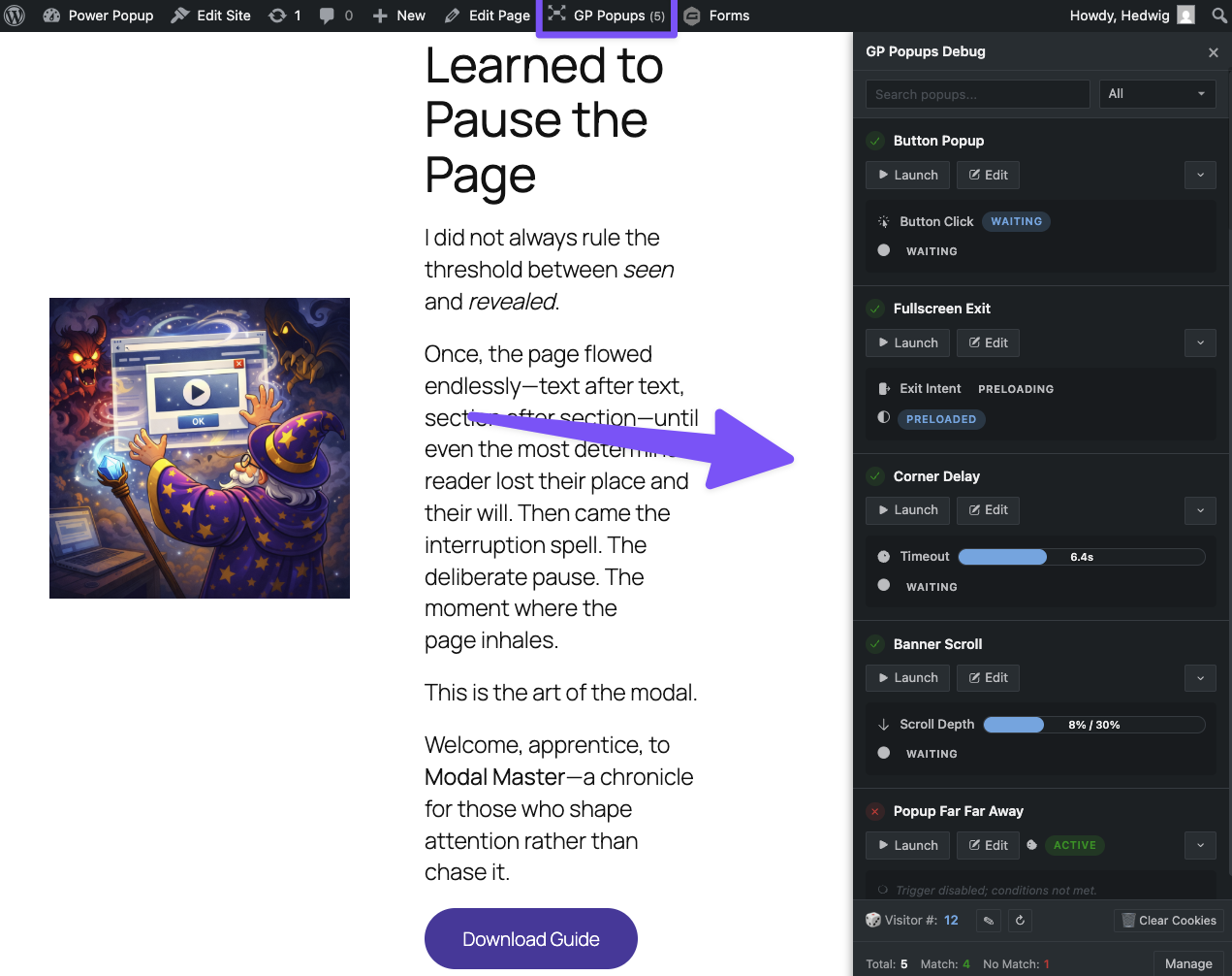
You can access all popups from this tool, see their names, triggers, and whether they’ve been preloaded, triggered, opened, and dismissed. For triggers like Delay and Scroll Depth, you have access to the real-time timer and scroll depth meter. You can also launch and close popups, clear your cookies, and see how many popups are targeting the page you’re in directly from the debugger.
Additionally, you can see and edit the Visitor Number, a randomly assigned number used in the Traffic Percentage page targeting rule.
FAQ
Why are popup feeds separate from the form?
Mainly because it makes it easy to swap out the form. For example, if you run Black Friday campaigns with the same popup but different forms to separate entries between years, you can change that directly in your Black Friday popup.
Can I pass any URL arguments to my popup?
Yes, this is directly supported via the gpp_iframe_url_args hook.
Can I pass field values to a popup form?
Yes, you can pass field values from a form on the page into a popup form using Gravity Forms dynamic population. This is useful when you want information already entered in a form to automatically populate fields in the popup form.
This snippet maps fields from the embedded form to the dynamic population parameters configured on the popup form.
Can I close a popup immediately after a user submits the form?
Yes, using this snippet. This removes the default 2-second delay and closes the popup right after a successful submission.
Translations
You can use the free Loco Translate plugin to create translations for any of our Perks. If you’ve never used Loco translate before, here’s a tutorial written for beginners.
Hooks
Gravity Forms has hundreds of hooks. Check out our Gravity Forms Hook Reference for the most thorough guide to Gravity Forms’ many actions and filters.
Related Resources
No related resources found.