

Extending Flowcrafter
React Extension API
Add custom React settings UI to Flowcrafter nodes when declarative fields can't do the job.
Most extensions never need a line of React. If your settings panel is a form — text inputs, selects, toggles, flow tag fields, conditional visibility — declare it in PHP and ship zero JavaScript. See settings fields for that path.
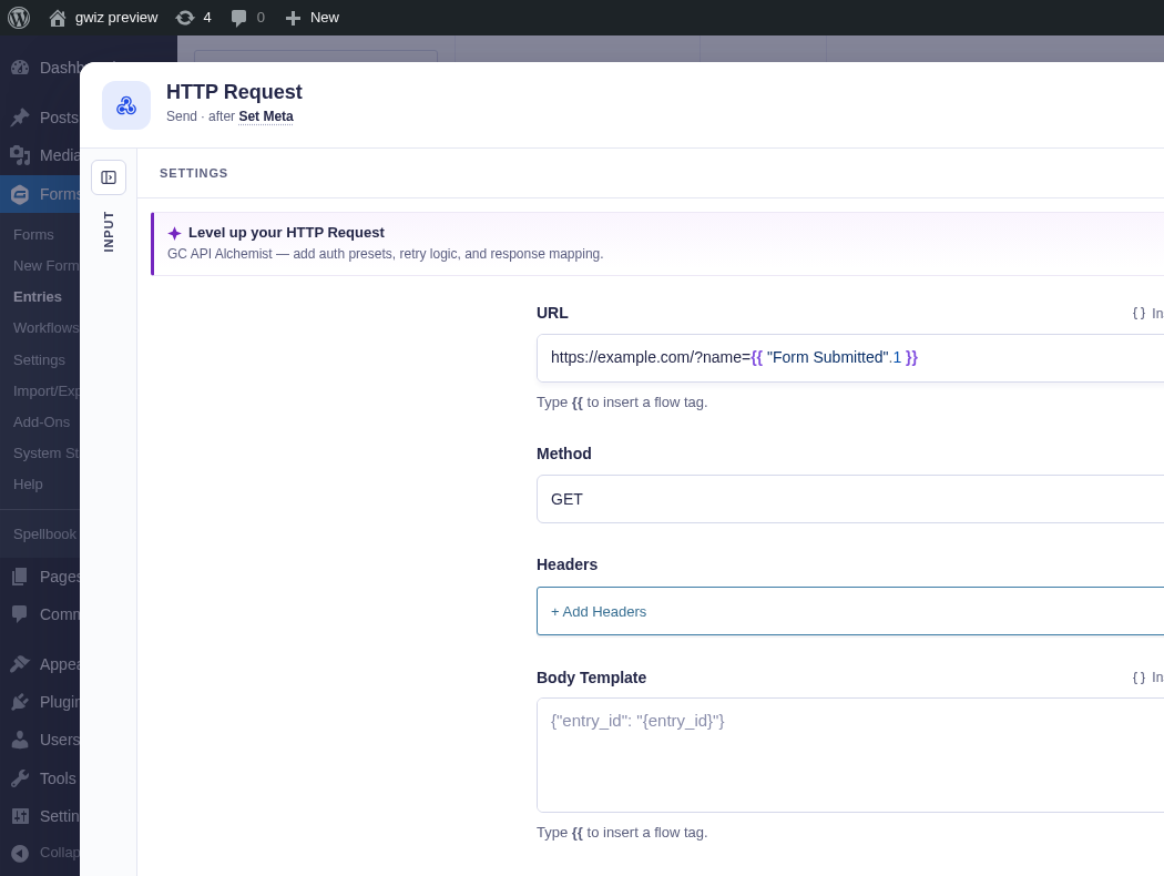
Reach for React when the panel needs something the field vocabulary can’t draw: a bespoke builder, live data fetching, a custom widget, or reusing React you already have in your own plugin. That’s what this page covers — the window.flowcrafter building blocks, the settingsComponent contract, and where a React panel can mount.
Exported building blocks
Section titled “Exported building blocks”The builder bundle sets window.flowcrafter when the workflow builder loads. Your extension bundle enqueues after it (with flowcrafter-editor in its dependency array), so the global is there by the time your code runs. Because the builder bundle only runs on the builder screen — not every admin page — a bundle that might load elsewhere should still guard:
if ( ! window.flowcrafter?.registerNodeExtension ) return;Here’s the full surface:
| Export | Kind | What it’s for | Signature / key props |
|---|---|---|---|
registerNodeExtension |
function | The main React-extension entry point. Register a settings component and/or a composition claim on an existing core node. | (options: RegisterNodeExtensionOptions) => void |
registerNodeType |
function | Register a brand-new node type (not an enhancement of a core node). | (registration: NodeTypeRegistration) => void |
getNodeTypeRegistration |
function | Look up a registered node type. Rarely needed by authors. | (type: string) => NodeTypeRegistration | undefined |
FlowTagInput |
component | The flow tag-aware CodeMirror input—label-row picker, {{ menu, path completion, drag-and-drop, linting, and whole-tag preview. The single most-reused export. |
ComponentType<FlowTagInputProps> |
DynamicField |
component | Renders one PHP-declared settings field using the same renderer Flowcrafter uses for declarative fields. Drop declarative fields into a custom React panel. | ComponentType<DynamicFieldProps> |
DynamicNodeSettings |
component | Renders the node’s complete PHP-declared settings with validation, composition, and the For Each output toggle. Use it to wrap the default settings with extra UI. Pass the host’s settings props unchanged. | ComponentType<NodeSettingsProps> |
CollapsibleSection |
component | Flowcrafter’s collapsible settings-section wrapper (matches Gravity Forms chrome). | ComponentType<CollapsibleSectionProps> |
BaseNode |
component | The canvas node shell — icon, label, handles, run-status chrome. Render this from a new node type’s component. |
ComponentType<BaseNodeProps> |
useFlowcrafterFlowTagSession |
hook | Read the live modal flow tag session (upstreamFlowTags, testRunOutputs, readOnly) without prop-drilling. |
() => FlowcrafterFlowTagSession |
withGFForm |
function | Run a synchronous callback with Gravity Forms’ global form object temporarily set to the requested form, then restore the previous value even if the callback throws. Use this before calling GF helpers that read window.form. |
<T>(form, callback: () => T) => T |
reactFlow |
namespace | The full @xyflow/react module, re-exported so your bundle shares Flowcrafter’s single React Flow instance (no duplicate context). |
typeof import('@xyflow/react') |
addFilter |
function | Typed wrapper over window.gform.addFilter, scoped to Flowcrafter’s filter names. |
(filterName, namespace, callback, priority?) => void |
applyFilters |
function | Typed wrapper over window.gform.applyFilters. |
(filterName, defaultValue, ...args) => return |
addAction |
function | Typed wrapper over window.gform.addAction. |
(action, namespace, callback, priority?) => void |
doAction |
function | Typed wrapper over window.gform.doAction. |
(action, ...args) => void |
A couple of things that are deliberately not here: there’s no removeFilter on the public API, and there’s no bundled React export — bring your own. WordPress provides window.React through the react script handle, so add it to your asset dependencies.
Settings on duplicated nodes
Section titled “Settings on duplicated nodes”A node registration can supply duplicateSettings(settings) when copied nodes need fresh provider-owned settings. The callback receives read-only settings and must return the complete replacement object, not a patch. Core remaps node references before calling it and rewrites copied Flow Tags afterward.
For example, an inbound-event provider can return { ...settings, token: crypto.randomUUID() } so a copied trigger never shares the original address. Core does not inspect provider token field names.
Wrap the default node settings
Section titled “Wrap the default node settings”A node type’s settingsComponent can add its own UI without rebuilding Flowcrafter’s field renderer:
function MyNodeSettings(props) { const { DynamicNodeSettings } = window.flowcrafter; return ( <> <MyConnectionControl readOnly={props.readOnly} /> <DynamicNodeSettings {...props} /> </> );}Pass the original props through rather than selecting only a few fields. The host includes validation and composition context alongside the documented node settings props. This also preserves the output-inclusion toggle when the node runs inside a For Each.
FlowTagInput props
Section titled “FlowTagInput props”The flow tag control every sibling integration reuses. If you build one custom field, it is usually this one. The public component includes the same {{ typeahead and hover/caret preview as core fields; a label-row Insert flow tag link is supplied when the host uses Flowcrafter’s label-row components. New expectation and menu-opening options used by core remain internal unless they appear in types/public-api.d.ts.
| Prop | Type | Notes |
|---|---|---|
id |
string |
Required. Must be unique — used for label association and the CodeMirror instance. |
value |
string |
Required. The raw flow tag template string. |
onChange |
(value: string) => void |
Required. |
rows |
number? |
1 = single-line compact; 6 = multi-line default. |
minRows |
number? |
Starting height in visible lines for multiline; grows before it scrolls. Ignored in compact/selection-only. |
placeholder |
string? |
e.g. 'Use {{ "Form submitted".id }} to reference upstream data'. |
flowTagGroups |
UpstreamFlowTagGroup[]? |
Explicit flow tag groups. If omitted, FlowTagInput falls back to the current node-edit session. Usually you pass upstreamFlowTags from props or the session hook. |
testRunOutputs |
Record<string, unknown>? |
Real test-run outputs — enables deep nested-path autocomplete beyond top-level schema keys. |
disabled |
boolean? |
Wire this to readOnly. |
selectionOnly |
boolean? |
Picker selects one complete flow tag instead of inserting at the cursor. |
onFlowTagSelect |
(token: string) => void? |
Called with the selected flow tag when selectionOnly is set. |
pickerTitle |
string? |
Accessible label for the picker trigger. |
selectionLabel |
string? |
— |
DynamicField props
Section titled “DynamicField props”Render one PHP-declared field inside a custom panel — handy for the boring fields you don’t want to rebuild by hand.
| Prop | Type | Notes |
|---|---|---|
field |
SettingsField |
The PHP-declared field descriptor. |
value |
unknown |
Current value. |
onChange |
(value: unknown) => void |
— |
allSettings |
Record<string, unknown> |
Sibling settings, for conditional-field visibility. |
upstreamFlowTags |
UpstreamFlowTagGroup[] |
— |
testRunOutputs |
Record<string, unknown>? |
— |
idPrefix |
string? |
Namespaces input ids. Flowcrafter passes ext-<slug> for extension fields. |
workflowFormId |
number | null? |
— |
issue |
ValidationIssue? |
Pins a validation message under the field. |
CollapsibleSection props
Section titled “CollapsibleSection props”{ label: string; defaultCollapsed?: boolean; children: ReactNode }.
Adjacent DynamicField wrappers receive the panel’s 0.75rem field spacing. Custom layouts nested inside the section keep control of their own spacing.
BaseNode props
Section titled “BaseNode props”For registerNodeType, not for extensions. Key props: variant ('trigger' | 'logic' | 'flow' | 'action'), icon (inline SVG string), label, hint?, selected?, nodeId?, hasTarget?, sourceHandles? ({ id, style?, className?, label? }[]), children?, runStatus?, runAttempts?, runDurationMs?, branchEnds?, decorator?, and disabled?.
BaseNode draws the shared canvas card: icon tile, small type label, title, summary, status chip, and—when selected—the action strip. Pass nodeId so it can display validation state and Edit, Duplicate, Test, and Delete actions.
The card’s color comes from the registration’s tone, not variant. Use 'trigger', 'confirmation', 'ai', 'actions', or 'logic' (the old 'feedback' and 'send' still work as aliases); set toneLabel when the small label should be more specific, such as AI · Text. Without a tone, triggers use trigger and other nodes use logic.
disabled is presentation only: it draws a grey, dashed card with an Off chip. It does not stop the runtime from executing the node. A node type that exposes a disabled state must enforce that behavior in its handler.
Custom node settings context
Section titled “Custom node settings context”A new node type registered through registerNodeType receives NodeSettingsProps. Alongside its saved settings and update callback, a custom panel receives:
| Prop | What it provides |
|---|---|
defaultSettings |
Ready-to-render PHP-declared fields, with validation messages and extension composition applied. Place this slot wherever the standard fields belong in your panel. |
testSession |
A read-only { runId, phase, data } view of the current test. Provider data is scoped to this node; a different node’s active listener is not exposed. |
function CustomSettings( { defaultSettings, testSession } ) { return ( <> <MyTestStatus session={testSession} /> {defaultSettings} </> );}Check window.flowcrafter.settingsContextVersion === 1 before registering a panel that depends on these props. This lets a product keep an older host’s bundled panel when the new context is unavailable. The mutable editor store stays private. Prefer the prepared slot when adding a header or status area; the generic DynamicNodeSettings export remains available for integrations such as GC OpenAI that wrap the renderer directly.
The settingsComponent contract
Section titled “The settingsComponent contract”A React panel attaches to a core node through registerNodeExtension:
window.flowcrafter.registerNodeExtension( { baseNodeType: 'HTTPRequestNode', // PascalCase core node type key slug: 'sample-react', // MUST match the PHP provider's get_slug() settingsComponent: SampleReactExtension, priority: 10, // optional; lower runs first for the component filter composition: { /* optional — see Slots below */ },} );registerNodeExtension is the full options bag:
| Field | Type | Notes |
|---|---|---|
baseNodeType |
string |
Required. PascalCase core node type, e.g. 'HTTPRequestNode', 'ConditionNode', 'GetEntriesNode'. |
slug |
string |
Required. Matches the PHP provider slug and the storage namespace. |
settingsComponent |
ComponentType<NodeExtensionSettingsProps>? |
Optional — omit it for composition-only (inline) claims. |
priority |
number? |
Default 10. Priority for the component filter, and the default composition priority. |
composition |
ExtensionCompositionOptions? |
Optional composition claim — see Slots. |
Two claims to the same (baseNodeType, slug) are resolved first-come-first-served: the first bundle to register wins. You can register a settingsComponent with no composition (it renders as its own standalone section), or a composition claim with no component (an inline claim — that’s exactly what the conditional-logic integration does).
The props your component receives
Section titled “The props your component receives”Every settings component is called with NodeExtensionSettingsProps:
| Prop | Type | What it is |
|---|---|---|
settings |
Record<string, unknown> |
Your extension’s own settings — your isolated namespace, separate from the core node. |
onChange |
(patch: Record<string, unknown>) => void |
Merge-patches your namespace. Shallow-merges into what’s already there. |
nodeSettings |
Record<string, unknown> |
The full core node settings — read these for awareness (e.g. react to method or object_type changes). |
onNodeSettingsChange |
(patch: Record<string, unknown>) => void |
Write to core node settings. Discouraged — prefer your own namespace. Used by composition activation toggles. |
upstreamFlowTags |
UpstreamFlowTagGroup[] |
Upstream node flow tag groups. Pass straight into FlowTagInput’s flowTagGroups. |
testRunOutputs |
Record<string, unknown>? |
Real test-run outputs for deep autocomplete. Pass into FlowTagInput’s testRunOutputs. |
formId |
number | null |
The Gravity Forms form id for the current workflow. |
node |
Node |
The React Flow node instance (@xyflow/react). |
readOnly |
boolean? |
True when viewing a past run — disable all inputs. |
The slug is one contract across three places
Section titled “The slug is one contract across three places”Your extension’s settings persist under settings.extensions[<slug>].settings. The JS slug, the PHP provider’s get_slug(), and that storage key are the same string — get one wrong and the panel silently reads back empty. Keep them identical.
Deriving your prop type without importing
Section titled “Deriving your prop type without importing”You can type your component against the public API without importing anything from Flowcrafter — the pattern to use against a peer plugin you don’t want a hard dependency on:
type SampleReactExtensionProps = ComponentProps< NonNullable< Parameters<typeof window.flowcrafter.registerNodeExtension>[0]['settingsComponent'] >>;Your component can’t take down the modal
Section titled “Your component can’t take down the modal”Every extension component is wrapped in an error boundary. If it throws, the modal shows a small fallback ("<label> settings failed to load" plus the error) and logs to the console — the rest of the settings modal keeps working. If a node is marked as React-rendered but no component resolved (usually the bundle didn’t enqueue), the modal shows a "<label> bundle not loaded" notice instead.
Flowcrafter doesn’t hand out arbitrary portal slots. Extension UI reaches the screen through a small, fixed set of seams — set with the composition option (or, for new node types, autoInjectSettingsSections).
| Slot | How to claim it | What renders | Live example |
|---|---|---|---|
| Standalone section | registerNodeExtension({ settingsComponent }) with no composition |
Your component in its own <CollapsibleSection>, appended below the node’s core settings. |
Sample React extension |
| Replace section | composition: { role: 'replace', sectionId, coversFields, activation? } |
Your component replaces the covered core fields for that named section. Exclusive — the highest priority among available extensions wins, and there’s one replace section per node. |
API Alchemist (sectionId: 'request', covers url/method); Populate Anything Get Entries (sectionId: 'lookup') |
| Append slot | composition: { role: 'append', sectionId, coversFields } |
Your component renders after a named section’s core fields. Non-exclusive — multiple appends stack by priority. |
Supported, no shipping consumer yet |
| Prepend slot | composition: { role: 'prepend', sectionId, coversFields } |
Same, but before the section’s core fields. | Supported, no shipping consumer yet |
| Inline takeover | composition: { role: 'inline', coversFields } — no settingsComponent |
Flowcrafter keeps the covered core field, paints no slot, and suppresses the standalone section. Your bundle mounts into that field’s own DOM via a document event (below). | Advanced Conditional Logic (Condition + Data Condition nodes, covers conditionalLogic) |
| Auto-injected sections | registerNodeType({ autoInjectSettingsSections: ['results'] }) |
For new node types with a custom settingsComponent: named PHP-declared sections are auto-rendered around the custom body, so you don’t rebuild boilerplate fields. |
Populate Anything collection nodes |
| DOM-event bridge | document event fc_conditional_logic_rendered |
Not a React slot. Flowcrafter hands the extension a live DOM container plus everything it needs to take the builder over: source ('entry' or 'data'), formId and the resolved form for an entry condition, the current value, an onChange writer, and getFlowTagSession(). |
Advanced Conditional Logic |
Two honest notes on this table. append and prepend are fully wired but have no shipping consumer yet — document them as supported, but there’s no live example to copy. And there is no public slot for node badges or the builder toolbar; the “enhanced by X” badge on a node is Flowcrafter-owned and appears automatically when an available extension exists — you can’t mount into it.
ExtensionCompositionOptions
Section titled “ExtensionCompositionOptions”| Field | Type | Notes |
|---|---|---|
sectionId |
string |
Named section id. Node types agree by convention (request, lookup, logic, auth, …). No PHP registry needed; coversFields define membership. |
sectionLabel |
string? |
Human name for the section — used as the activation toggle’s accessible name. |
role |
'replace' | 'append' | 'prepend' | 'inline' |
See the slot table above. |
coversFields |
string[] |
Core field names this section owns. For a replace claim with a core owner, order = render order. |
priority |
number? |
Default 10. Exclusive replace-stack priority — higher wins among available extensions. |
activation |
CompositionActivation? |
Optional user-facing “who owns this section” toggle. |
CompositionActivation
Section titled “CompositionActivation”A replace section can offer a toggle so the user picks between the core UI and your UI (think Simple vs. Advanced).
| Field | Type | Notes |
|---|---|---|
settingKey |
string |
The core node setting the choice is stored on, e.g. query_mode, request_mode. |
options |
CompositionActivationOption[] |
First option is the default. |
getSettingsPatch? |
(ctx: { value, previousValue, nodeSettings }) => Record<string, unknown> |
Extra core-settings changes saved atomically when the toggle flips. |
Each CompositionActivationOption is { value: string; label: string; owner: 'core' | 'extension'; description?: string }. The owner decides who paints the section body for that option. When the extension is removed, Flowcrafter falls the toggle back to the core-owned option automatically.
The reference samples show both approaches mounted in the same HTTP Request window. Sample React Extension is a custom component; Sample Declarative Extension is generated from PHP fields. They live under docs/examples/extension-samples/, are not loaded by core, and must be adapted in an integration plugin.
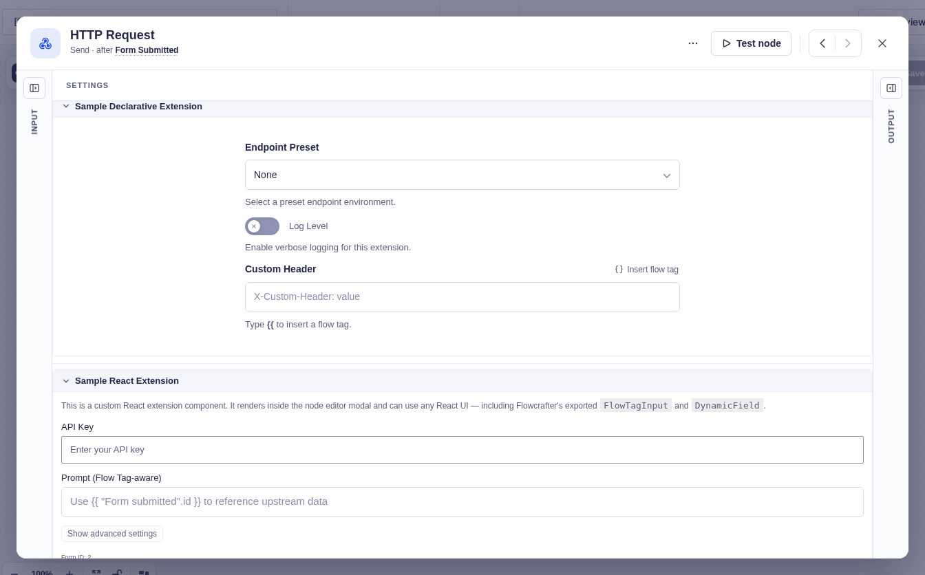
React vs. declarative
Section titled “React vs. declarative”The decision is one question: can PHP get_settings_fields() express the whole panel?
If yes, ship declarative. No build step, no bundle to enqueue, no version skew, and Flowcrafter renders it for you. The declarative field vocabulary is broad — text, textarea, php_code, number, select, checkbox, toggle, key_value, field_select, hidden, conditions, entry_source, form_source, notice, section, parameter_adder, media — and fields support flow tag inputs (supports_flow_tags), conditional visibility, choices, presets, tooltips, and required flags. A “form with flow tag inputs and a few fields that show or hide” is squarely declarative territory. See settings fields for the full reference.
Reach for React when you need any of:
- A custom widget the field types can’t draw — a multi-group AND/OR condition builder, a connection-profile picker with add-new links, a query builder with filter groups and ordering.
- Live or async data — fetching connection profiles or remote schemas, or reacting to
nodeSettingschanges in ways declarativeconditionalvisibility can’t. - Reusing existing React from your own plugin — a query store, a conditional-logic store, whatever you already ship.
- Replacing or augmenting core fields in place via composition (
replaceneeds a component;inlinemounts into the field’s own DOM).
You don’t have to pick one wholesale. A React settingsComponent can render Flowcrafter’s own DynamicField for the boring fields and hand-build only the one custom control. And for new node types, autoInjectSettingsSections lets Flowcrafter render named PHP sections around your custom body.
The cost of React, stated plainly: you own a webpack entry, the enqueue ordering (deps: [ ..., 'flowcrafter-editor' ]), and keeping any locally-declared prop types in sync with Flowcrafter’s. Declarative has none of that. Most extensions should stay declarative.
The custom component can also own interactions such as revealing advanced settings. Here the development sample has opened its Debug mode and Timeout controls; no API key is entered and no request is executed.
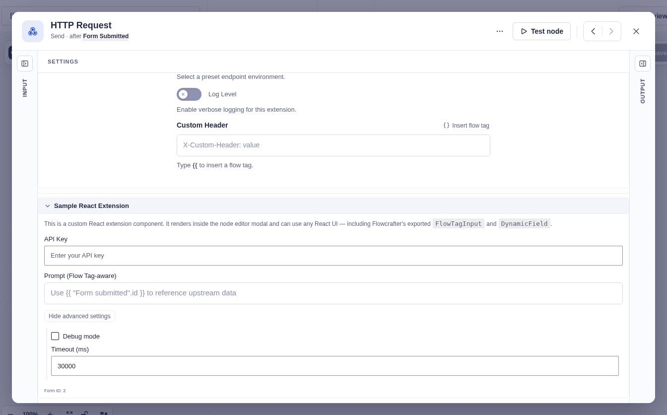
A complete React extension
Section titled “A complete React extension”This reference example shows registration, a component, and a PHP enqueue. Its source lives under docs/examples/extension-samples/; Flowcrafter does not load or build it, even in dev/debug mode. Adapt the source and asset paths in your own integration plugin. For maintained production patterns, see Real Integrations.
Registration
Section titled “Registration”import { SampleReactExtension } from './SampleReactExtension';
window.flowcrafter.registerNodeExtension( { baseNodeType: 'HTTPRequestNode', slug: 'sample-react', // matches Sample_React_Provider::get_slug() settingsComponent: SampleReactExtension,} );No guard here because this bundle only ever enqueues on the builder screen, with flowcrafter-editor as an explicit dependency. A third-party bundle that could load on other admin pages must guard with if ( ! window.flowcrafter?.registerNodeExtension ) return;. And with no composition, this renders as a standalone collapsible section under the HTTP Request node’s core settings.
The component
Section titled “The component”import React, { type ComponentProps, useState } from 'react';
// Derive the prop type straight from the public API — no import from Flowcrafter.type SampleReactExtensionProps = ComponentProps< NonNullable< Parameters<typeof window.flowcrafter.registerNodeExtension>[0]['settingsComponent'] >>;
export function SampleReactExtension( { settings, // this extension's own namespace onChange, // merge-patch that namespace formId, // GF form id readOnly, // disable inputs when viewing a run}: SampleReactExtensionProps ) { const [ showAdvanced, setShowAdvanced ] = useState( false );
// Grab exported building blocks off the global — the bundle is a peer, not a dependency. const { FlowTagInput, useFlowcrafterFlowTagSession } = window.flowcrafter; // Read the live modal session for flow tag autocomplete data. const { upstreamFlowTags, testRunOutputs } = useFlowcrafterFlowTagSession();
return ( <div className="sample-react-ext"> <input value={ ( settings.api_key as string ) ?? '' } onChange={ ( e ) => onChange( { api_key: e.target.value } ) } disabled={ readOnly } />
<FlowTagInput id="sample-react-prompt" value={ ( settings.prompt as string ) ?? '' } onChange={ ( value ) => onChange( { prompt: value } ) } rows={ 3 } placeholder={ 'Use {{ "Form submitted".id }} to reference upstream data' } flowTagGroups={ upstreamFlowTags } testRunOutputs={ testRunOutputs } disabled={ readOnly } />
{showAdvanced && ( <input type="number" value={ ( settings.timeout as number ) ?? 30000 } onChange={ ( e ) => onChange( { timeout: Number( e.target.value ) } ) } disabled={ readOnly } /> )}
<small>Form ID: { formId }</small> </div> );}Worth calling out:
- Exports are read off
window.flowcrafterinside the component, not via import — the extension bundle is a peer of the builder bundle, not a dependency of it. useFlowcrafterFlowTagSession()is the clean way to getupstreamFlowTags/testRunOutputsfor a deeply nested control. They’re on props too — use whichever is tidier.- Every input honors
readOnly, so a past-run view is genuinely read-only.
The PHP side owns the rest
Section titled “The PHP side owns the rest”The matching provider returns 'react' from get_render_mode() and an empty get_settings_fields() — the React component owns all the UI. Because there are no declarative fields to derive a schema from, get_settings_schema() is hand-authored (here, api_key / prompt / debug_mode / timeout), and get_output_schema() and validate() round out the contract. The split to remember: JS owns the UI; PHP owns the slug, schema, validation, and execution.
Enqueue the bundle
Section titled “Enqueue the bundle”add_action( 'flowcrafter_editor_scripts', function (): void { $asset = include plugin_dir_path( __FILE__ ) . 'build/sample-react-extension.asset.php'; wp_enqueue_script( 'flowcrafter-sample-react-extension', plugins_url( 'build/sample-react-extension.js', __FILE__ ), array_merge( $asset['dependencies'], [ 'flowcrafter-editor' ] ), // depend on the builder bundle $asset['version'], true );} );flowcrafter_editor_scripts is the action to hook for a builder bundle, and listing flowcrafter-editor as a dependency is what guarantees window.flowcrafter exists before your code runs.
Real-world patterns
Section titled “Real-world patterns”Three shipping integrations cover the whole surface between them:
- API Alchemist — a
replaceclaim onHTTPRequestNode(sectionId: 'request', coversurl/method) with an activation toggle onrequest_mode(Manual = core, Connection = extension). The reference for “swap a core section for my UI, with a toggle back to core.” - Populate Anything — uses both entry points:
registerNodeTypefor new collection nodes rendered withBaseNode, andregisterNodeExtensionwith areplaceclaim onGetEntriesNode(sectionId: 'lookup', Simple/Advanced activation onquery_mode). The single best example of the whole React surface, plusautoInjectSettingsSections: ['results']on the new node types. - Advanced Conditional Logic — composition-only
inlineclaims (nosettingsComponent) onConditionNodeandDataConditionNodecoveringconditionalLogic, and onWaitForFormSubmissionNodecoveringmatch_rules. It mounts its own React root into Flowcrafter’s field DOM through thefc_conditional_logic_rendereddocument event, and usesFlowTagInputoff the global for rule rows. The reference for “render inside a core field” and the event bridge.