

Getting Started
A Tour of the Builder
Learn how to navigate the Flowcrafter builder.
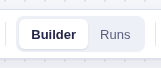
The builder has two modes on one canvas. Use Builder to create and test the workflow. Select Runs to replay what happened without changing anything.
The canvas
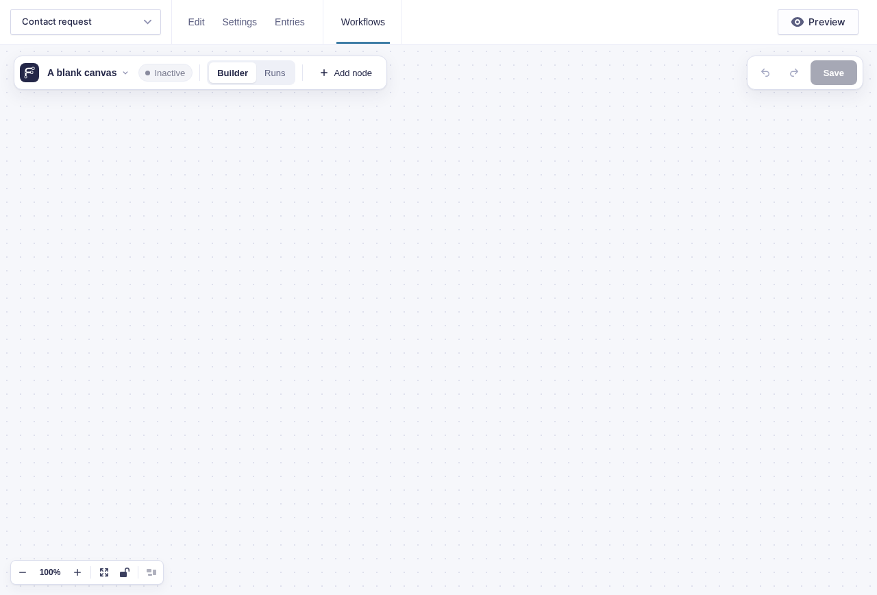
Section titled “The canvas”Each card on the canvas is a node. The short lines and arrows between cards determine what runs next. Moving a card changes only the layout; changing a connection changes the workflow.
The controls in the bottom-left corner let you:
- zoom in or out;
- fit the workflow on screen;
- lock the canvas so panning cannot move a node; or
- select Tidy up to arrange the complete workflow automatically.
Read and act on a node card
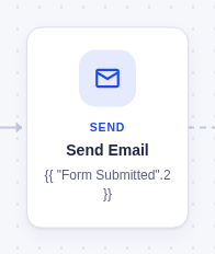
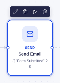
Section titled “Read and act on a node card”Nodes are separated into four different types, so node cards use color families to make them easier to spot. Each card shows an icon, a short type label, the node’s name, and a one-line summary.
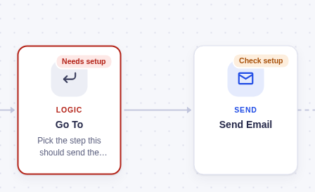
A node with a blocking problem shows Needs setup, turns red, and replaces its summary with the problem. Warnings show Check setup. Select either chip to open the Issues panel.
Select a card to reveal its action bar:
- Edit step opens its settings.
- Duplicate step makes a connected copy.
- Test this step runs it with test data.
- Delete step removes it.
Deleting does not open a confirmation. A notice at the bottom offers Undo for a few seconds. If you make another edit first, the notice closes rather than undoing the wrong change.
Add and connect nodes
Section titled “Add and connect nodes”An empty canvas begins with Start here and Add your first trigger. Select Add trigger to choose how the workflow starts, or Start from a template to preview a ready-made workflow.
After that, open the Add a node panel with Add node in the toolbar, or press A or / while focus is on the canvas. Nodes are grouped by type—Logic, Flow, AI, Actions, Confirmation, and Triggers—and the groups remember whether you left them open or collapsed.
Where the new node goes depends on what you selected:
| Before opening the panel | Where the node goes |
|---|---|
| One regular node selected | Directly after that node |
| Nothing selected | At the end of the workflow |
| A node with several possible paths selected | On the canvas, ready for you to connect |
You can also:
- select the + on a card or connection to add at that exact point;
- drag a connection from one node to another; or
- drag a node from the panel onto a connection. The connection turns blue, and dropping inserts the node between its two neighbors.
Each unfinished path ends with a dashed Add a node circle, so you can see where the workflow stops.
Configure a node
Section titled “Configure a node”Double-click a node, press Enter while it is selected, or use its pencil action to open the node window.
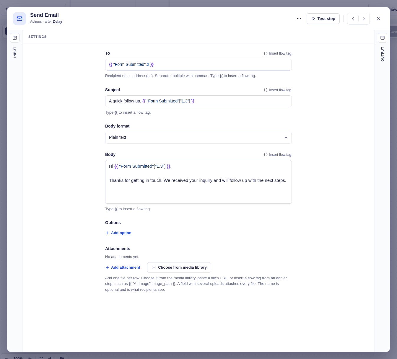
The header shows the node’s icon, editable name, and position in the workflow. Use ‹ and › to move to connected nodes without closing the window. Where the workflow branches or rejoins, the control asks which path or parent to follow.
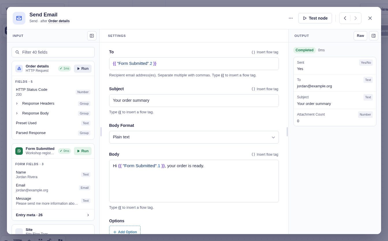
The window has three columns:
| Column | What it shows |
|---|---|
| Input | Values available from earlier nodes, using friendly field names and types |
| Settings | The controls that tell this node what to do |
| Output | What the node produced in a test or run, plus its status and duration |
Input and Output begin as narrow rails so Settings has room. Select a rail to open it. Flowcrafter remembers which columns you prefer across nodes and workflows. Starting a test opens Output automatically.
Use values from Input
Section titled “Use values from Input”Click in a compatible setting, then select a value in Input to insert its flow tag at the cursor. If no field is ready, the value says Drag instead; drag it onto a compatible setting. Valid targets turn blue, while an incompatible target explains what it expects.
Read Output
Section titled “Read Output”Before a node has run, Output shows the steps needed to produce a result. After a test or production run, it shows friendly result rows. Use Raw when you need the complete data structure. Confirmation output is previewed as the visitor would see it.
The ⋯ menu contains Duplicate, Delete, retry behavior, and a private note about the node.
Use the toolbar
Section titled “Use the toolbar”The toolbar floats over the canvas as two pills.

| Control | What it does |
|---|---|
| Workflow name ▾ | Select, rename, or create workflows (with 8 or more, type in Find a workflow to narrow the list); clear test data; open the builder guide |
| Active / Inactive | Turn automatic triggers on or off immediately |
| Builder / Runs | Choose between editing and run replay |
| Add node | Open the Add node panel |
| Issues | Open validation problems that must be fixed |
| Undo / Redo | Move through unsaved changes |
| Save | Save the workflow; a yellow dot means changes are waiting to be saved |
Use Runs mode
Section titled “Use Runs mode”Select Builder → Runs to open a read-only replay. The newest run opens automatically, and Run history appears on the left.
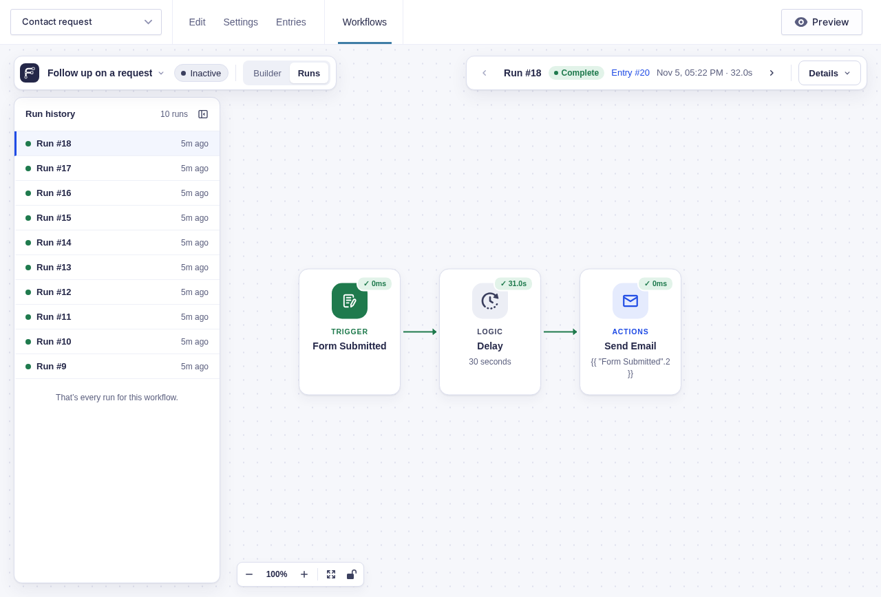
Each run in the history shows a status-colored dot, run number, relative start time, and a Test tag when applicable. Select a run to replay it.
The right toolbar pill shows the selected run, its status, entry, start time, and duration. Use ‹ and › to move between runs. Details adds progress, waiting or failure information, run controls, and a link to the corresponding Action Scheduler jobs.

On the canvas:
- connections taken by the run turn green;
- successful nodes show a quiet check and duration;
- failed nodes turn red and show the reason; and
- nodes that never ran are faded.
Select a node to open its real Input and Output for that run. Settings remain visible but read-only. Return to Builder to restore the editable workflow, including unsaved changes.
Keyboard controls
Section titled “Keyboard controls”Press Tab to reach a node, then use the arrow keys to follow its connections. Up and down move between branches.
| Key | Action |
|---|---|
| Enter or Space | Open the selected node |
| Delete or Backspace | Delete it and offer Undo |
| A or / | Open Add a node |
| ? | Open the builder guide |
| Alt/Option + ← or → | Move between connected nodes in the node window |
Flowcrafter removes movement and resizing animations when your system requests reduced motion.