

Extending Flowcrafter
Settings Fields (Declarative UI)
Add settings UI to Flowcrafter nodes and extensions with plain PHP arrays — no React required.
Most of Flowcrafter’s settings UI is just data. A PHP method returns an array of field definitions, and the builder renders the whole panel for you — inputs, dropdowns, toggles, repeaters, the flow tag picker, the works. No React, no build step, no JavaScript at all.
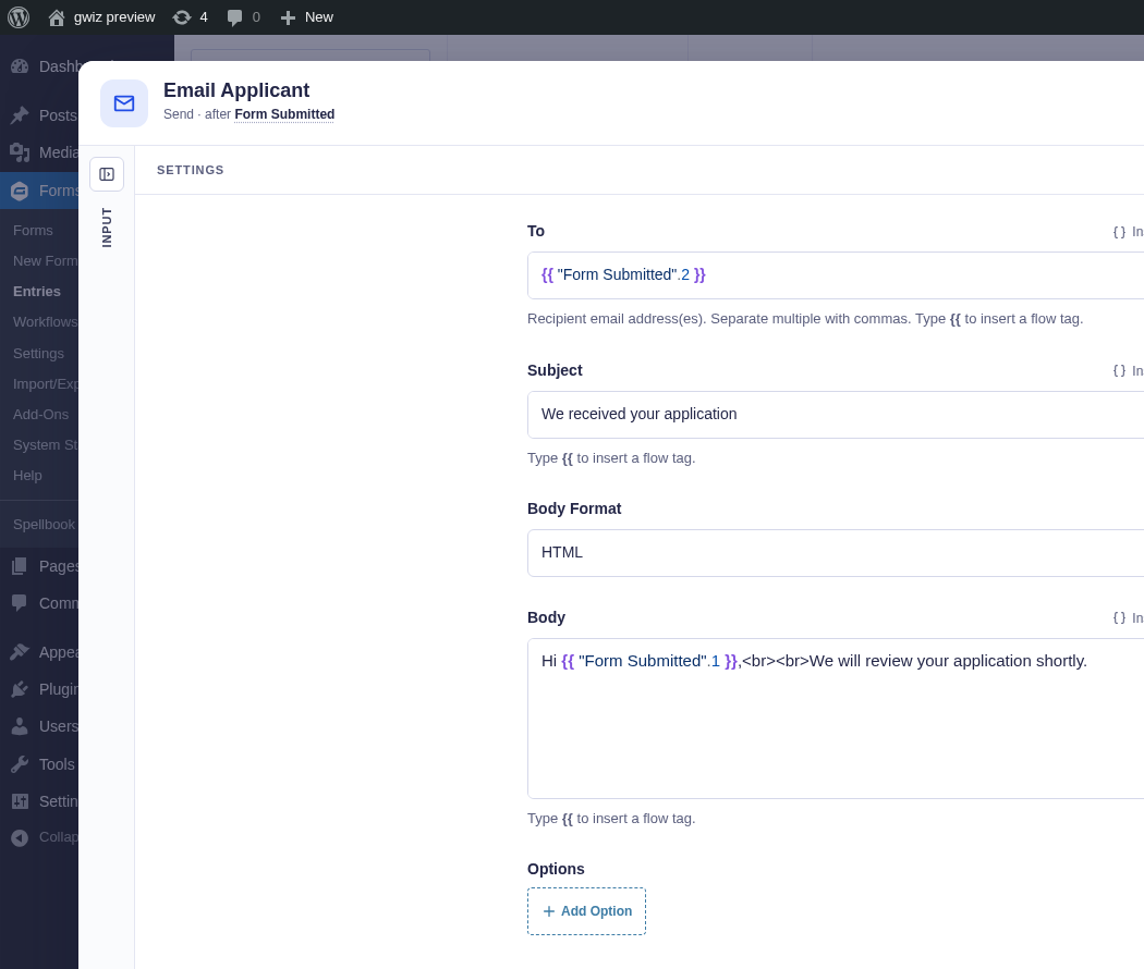
This is the declarative API. If you can describe a field with a plain PHP array, you never have to touch a component. When arrays aren’t enough — a bespoke picker, live data, custom interaction — reach for the React API.
Any node handler or extension provider returns these arrays from a
get_settings_fields() method. New to writing nodes? Start with
Writing a Node; this page is the field vocabulary
both nodes and extensions share.
The sample classes used below are reference source in docs/examples/extension-samples/, not nodes or providers loaded by core. Copy and adapt them in your own integration plugin; see Real Integrations for maintained production patterns.
The field types
Section titled “The field types”There are 17 field types. Every field is a plain PHP associative array with a
few required keys — name (the settings key), label, and type — plus
whatever config the type accepts.
A few things worth knowing up front:
- An unknown
typerenders a visibleUnsupported field type: <type>placeholder rather than silently vanishing, which makes typos easy to spot. sectionis the odd one out — it groups other fields instead of rendering a control of its own, so it’s handled a level up from the rest.- “Flow tags?” means the field can opt into the flow tag picker via
supports_flow_tags: true(see flow tag support below). Setting the flag on a type without flow tag support does nothing.
| # | type |
Renders as | Key config props | flow tags? |
|---|---|---|---|---|
| 1 | text |
Single-line text input | placeholder |
Yes (opt-in) |
| 2 | textarea |
Multi-line auto-growing text | placeholder, rows |
Yes (opt-in) |
| 3 | php_code |
Text field styled for PHP (CodeMirror) | placeholder |
Yes (opt-in) |
| 4 | number |
Numeric input | placeholder, required, suffix |
Yes (opt-in) |
| 5 | select |
Dropdown | choices ([{label,value}]), placeholder, required |
Yes (opt-in) |
| 6 | field_select |
Live GF form-field dropdown | choices (static fallback), placeholder, required |
Yes (opt-in) |
| 7 | checkbox |
Group of checkboxes | choices ([{label,value}]) |
No |
| 8 | toggle |
On/off switch, or a two-option segmented control | segmented, group (boolean default) |
No |
| 9 | key_value |
Repeater of key/value rows | media_picker (bool), mime_types |
Yes (opt-in, value input) |
| 10 | parameter_adder |
Preset-driven multi-row repeater | presets, add_button_label, show_keys, custom_option_hint |
Yes (opt-in) |
| 11 | entry_source |
Entry picker ($input / upstream node / literal) |
default |
Yes (opt-in) |
| 12 | form_source |
Form picker with auto-detect badge | default |
Yes (opt-in) |
| 13 | conditions |
Flowcrafter’s own rule builder | subject (names the sibling form/entry setting) |
Yes (opt-in, both sides) |
| 14 | media |
WP media-library picker | mime_types (string|string[]), multiple (bool) |
No |
| 15 | notice |
Static callout banner | variant (info|success|warning|error), message |
No |
| 16 | hidden |
Nothing — carries a stored value with no UI | — | No |
| 17 | section |
Collapsible group of named child fields | fields (string[] of child names), collapsed (bool), flat (bool) |
n/a |
A few type-specific notes:
-
textarea—rowsis the starting height in lines (defaults to 4, minimum of 2). It auto-grows a few lines before it starts scrolling. -
select— a non-required select shows a leading empty option, muted until something is picked:placeholder, or “Choose a {label}” built from the field’s label (“Choose a body format”). Write placeholders the same way: sentence case, saying what to choose, no em dashes. -
number—suffixputs a muted unit inside the box after the value (“24 hours”, “25 entries”) and narrows it to 180px. Use it instead of a unit in the label (“Expiry”, not “Expiry (hours)”). There are no spinner arrows. -
toggle— renders as a switch row: switch, label, thentooltipas a one-line description, in a bordered box. Setsegmentedwhen naming each state explains it better than on/off:[ 'on' => 'Full entries', 'off' => 'Entry IDs only', 'on_help' => '…', 'off_help' => '…' ]draws a two-option segmented control (on first) over the same boolean, and the matching help replacestooltip. -
field_select— populates from the connected form’s fields at render time;choicesis the fallback when there’s no live form to read. -
conditions— a rule builder: matchalloranyof a list ofsource · operator · valuerows.subjectdecides what a rule’s left side means, and it is the only prop that matters:subjectLeft side Evaluated against omitted a flow tag or literal an upstream node’s output 'form_source'or'entry_source'a dropdown of that form’s real fields a Gravity Forms entry Name the sibling setting that already picks the form — the one Flowcrafter injects for you when your handler implements
Requires_FormorRequires_Entry. Getting this wrong is not cosmetic: it also picks which PHP evaluator runs, so a rule authored as a field ID but evaluated as a token compares the literal string"3"and never matches. Operators come from Gravity Forms, so add-on operators appear automatically. -
key_value—media_picker: trueadds a “Choose from media library” button that appends one row per file (value = URL, key = filename). -
parameter_adder— each preset is{ key, label, description, input_type, placeholder, group }, whereinput_typeisnumber,text, orjson. There’s always a “Custom Key/Value” row alongside the presets.add_button_labeldefaults to “Add Parameter”. -
notice— read-only.labelis the heading,messageis the body. -
section— child fields are declared normally at the top level and listed bynameinfields; they render inside the section instead of at the top. Withflatset they render inline instead, with no accordion: the section only groups them for code, such asautoInjectSettingsSections.collapsed(default true) sets the initial state.
Common optional keys
Section titled “Common optional keys”Every field type accepts these:
| Key | Type | Meaning |
|---|---|---|
default |
mixed | Initial value. |
allow_empty |
bool | For number fields, preserve an explicitly cleared value instead of restoring default. Omit it to keep the default-restoring behavior. |
tooltip |
string | Help text (rendered as the GF description / info tip). |
required |
bool | Marks the field required (honored by text-family, select, field_select, number). |
placeholder |
string | Input placeholder (text-family, select, number, field_select). |
group |
string | toggle only. Consecutive top-level toggles with the same value share one bordered fieldset under this heading, with each tooltip as its description. Current limitation: toggles moved into a section or claimed by composition render separately. |
conditional |
{ field, operator: 'is'|'is_not', value } |
Show this field only when a sibling field’s value matches. Hidden fields render nothing. |
supports_flow_tags |
bool | Opt into the flow tag picker. See below. |
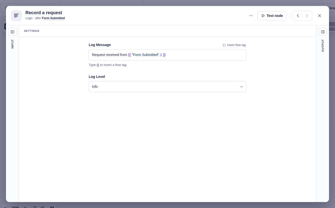
The reference sample logging node turns PHP field definitions into a flow tag-aware message field and a level selector.
Declarative nodes vs. declarative extensions
Section titled “Declarative nodes vs. declarative extensions”The same field arrays power two different jobs, through two different base classes.
- A whole new node — your handler owns its settings panel.
- Extending a built-in node — your provider appends fields to a node someone else built, without touching it.
Here’s the split side by side:
| Declarative node | Declarative extension | |
|---|---|---|
| Base class | Abstract_Node_Handler |
Abstract_Node_Extension_Provider |
| Fields method | get_settings_fields( int $form_id ) |
get_settings_fields( array $base_node, array $extension_settings ) |
| Registers via | flowcrafter_register_nodes |
flowcrafter_register_node_extensions and flowcrafter_register_node_extension_providers |
| Targets | itself (a new node type key) | an existing node type (get_base_node_type()) |
| Values stored at | data.settings.<name> |
data.settings.extensions.<slug>.settings.<name> |
| flow tag contract | implement Resolves_Flow_Tags if any field opts in |
provider owns resolution; validate via validate() |
| Active / inactive | always active once registered | active only when a live provider is registered (metadata-only = upsell) |
A whole new node
Section titled “A whole new node”A node handler extends Abstract_Node_Handler and returns its entire settings
panel from get_settings_fields( int $form_id ). The $form_id is the node’s
primary form (or 0 when there is no form context). Values save to data.settings.<name>.
class Sample_Log_Node extends Abstract_Node_Handler implements Contracts\Resolves_Flow_Tags {    use Traits\Resolves_Flow_Tags;
    public function get_settings_fields( int $form_id ): array {        return [            [ 'name' => 'log_message', 'label' => 'Log Message', 'type' => 'text',              'default' => '', 'placeholder' => 'Enter a message to log',              'supports_flow_tags' => true, 'required' => true ],            [ 'name' => 'log_level', 'label' => 'Log Level', 'type' => 'select',              'default' => 'info',              'choices' => [                  [ 'label' => 'Info',    'value' => 'info' ],                  [ 'label' => 'Warning', 'value' => 'warning' ],                  [ 'label' => 'Error',   'value' => 'error' ],              ] ],        ];    }    // + get_label / get_category / get_description / execute / get_output_* …}
Register the type against the flowcrafter_register_nodes hook:
add_action( 'flowcrafter_register_nodes', function ( string $registry_class ): void { $registry_class::register( 'SampleLogNode', Sample_Log_Node::class );} );Because log_message declares supports_flow_tags: true, the handler must
implement the Resolves_Flow_Tags contract — Flowcrafter throws an
InvalidArgumentException naming the offending field if you declare a flow tag
field without it. Declaring a flow tag field is a promise to resolve it at runtime.
Extending a built-in node
Section titled “Extending a built-in node”An extension provider implements Node_Extension_Provider (usually via
Abstract_Node_Extension_Provider) and targets an existing node type. Its fields
render in that node’s modal as an extra section — the built-in node is untouched,
and its values save under a namespaced key so they never mix with the node’s own
settings.
Note the different method signature — a provider gets the base node and the current extension settings, not a form id:
public function get_settings_fields( array $base_node, array $extension_settings ): arrayRegistration is two steps, and both matter:
// 1. Metadata — what the builder lists, gating, upsell copy.add_action( 'flowcrafter_register_node_extensions', function ( string $registry_class ): void {    $registry_class::register( 'HTTPRequestNode', 'sample-declarative', [        'label'        => 'Sample Declarative Extension',        'plugin_slug'  => 'flowcrafter',        'product_line' => 'gravity_connect',        'value_prop'   => 'Sample extension showing declarative settings fields.',    ] );} );
// 2. The live provider instance — this is what makes the extension "active".add_action( 'flowcrafter_register_node_extension_providers', function ( string $registry_class ): void {    $registry_class::register( new Sample_Declarative_Provider() );} );
Why two registries? They answer two different questions:
- Metadata feeds the builder UI so it can show an extension (and its upsell) even when the plugin providing it isn’t active. That’s how a locked node still advertises what it could do.
- Provider holds the actual instance. Present = the extension is available and
active; absent = the metadata still lists it, but greyed out with an upsell. The
builder filters on
availablebefore rendering, so an inactive extension never paints its fields.
The registry is keyed by (base_node_type, slug), so one plugin slug can enhance
several node types with distinct providers.
You also get settings validation for free: a declarative provider derives a
JSON schema from its own get_settings_fields(), so saved values are validated
without any extra code.
Where extension fields land
Section titled “Where extension fields land”By default, an active declarative extension gets one appended collapsible
section — titled with your label, holding your fields, open by default. No
slot registration, nothing to wire. Field ids are prefixed ext-<slug>-<name> so
they can’t collide with the core node’s fields.
For tighter integration — putting your UI next to or over a specific core field instead of in a section at the bottom — Flowcrafter has a composition system. An extension files a claim against a named section of the node with a role that says how its content should sit relative to the core fields:
| Role | What it does |
|---|---|
replace |
Your content replaces the covered core fields and paints the whole section. Exclusive — highest priority wins (default 10). |
prepend |
Your content is injected before the section’s core fields. Every prepend claim is hosted. |
append |
Your content is injected after the section’s core fields. Every append claim is hosted. |
inline |
Your content renders inside a core field’s own render slot; Flowcrafter just hides your standalone section and leaves the core field in place. (This is how GP Advanced Conditional Logic takes over a conditions field.) |
Composition is registered from JavaScript, so it’s technically a React seam — but the content those slots host can still be plain declarative fields. It’s worth knowing the roles exist even if you start with the simple appended section. The full mechanics live in the React API.
Flow tag support
Section titled “Flow tag support”Making a field flow tag-aware is one flag: supports_flow_tags: true. That’s the
entire declarative flow tag API.
When it is on, the field receives upstream flow tag groups and shows Insert flow tag on its label row. Number fields use the same label action and switch to a flow tag input after a tag is selected. Select and source fields use a List / Custom switch: List keeps the normal choices, while Custom accepts flow tags and text. When support is off or absent, the flow tag controls are not shown. You don’t assemble the flow tags — the builder supplies them from the node’s upstream data and any test-run outputs. Opting in is all you do.
[ 'name' => 'custom_header', 'label' => 'Custom Header', 'type' => 'text', 'default' => '', 'placeholder' => 'X-Custom-Header: value', 'supports_flow_tags' => true ], // ← adds the flow tag pickerTwo things to know:
- The flag is strict. Flowcrafter normalizes it to a real boolean before
anything renders — only a literal
truecounts."true",1, or a malformed value all becomefalse. So the frontend can trust it. - Only these types honor it:
text,textarea,php_code,number,select,field_select,key_value,parameter_adder,entry_source,form_source,conditions. Setting it oncheckbox,toggle,notice,section,hidden, ormediadoes nothing.
There’s no per-field flow tag allow-list or custom flow tag source in the declarative
API — it’s a boolean. If you need a bespoke flow tag experience (say, an
array-path picker), that’s a job for a custom React settingsComponent in the
React API.
A minimal declarative extension
Section titled “A minimal declarative extension”Here’s the whole thing — a PHP-only extension on the built-in HTTP Request node, no JavaScript bundle. Every interface method is implemented, but the ones that don’t apply stay trivial.
namespace Flowcrafter;
class Sample_Declarative_Provider extends Abstract_Node_Extension_Provider {
    // Stable machine slug — the storage namespace is settings.extensions['sample-declarative'].    public function get_slug(): string { return 'sample-declarative'; }
    // Which built-in node this attaches to. (base_node_type, slug) is the registry key.    public function get_base_node_type(): string { return 'HTTPRequestNode'; }
    // Section heading shown in the modal.    public function get_label(): string { return 'Sample Declarative Extension'; }
    // Listing / gating / upsell metadata surfaced via REST.    public function get_metadata(): array {        return [            'label'        => $this->get_label(),            'plugin_slug'  => 'flowcrafter',            'product_line' => 'gravity_connect',            'value_prop'   => 'Sample extension showing declarative settings fields.',        ];    }
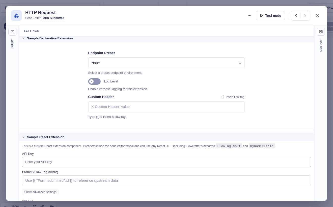
    // THE declarative UI. Plain field arrays — rendered automatically.    // Signature is ($base_node, $extension_settings) — NOT a form id.    public function get_settings_fields( array $base_node, array $extension_settings ): array {        return [            [ 'name' => 'endpoint_preset', 'label' => 'Endpoint Preset', 'type' => 'select',              'default' => 'none',              'choices' => [                  [ 'label' => 'None',       'value' => 'none' ],                  [ 'label' => 'Production', 'value' => 'prod' ],                  [ 'label' => 'Staging',    'value' => 'staging' ],              ],              'tooltip' => 'Select a preset endpoint environment.' ],
            [ 'name' => 'log_level', 'label' => 'Verbose Logging', 'type' => 'toggle',              'default' => false,              'tooltip' => 'Enable verbose logging for this extension.' ],
            [ 'name' => 'custom_header', 'label' => 'Custom Header', 'type' => 'text',              'default' => '',              'placeholder' => 'X-Custom-Header: value',              'supports_flow_tags' => true ],   // ← the one flag that turns on the flow tag picker        ];    }
    // Extra output flow tags this extension contributes downstream. Return $base_schema unchanged if none.    public function get_output_schema( array $base_schema ): array {        return [ 'preset_used' => [ 'label' => 'Preset Used', 'type' => 'string' ] ];    }
    // Save-time validation of this extension's own settings. Return WP_Errors to block; [] = OK.    public function validate( array $base_node, array $extension_settings, array $context ): array {        return [];    }
    // 'declarative' = render settings_fields automatically, no JS bundle.    // 'react' would require window.flowcrafter.registerNodeExtension() + a component.    public function get_render_mode(): string { return 'declarative'; }}
After adapting and registering this sample in an integration plugin, open an HTTP Request node to find a collapsible Sample Declarative Extension section with a preset dropdown, a verbose-logging toggle, and a flow tag-aware Custom Header field — zero React. Values save to
data.settings.extensions['sample-declarative'].settings.{…}, and you read them
back at runtime with
Node_Extension_Provider_Registry::get_settings_for_node( $node, 'sample-declarative' ).
This example is illustrative — a one-field provider is perfectly valid. You must
implement every interface method (get_slug, get_base_node_type, get_label,
get_metadata, get_settings_fields, get_output_schema, validate,
get_render_mode), but get_output_schema can return $base_schema untouched
and validate can return [].
When declarative isn’t enough
Section titled “When declarative isn’t enough”Reach for the React API when you need live data, a custom picker, a bespoke flow tag experience, or want your fields woven into specific core fields via composition. Everything else — inputs, dropdowns, repeaters, toggles, notices, the standard flow tag picker — is just an array.